Office re-design for Fred. Olsen in Stirling
Fred. Olsen Renewables
Fred. Olsen Renewables is an energy producer operating 12 wind farms with more than 338 wind turbines in Scotland, Norway and Sweden and one under construction south of Fort Augustus.
Amos Beech were approached by Fred. Olsen to re-design their expanding office space in Stirling. In this case-study we describe 3 phases finished in 2021, 2022 and 2023.
Office fit-out and refurbishment Fred. Olsen, Stirling
With the country slowly coming out of lockdown and with the hope of eventually heading back to the workplace sometime this year, the client felt it was the ideal time to introduce a more flexible way of working and refurbish the office space and facilities. A fresh start in a fresh space for staff to return to.
Stirling office refurbishment
Phase 1
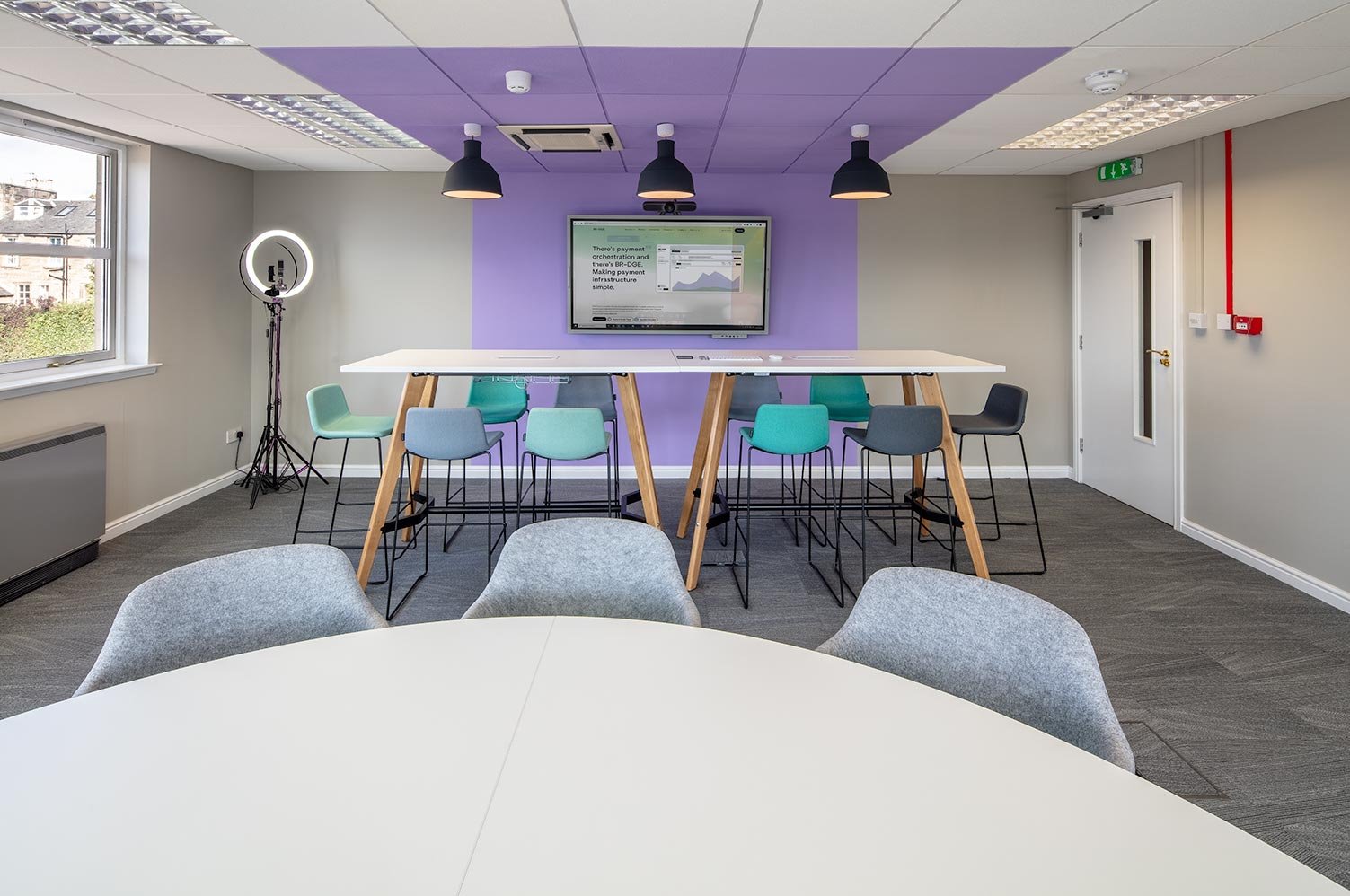
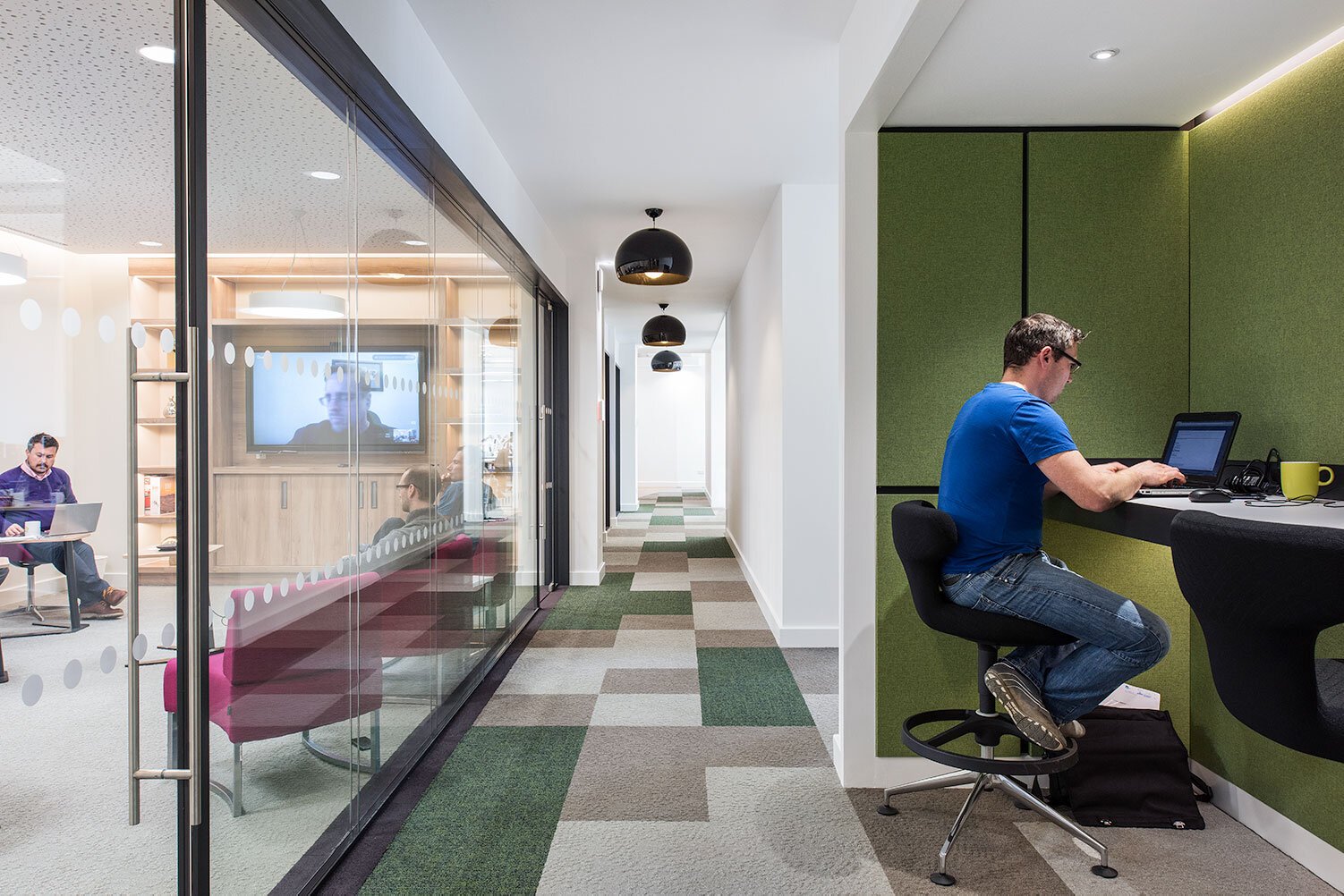
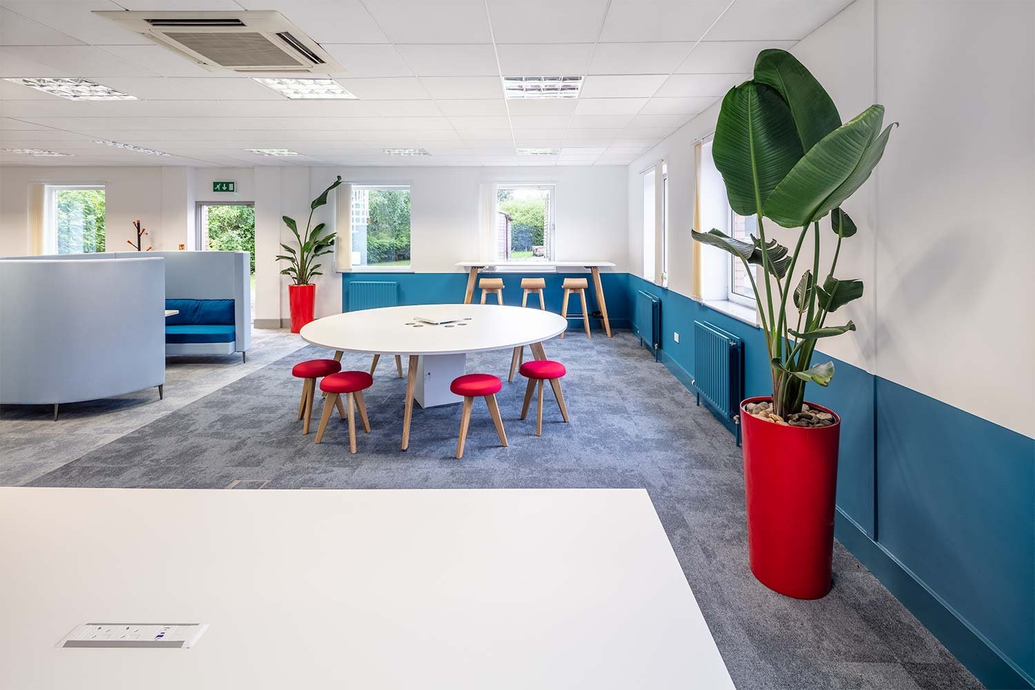
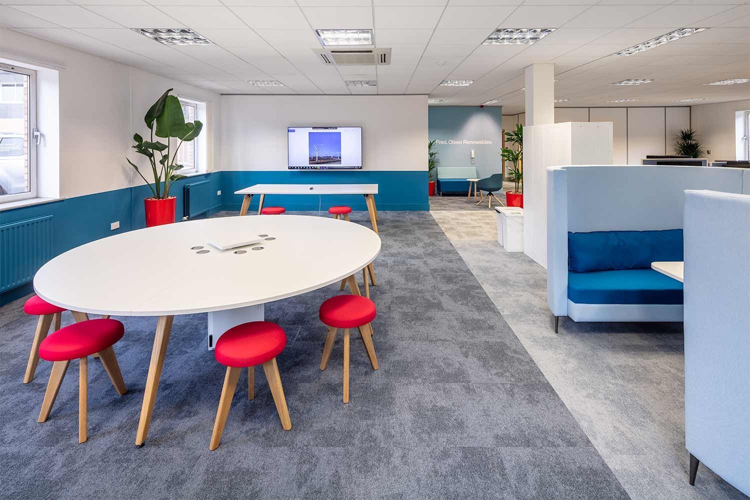
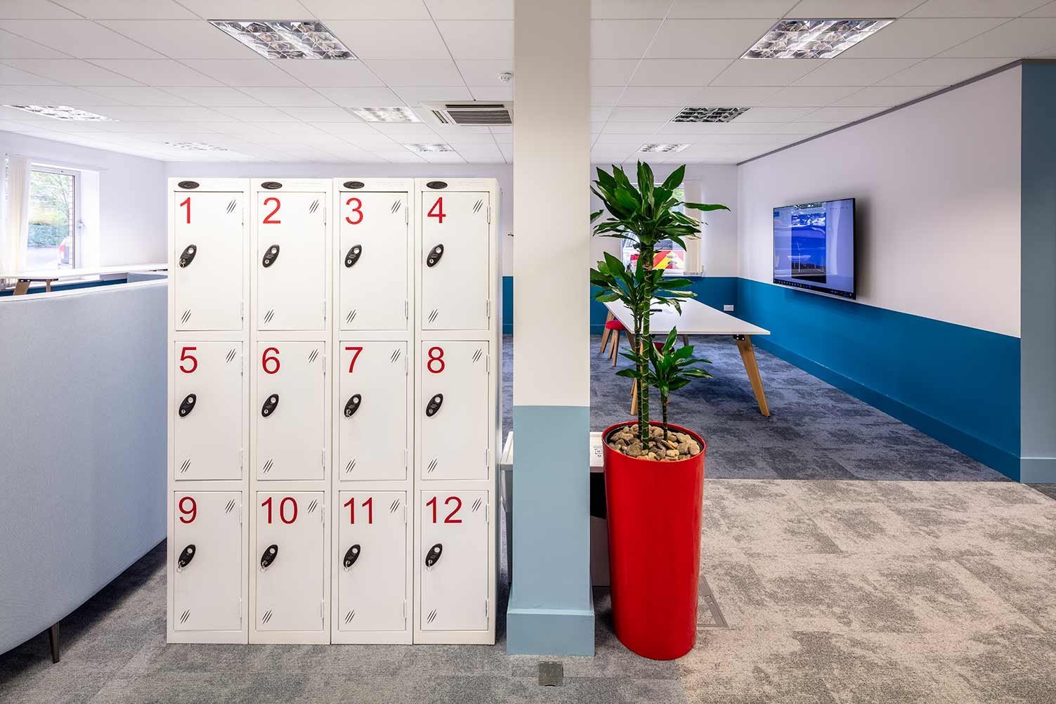
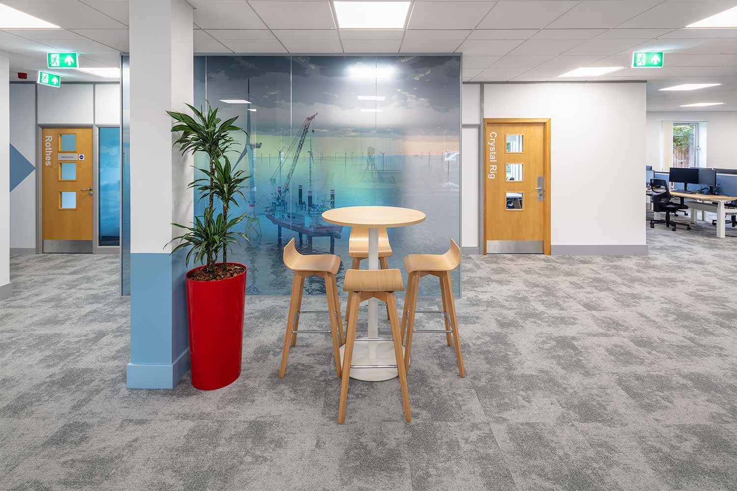
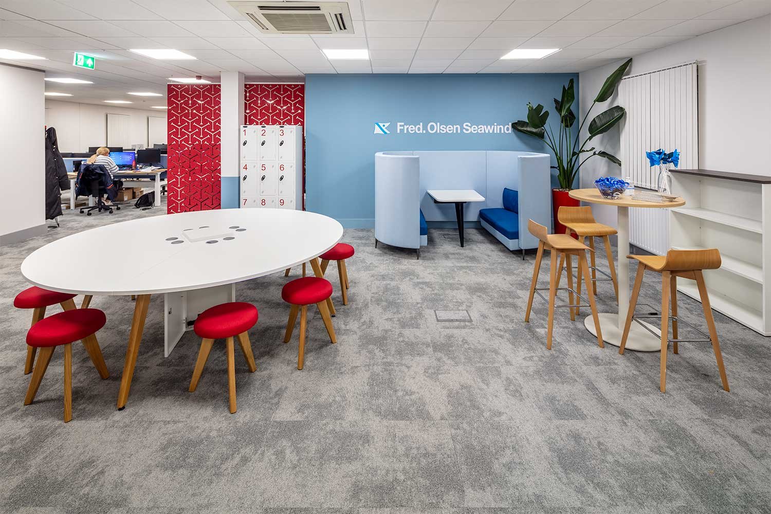
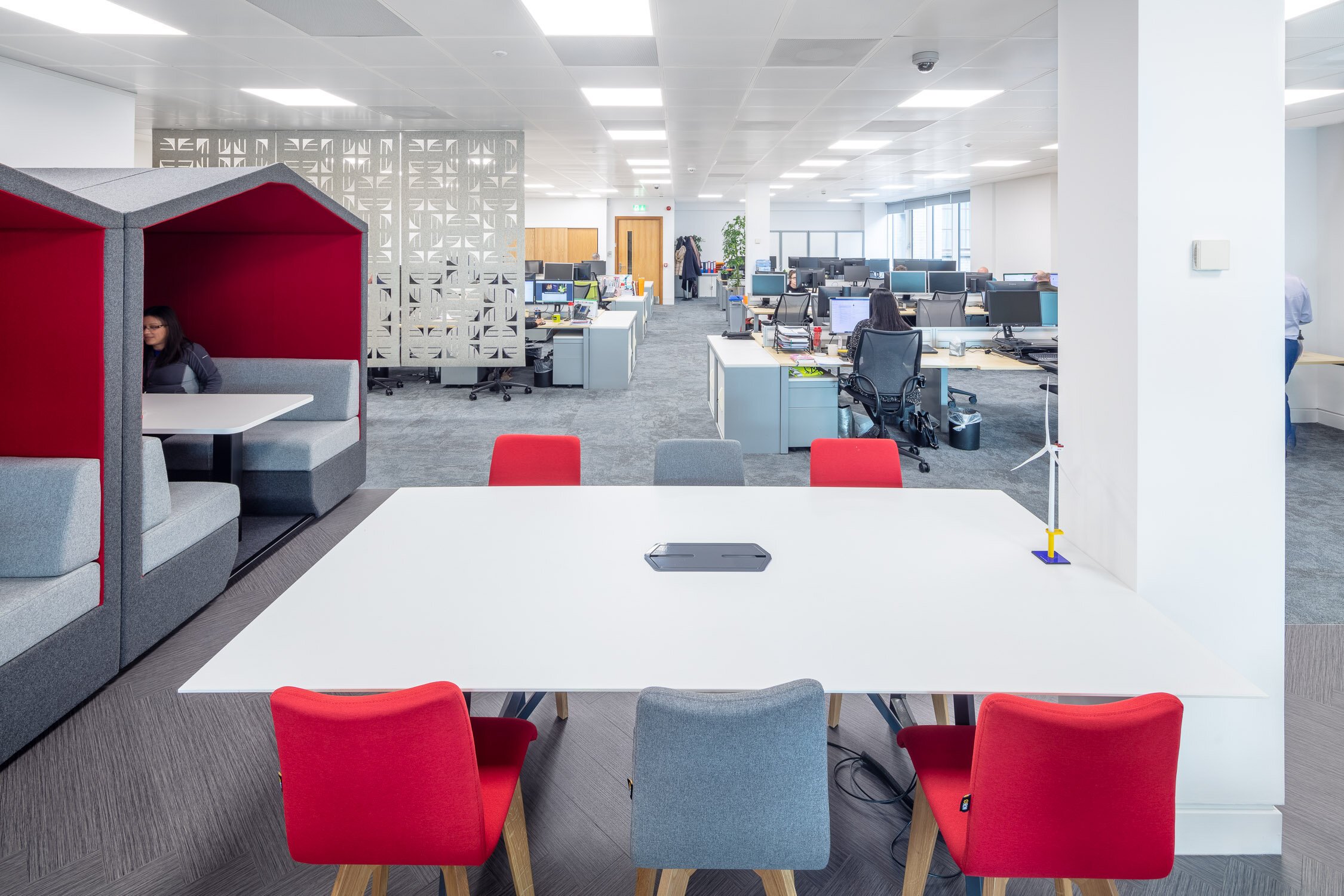
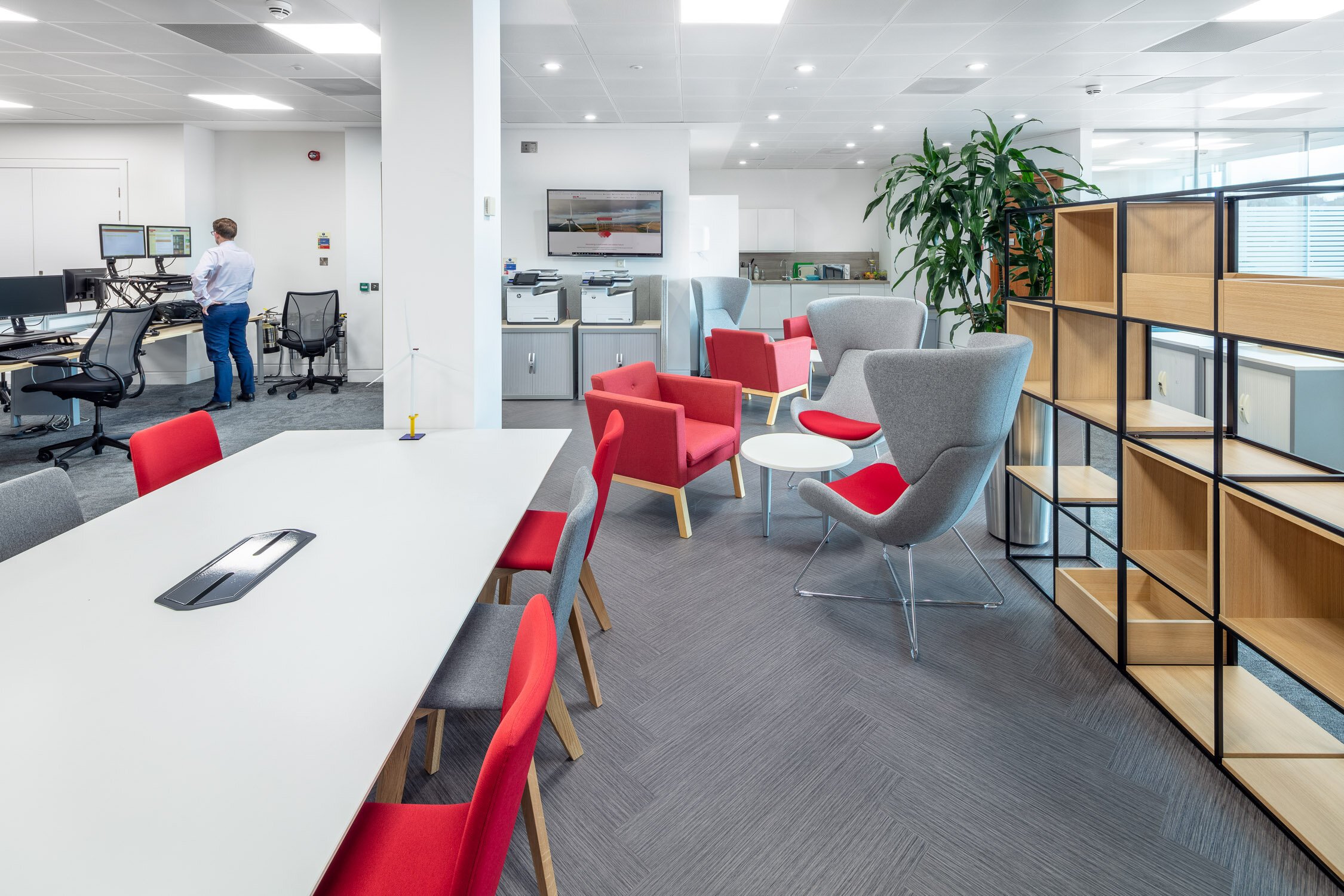
Half of the office space is dedicated entirely to a variety of collaboration and break out areas. The introduction of large collaboration tables and a large media screen for presenting, allows staff to come together in a vibrant co-working environment. High hot desk benching along the windows allows views out to the surrounding green spaces.
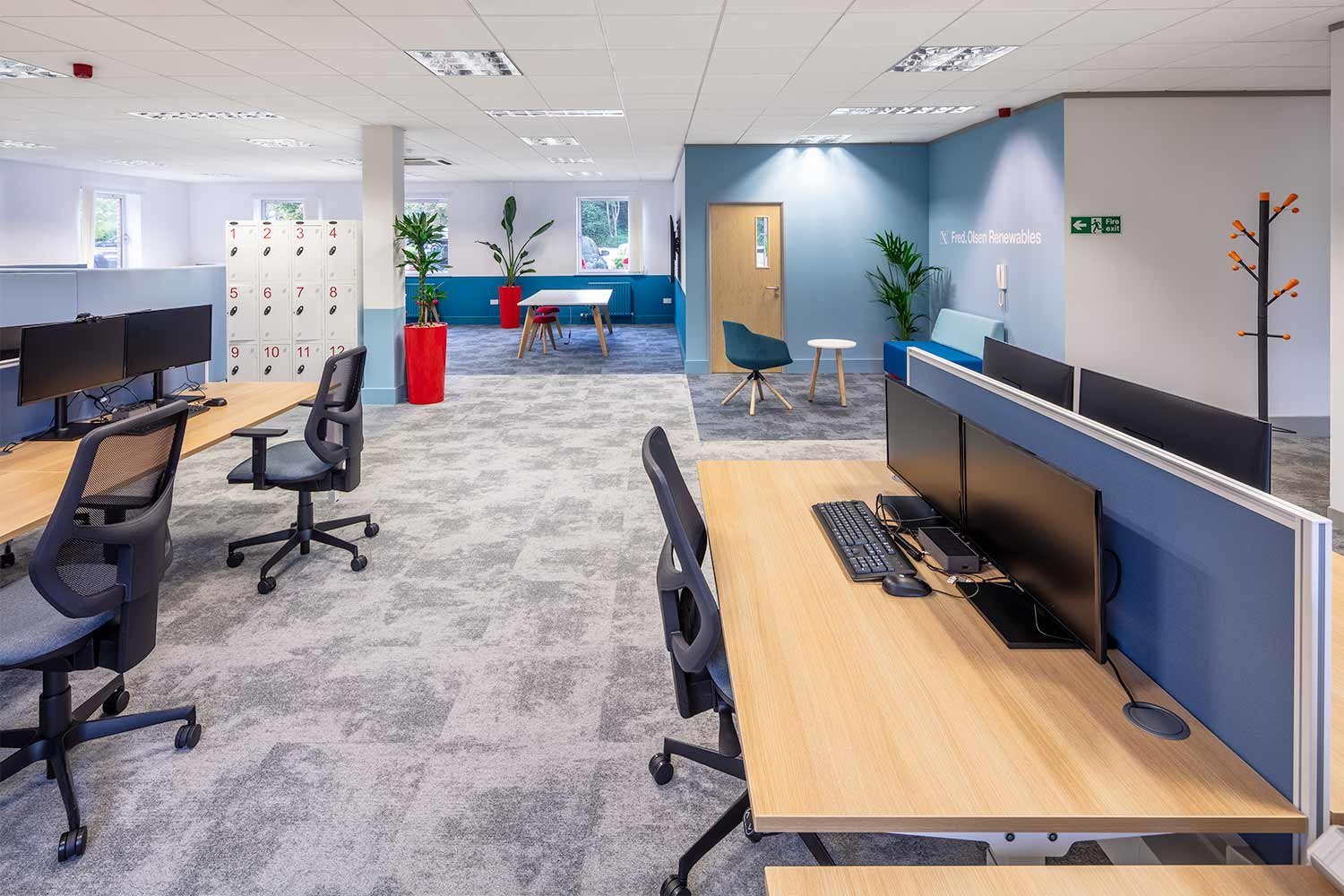
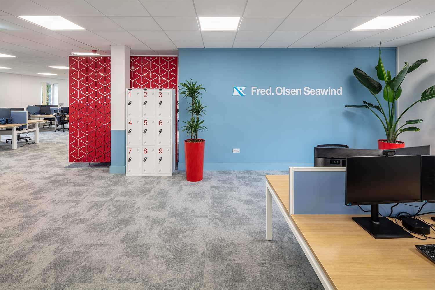
Lockers and a high back meeting booth divide the office without the use of walls. A mix of fixed benches and height adjustable desks make up the more focused workspace. The furniture allows a complete ergonomic selection contributing to a healthy working environment.
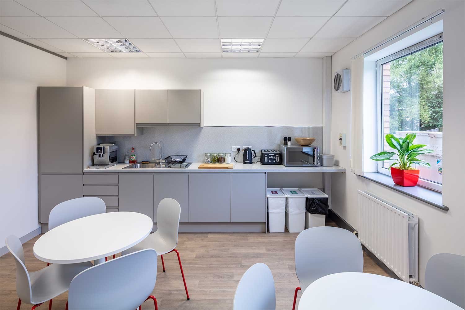
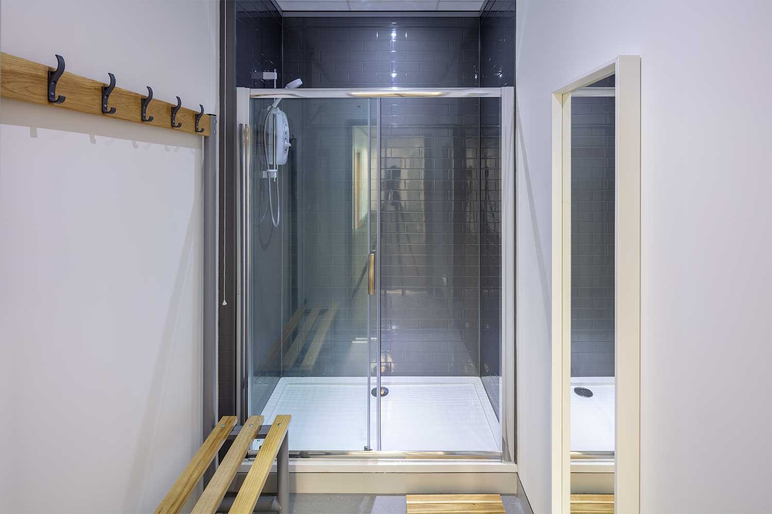
New shower and kitchen facilities
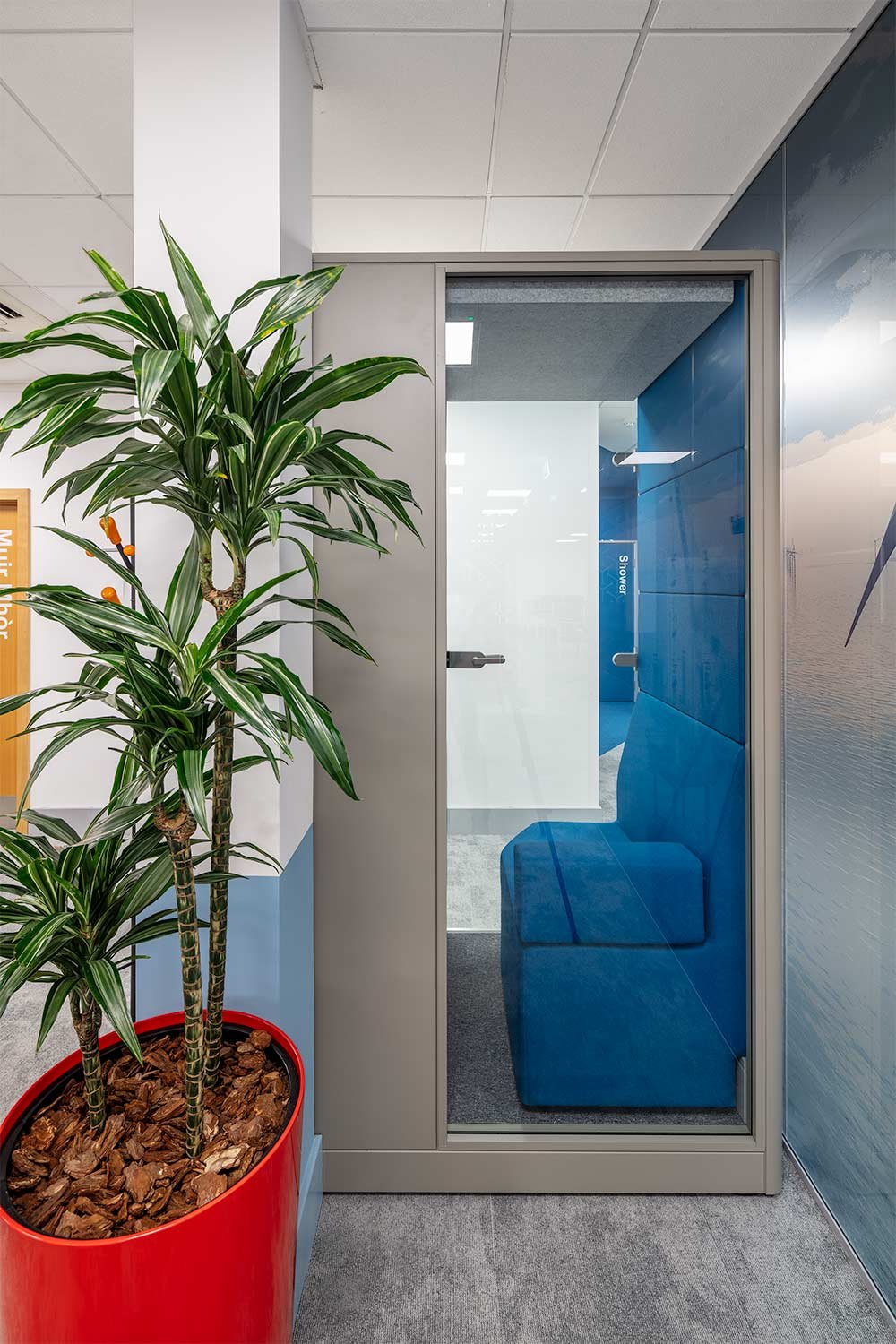
New shower and larger kitchen facilities have been introduced, providing staff with cycle to work options and an area to have breaks out with the workspace. The focus on staff well being is apparent and truly reflects the company’s ethos and values.
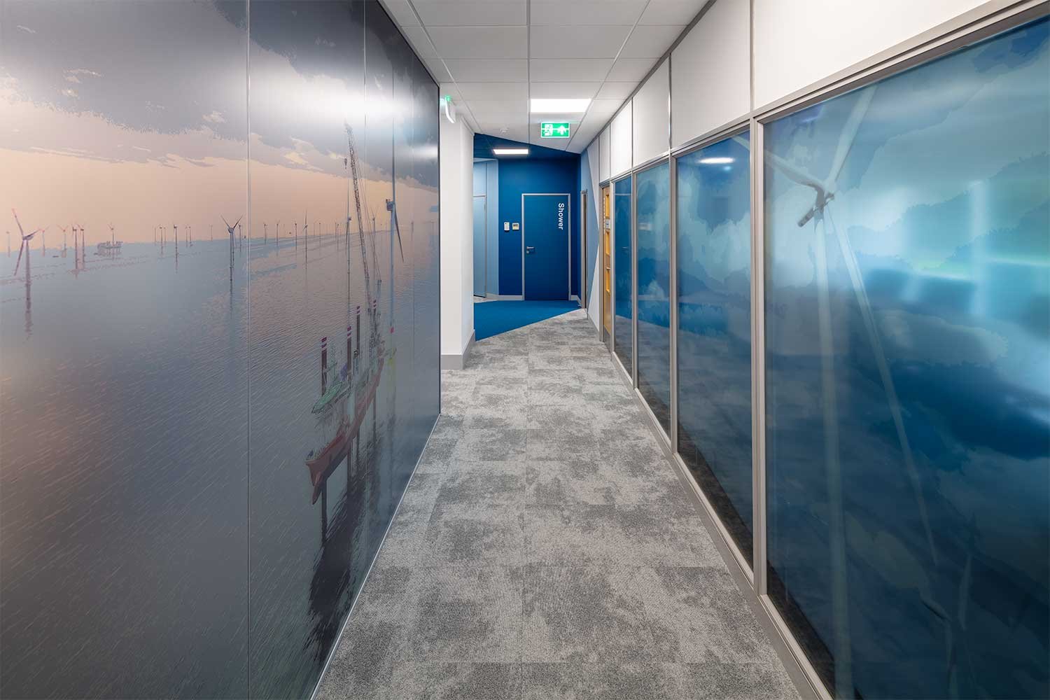
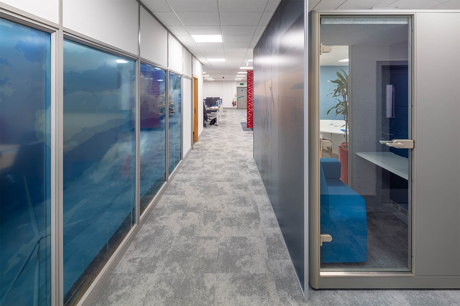
The design finishes reflect Fred. Olsen branding in the colours and images selected. A large wind farm graphic dominates the glass on the Boardroom, adding interest and colour to the entry corridor. Colour blocking to the walls define spaces and a splash of much needed colour to the walls. Colour pops in the furniture continue the branding throughout the space.
Phase 2
After the success of the initial office refurbishment in Stirling, Fred. Olsen reached out to Amos Beech again when the requirement for additional space arose to accommodate the Fred. Olsen Seawind team.
The brief was to open up the office to create a shared space to connect the teams whilst still giving each their own designated area. The design also had to incorporate an upgrade to the entrance area and enhance acoustics and lighting throughout.
A gateway of colour:
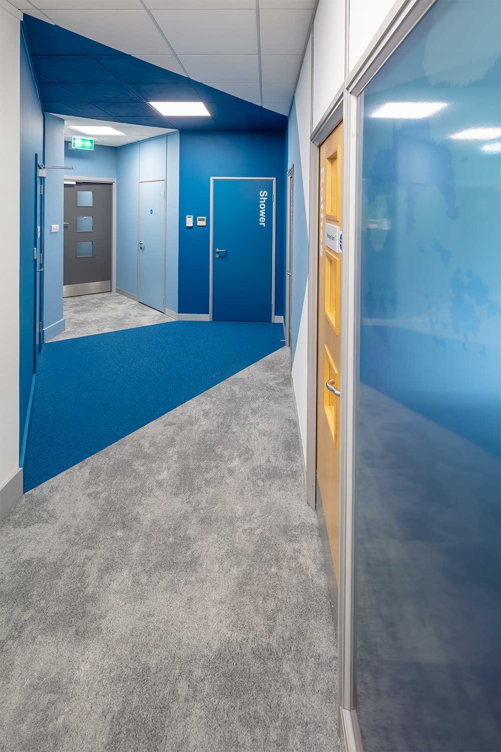
Directional paint “points the way”
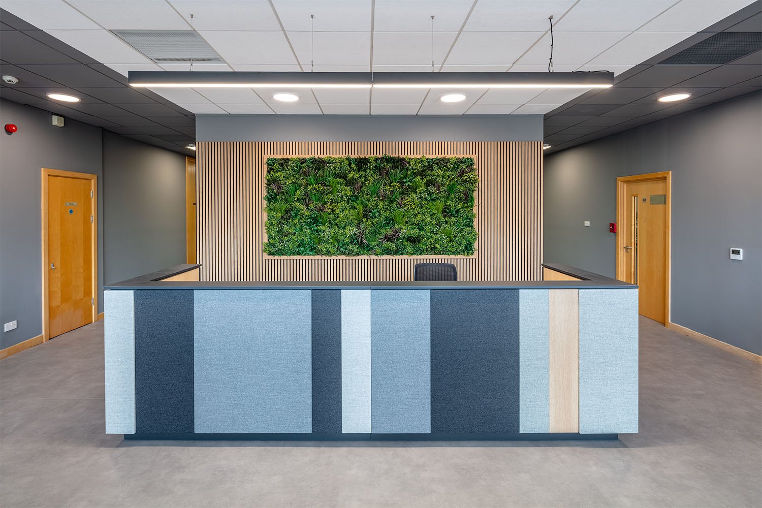
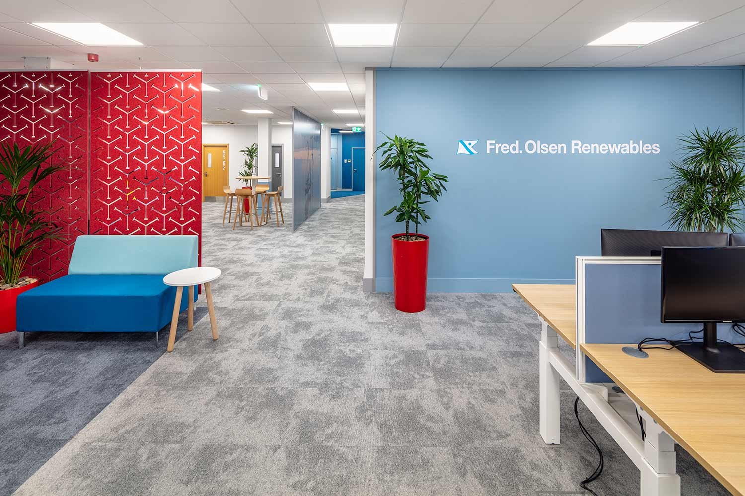
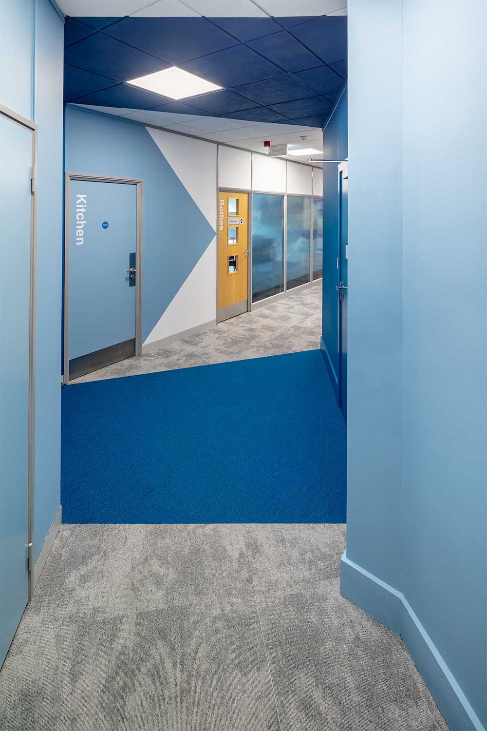
The entrance at Fred. Olsen required the same modern, contemporary imagination that the rest of the office has. There is no assigned reception desk, so the entry way must welcome any visitors and make it easy to navigate the space. The design creates a gateway of colour to walk through and draw you into the space. Clever directional paint “points the way” and is instantly recognisable as part of the Fred Olsen brand colours.
Through the “gateway” a new stand-alone glazed partition, separates the Seawind space from the corridor. Specific branding images on the glass represents the Seawind team and reflects the original Fred Olsen Renewables graphic opposite on the Boardroom glass. There is no doubt as to whose office you have entered.
It was important to emphasise the sharing of the collaboration and meeting/breakout facilities by both Seawind and Renewables teams however, the open plan desking, although not separated by partitions retains the feeling of their own identity. The finishes from the original refurbishment continue into the new space which makes it feel fresh and part of the whole.
Phase 3
Phase 3 of the Fred. Olsen project had multiple facets: the initial one being acoustics. The existing meeting room partitioning was not providing the acoustic needs required for the space. Since opening up the Seawind section of the open plan office as part of Phase 2, they were having issues with noise transfer.
Acoustic solutions
As Amos Beech did not build these rooms originally, we had to come up with solutions to retrofit products and bring the partitions up to the acoustic rating necessary. In addition to above ceiling insulation, we partnered with acoustics specialists BuzziSpace to carry out reverberation tests within each room and come up with the ideal aesthetic solutions to help the sound transfer.
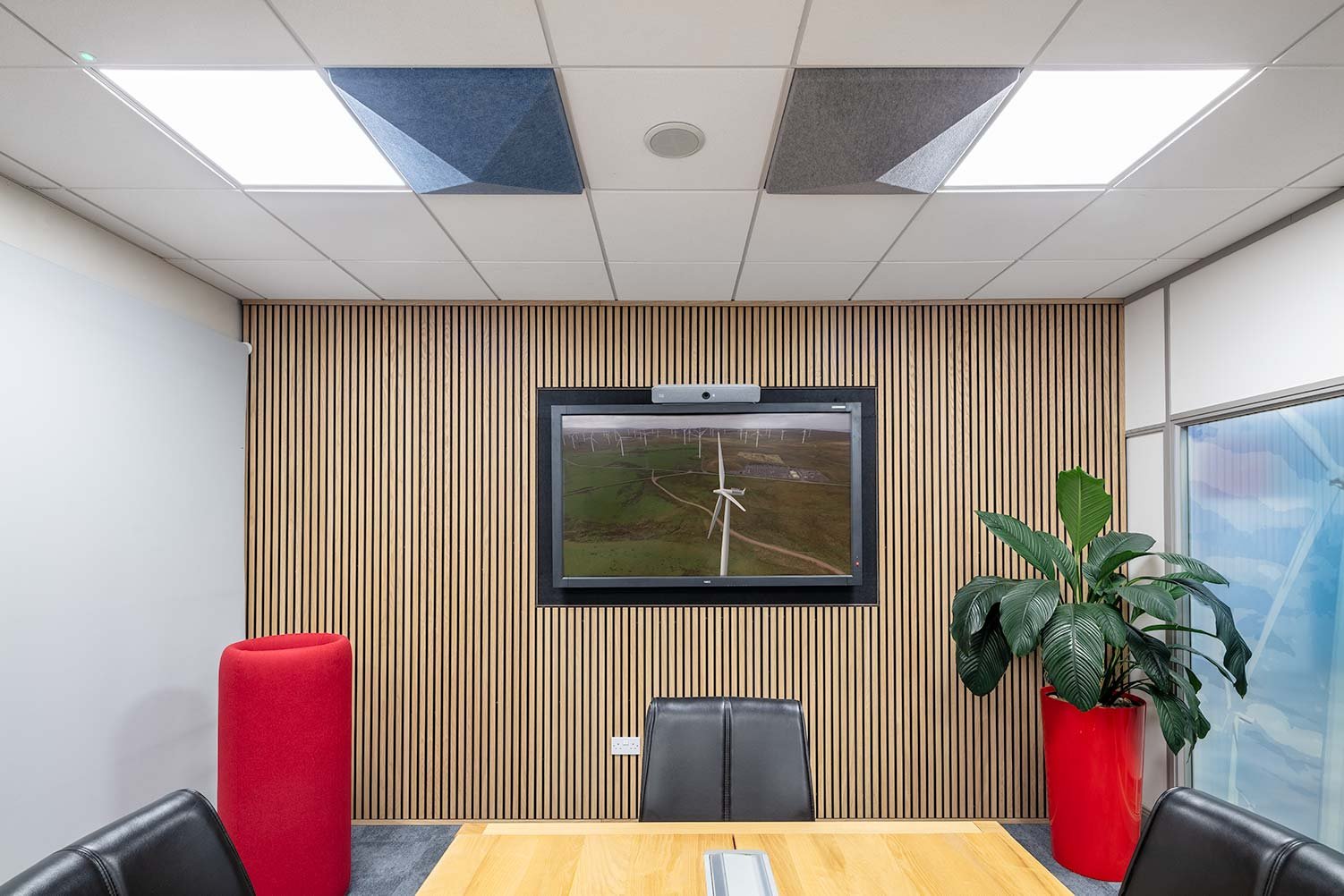
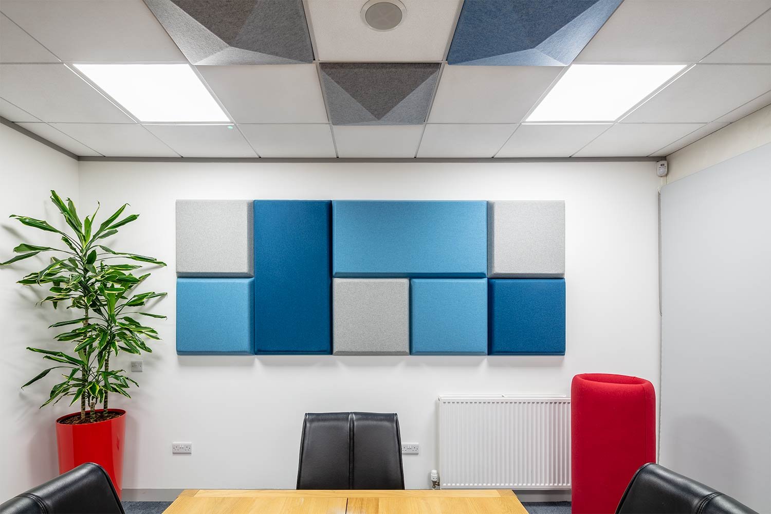
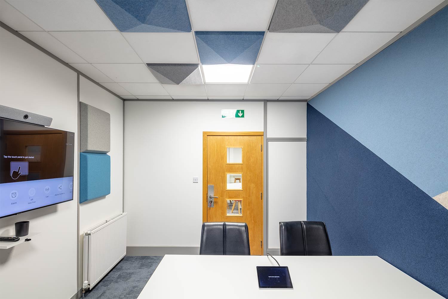
The solutions included several products: acoustic wall tiles, felt wall covering acoustic blocking panels to entire walls, acoustic planters and a timber acoustic panelling system.
Acoustic wall tiles whose foam has extraordinary noise-absorbing capabilities which work on all sound frequencies. These tiles come in different colours, thickness and formats allowing designs appropriate to the room to be developed with the appearance of a piece of art.
A felt wall covering over acoustic blocking panels allowed us to re-create the original feature wall decoration to the small meeting room using various colours. Keeping the bold colour block design, whilst improving acoustics and becoming a tackable surface. It is the perfect solution for reducing speech and high tones in the space due to its large surface with excellent absorption capabilities.
The client replaced their original planters in the meeting rooms with acoustic planters, an upholstered colourful pot made from high density foam to absorb excessive noise whilst also housing greenery creating healthier environments for people to thrive.
The Boardroom has been upgraded to a timber panelling system surrounding the wall mounted screen which not only helps the acoustics but also creates a high end look to the space. Sound insulation material was used behind to build the wall out and create the housing for the TV.
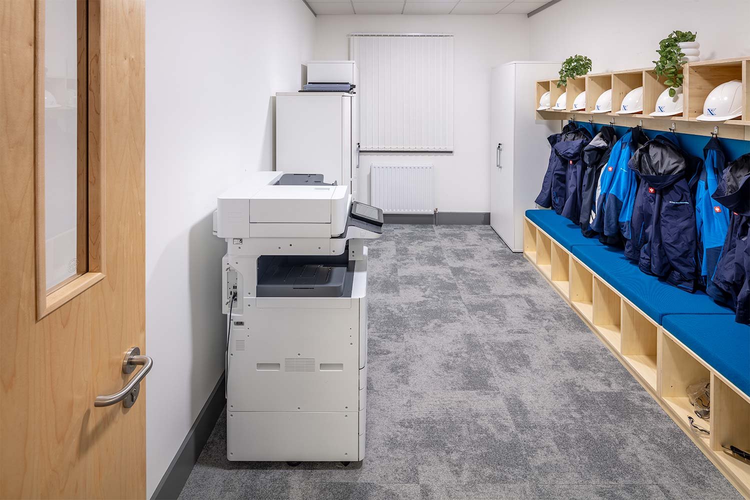
The second part of Phase 3 was to upgrade the storeroom built in Phase 1 and make practical, whilst attractive solution for PPE storage. A simple yet effective birch plywood unit was designed to fulfil storage needs whilst the seat pad offers a pop of colour to tie into the Fred Olsen branding demonstrated throughout the space.
A shared collaboration space
The third and final part of Phase 3 was to re-arrange the Seawind section of the open plan office to become a shared collaboration space.
Utilising the existing furniture throughout the office the high back booth, large round worktable and high poseur tables were brought together to form a more collaborative section of the office. This stresses even more the importance of the acoustics implemented above.
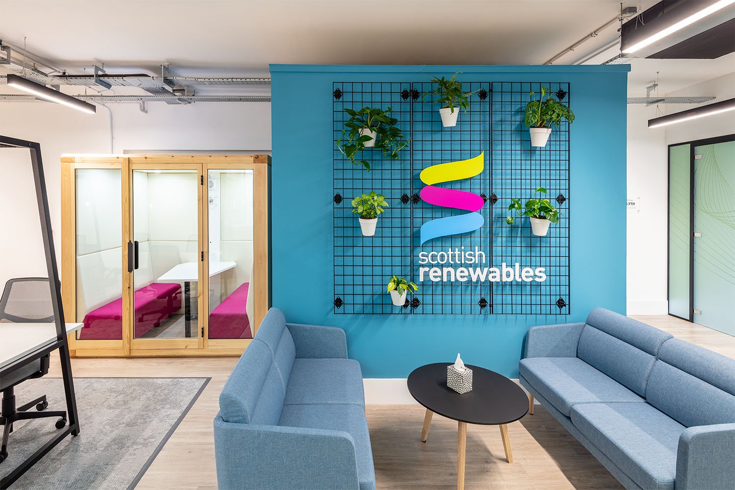
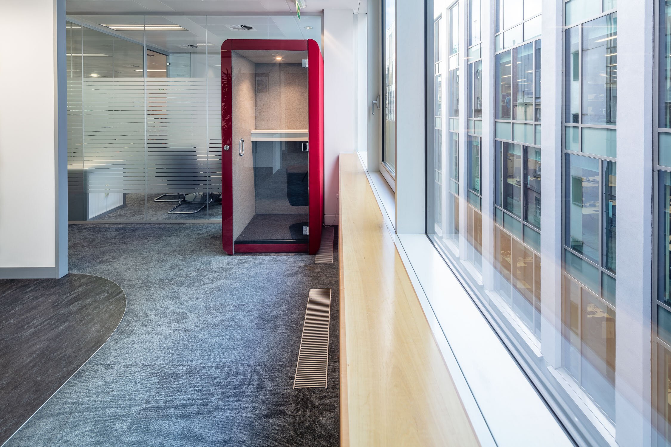
Into this zone Fred. Olsen have added a single person acoustic work pod, in which to make VC and private calls away from the desk without booking out a full meeting room. The Max Calma Z acoustic pod has its own lighting and ventilation system, desktop with power/USB and in-built soft seating. The acoustic felt ceiling and side wall ensure you won’t be disturbed by outside noise and creates a comfortable workspace for concentration.
These additions to the office have ensured a better working environment, and relatively simple changes to the furniture layout have made sure the space is functioning correctly for the current needs of the Fred. Olsen business.
Published: 23rd August 2021 (phase 1), 12 December 2022 (phase 2), 30 Januari 2024 (phase 3)
Text & Photography: The Amos Beech Team
Office space planning for Red Rock Power in Edinburgh
Red Rock Power, the renewable and sustainable energy company based on Princes Street in Edinburgh, was spread over two wings on separate floors in the same office building. When additional office space became available on the fifth floor, Red Rock Power asked Amos Beech to plan the space in such a way that the whole company could be located on one level and facilitate greater collaboration.
Office space planning, fit-out and furniture for Red Rock Power in Edinburgh
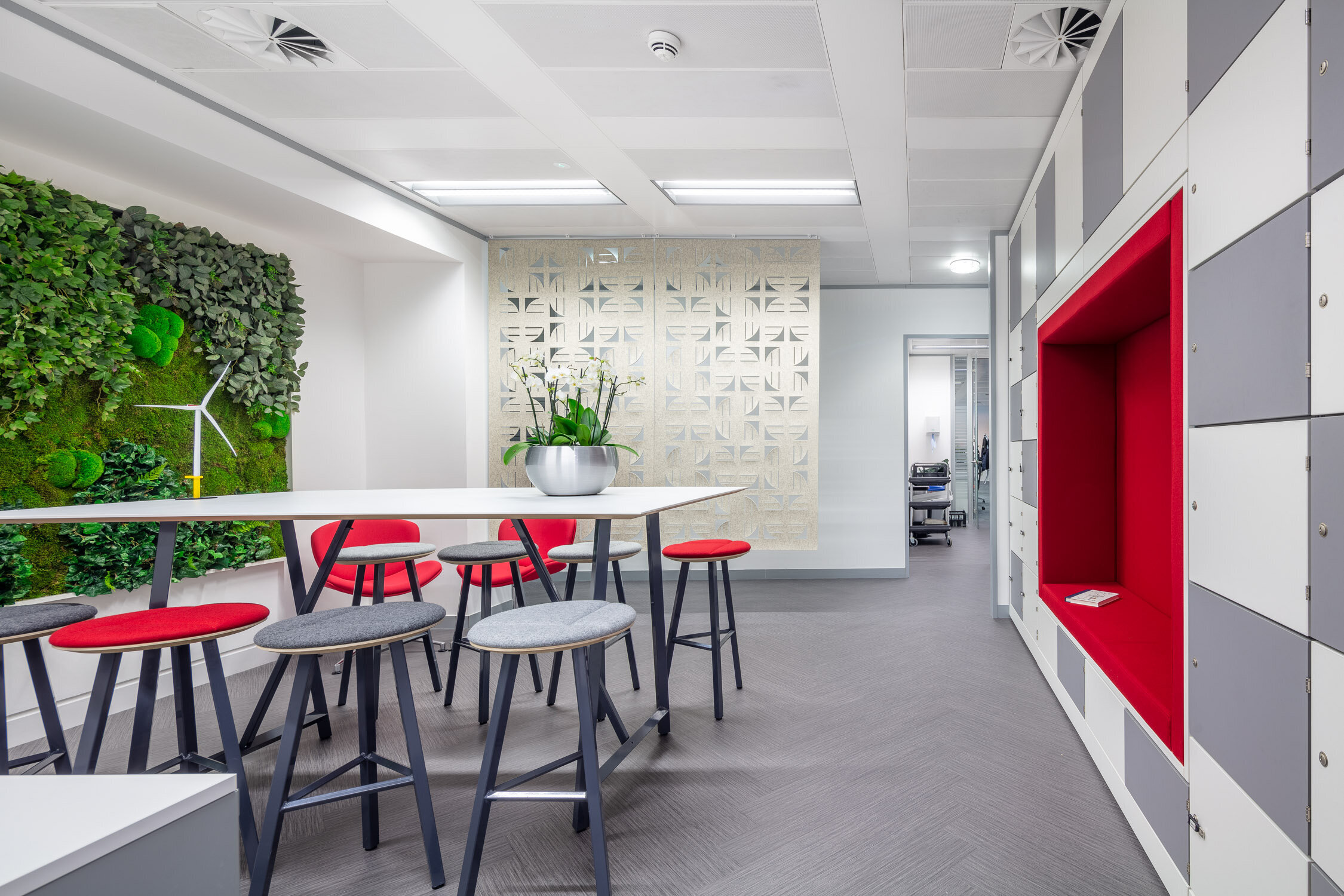
Our fit out team knocked through the wall to connect the west wing to the east wing and created a central ‘heart’ with a collaboration space, complete with a storage wall of lockers by Spacestor and a biophilia moss wall by Benholm.
The Red Rock Power office is a busy and often noise environment and some acoustic treatments were needed so we fitted acoustic hanging screens made by Friends of Wilson from Glasgow. Meeting space was also limited so we added ‘pods’ to create informal collaboration areas at the ‘heart’ of the office that offer an excellent alternative to booking a meeting room and provide both quiet work space and dining too.
Whilst the pods are perfect for personal phone calls we also supplied phone booths for privacy and quiet away from the noisy office (both booths designed and manufactured by Joint Design Direction, from Birmingham) . Further soft seating and meeting room furniture was supplied to complement the existing office furniture.
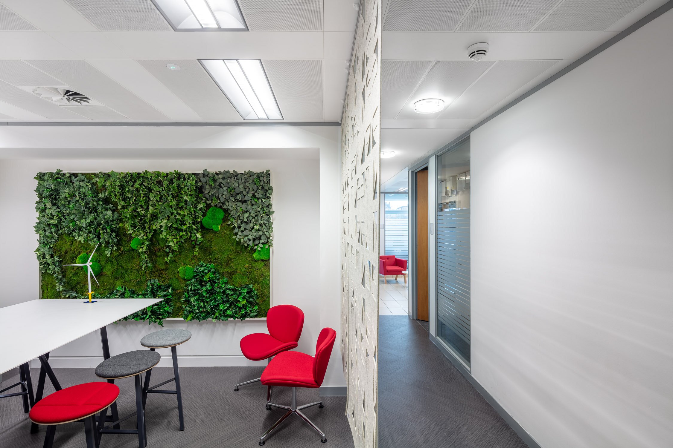
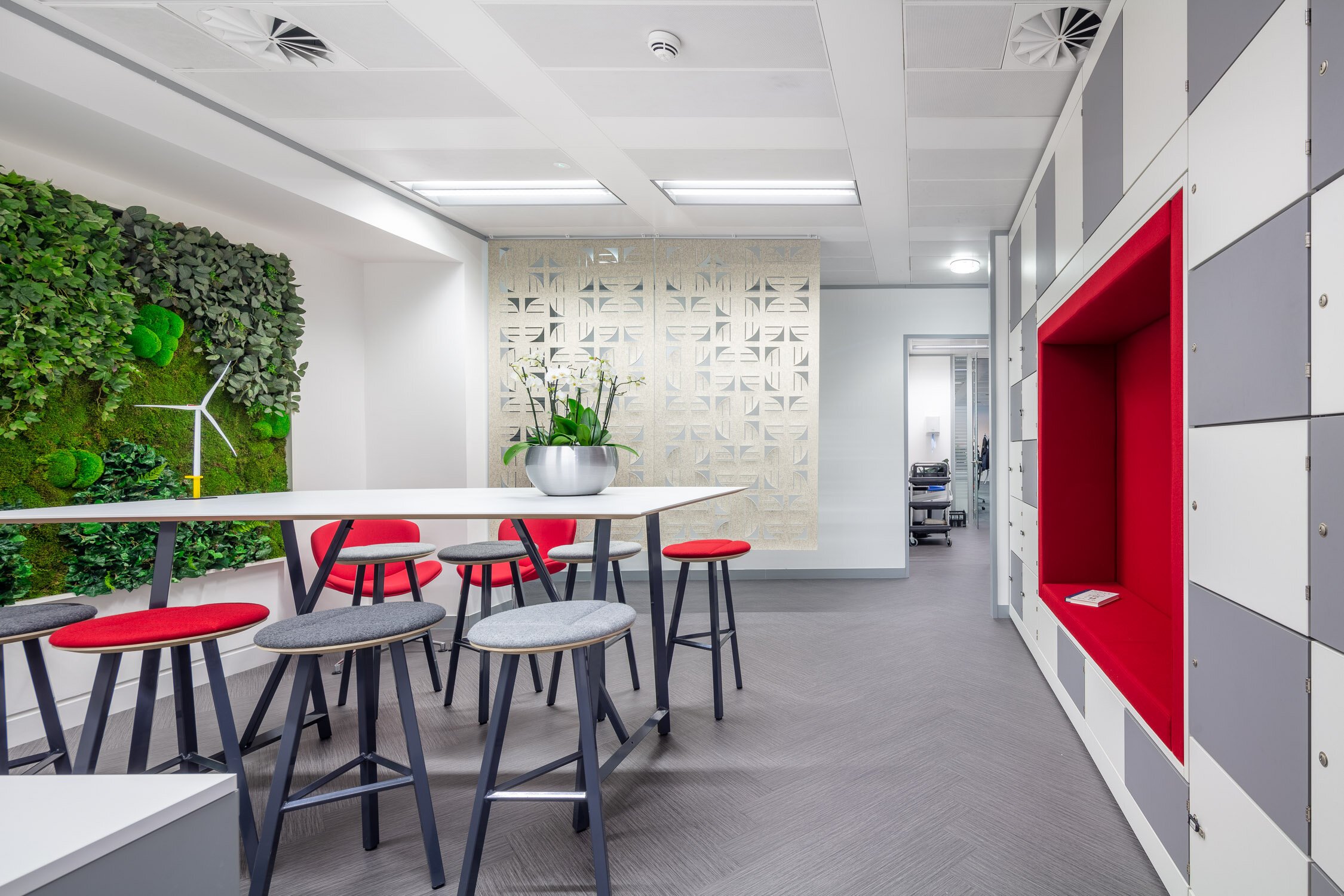
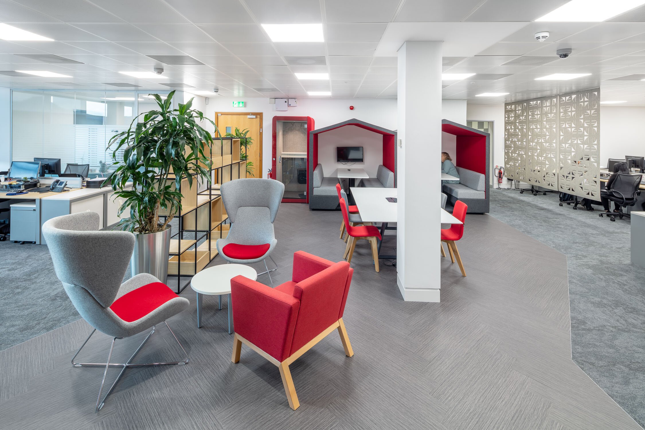
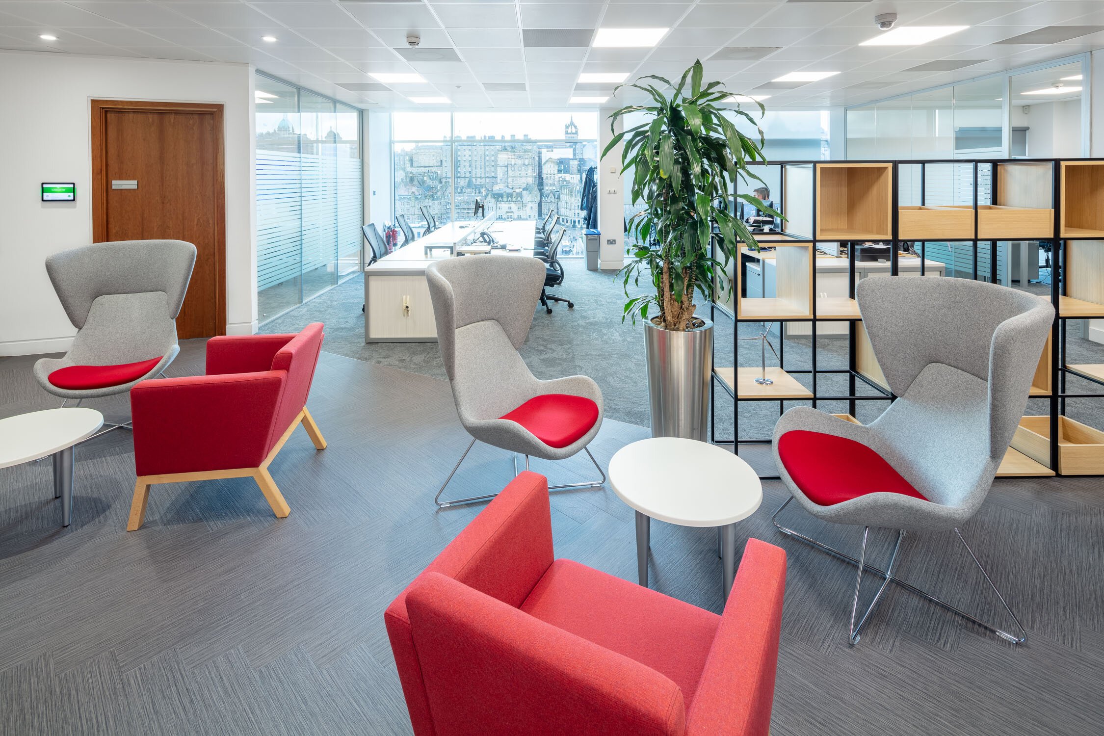
In an area that both separates and unites the two office wings, sits the newly fitted tea prep area and a meeting/dining table providing a great space for team breakfasts and lunches. Unfortunately our photographer planned his shoot on the wrong day…
Office space planning Edinburgh
Office redesign for UK Steel Enterprise in Bellshill, Lanarkshire
UK Steel Enterprise (UKSE) is helping the economic regeneration of communities affected by changes in the steel industry. It is a private equity and venture capital firm specialising in investments in incubation, start up, early stage, expansion finance, growth capital, and management buyouts and buy-ins in small and medium enterprises.
The firm provides investment for working capital, equipment purchase, premises, and relocations. Additionally, it offers business loans to help companies grow their businesses. The firm typically seeks to invest in manufacturing, business to business services, technology based businesses, steel areas, and consumer durables and apparels.
Prior to the launch of their new branding in October this year, UK Steel Enterprise approached Amos Beech to give their Bellshill base at Strathclyde Business Park, Lanarkshire a design refresh. The priority being to create a ‘wow’ factor to the main atrium space and to introduce a social space for all tenants to share. The conference room and UKSE offices also received an interior upgrade.
Office Redesign Strathclyde Business Park, Bellshill Lanarkshire
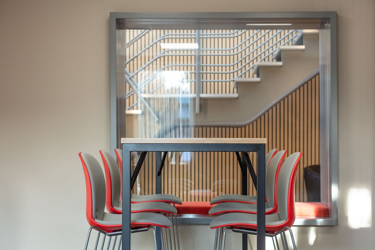
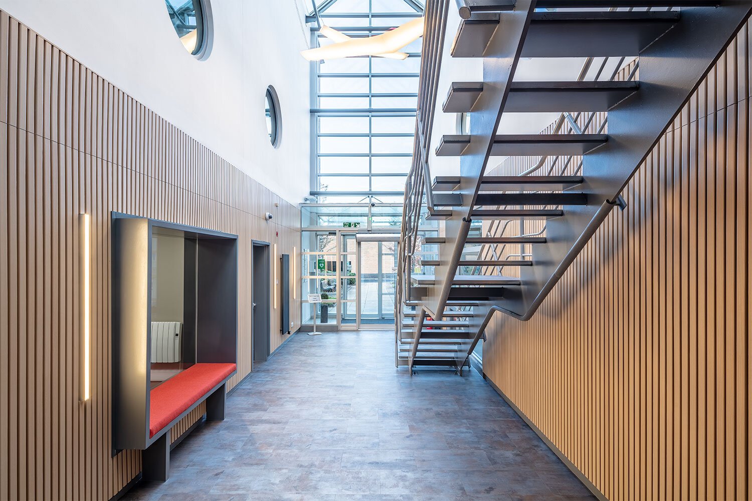
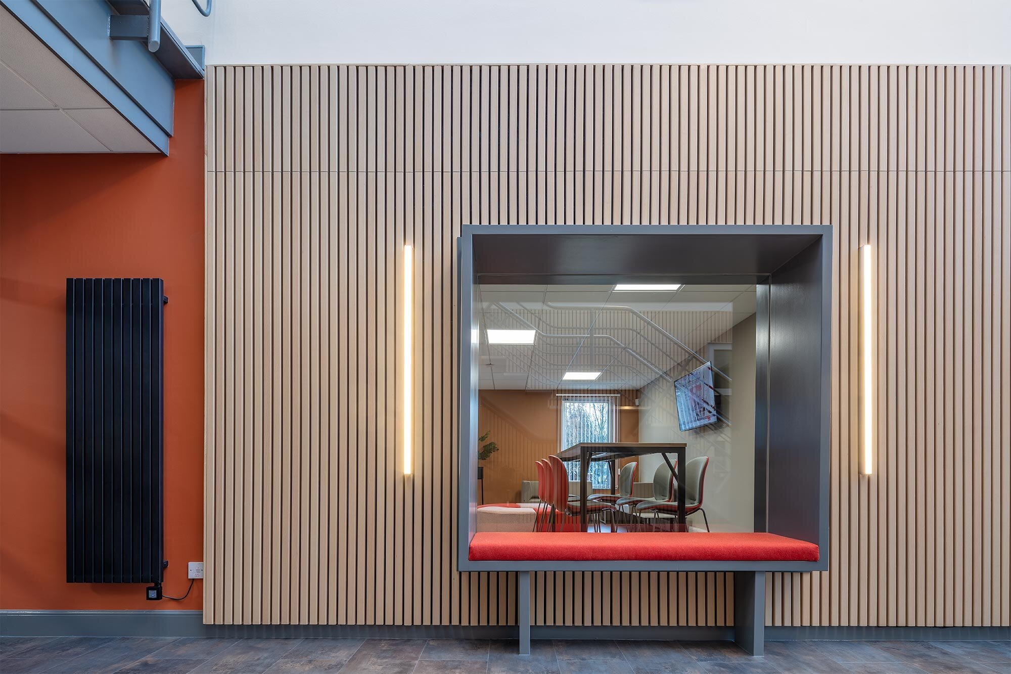
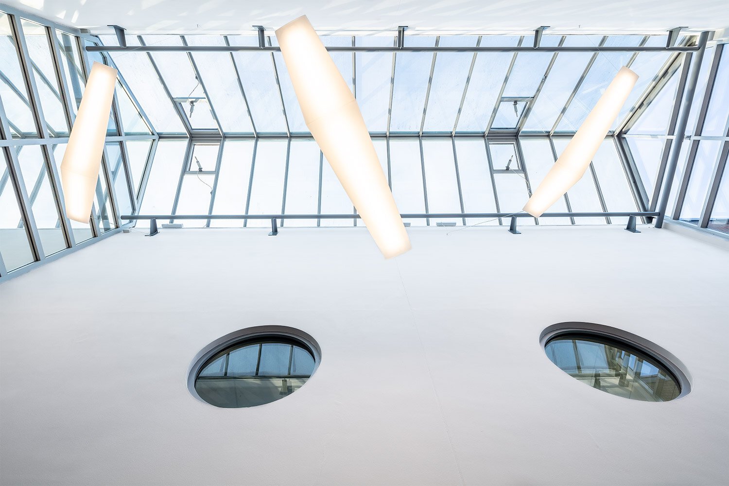
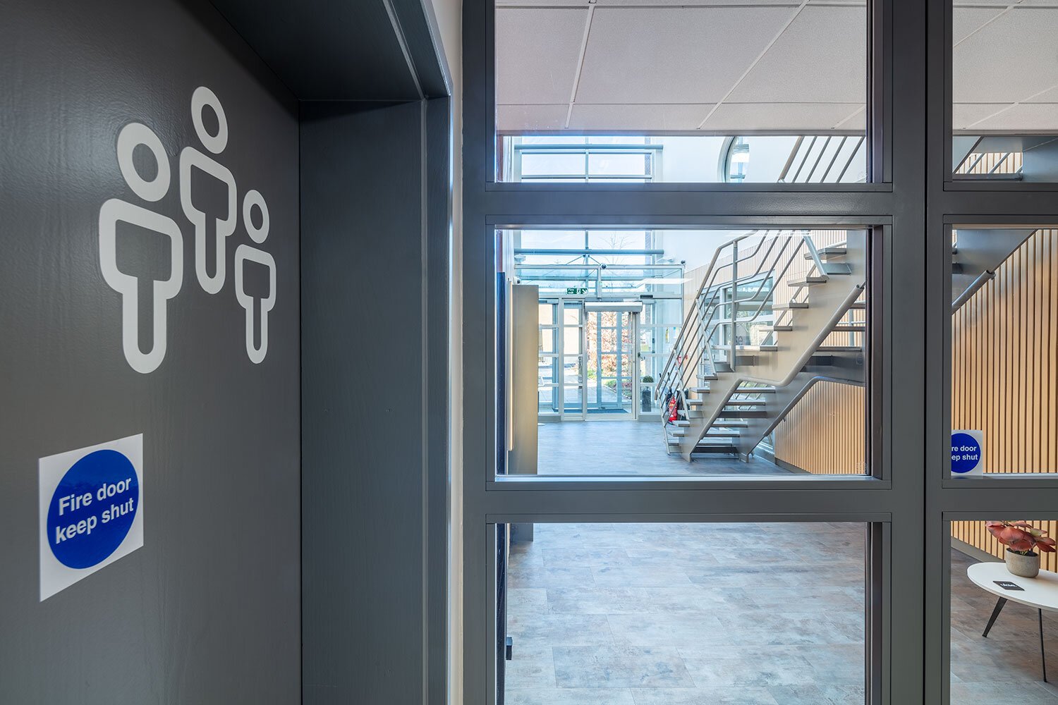
Large suspended feature lights illuminate the new atrium and the introduction of ash timber wall cladding adds warmth and aids the acoustics to this double height space. A large picture window formed to create a visual connection between the social space and the atrium also doubles as a window seat and allows the atrium to become a more useable space - somewhere for people to perch whist waiting or on a call. A muted palette of contemporary colours and materials instantly makes the space more welcoming and appealing.
Artimide feature lighting
Window seat
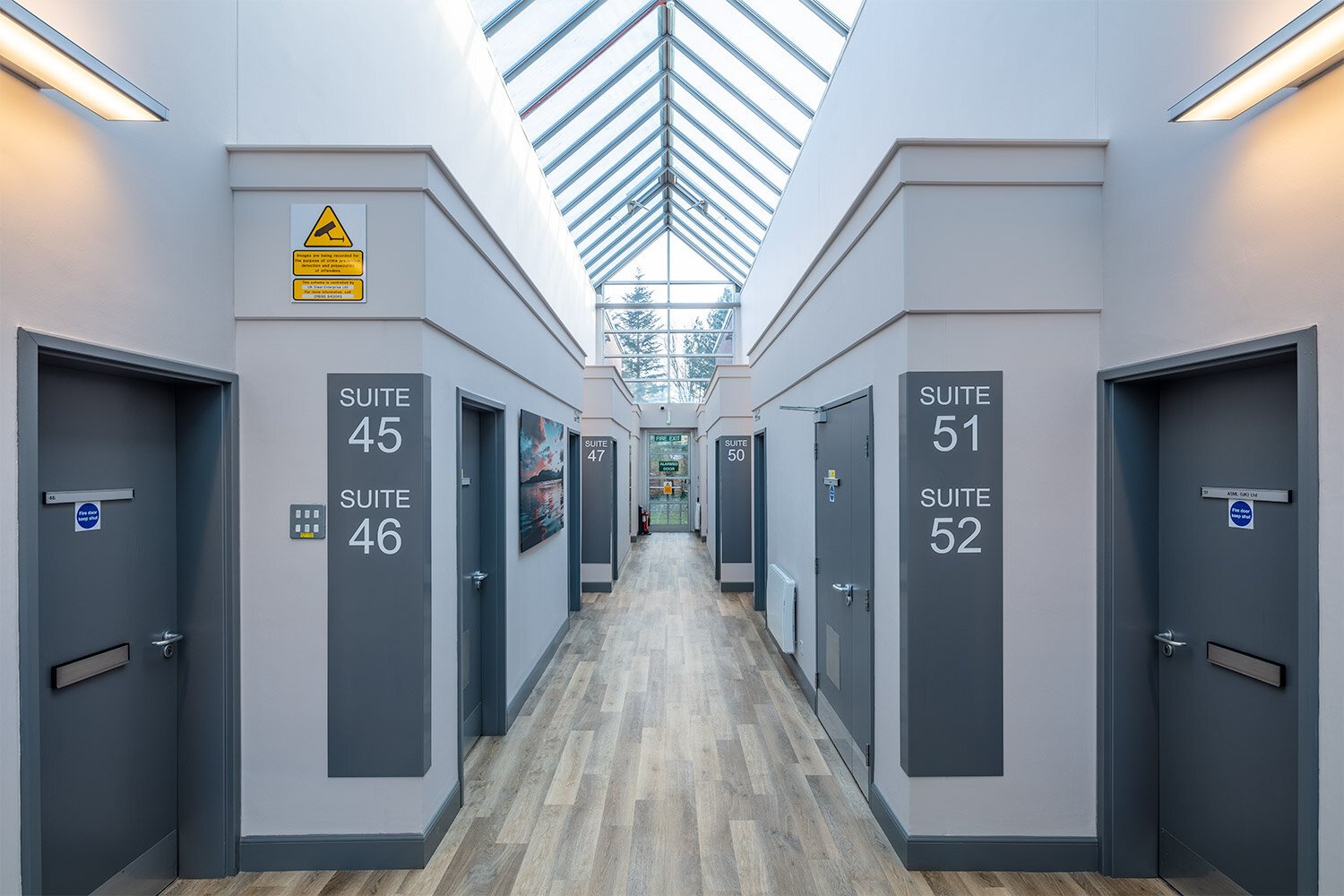
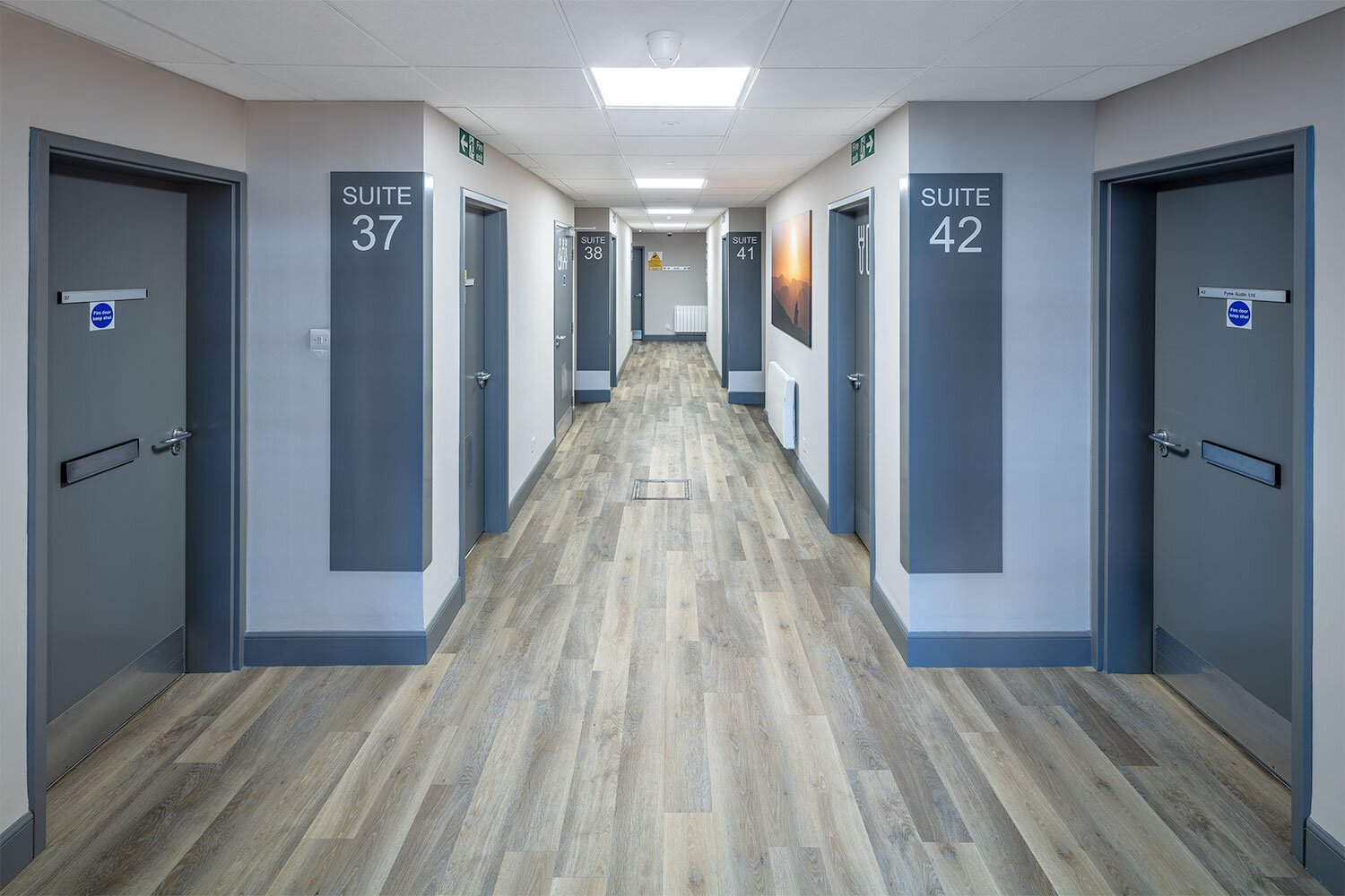
The rear corridor has been transformed by new lighting, flooring, decoration and artwork. Corner wrapped way-finding signage now gives clear direction to each of the leased suites; a benefit to both tenants and visitors to the space. The clean, modern look is also mirrored in the first floor corridor.
Social space
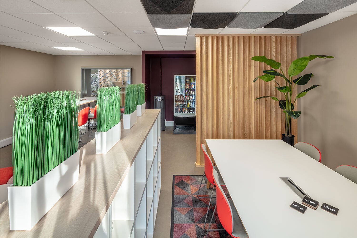
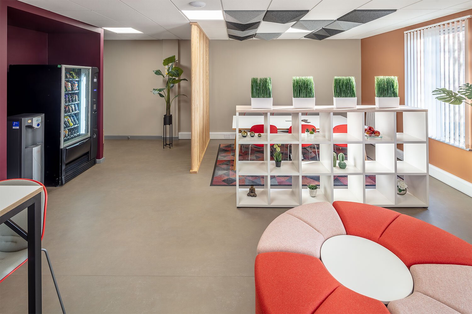
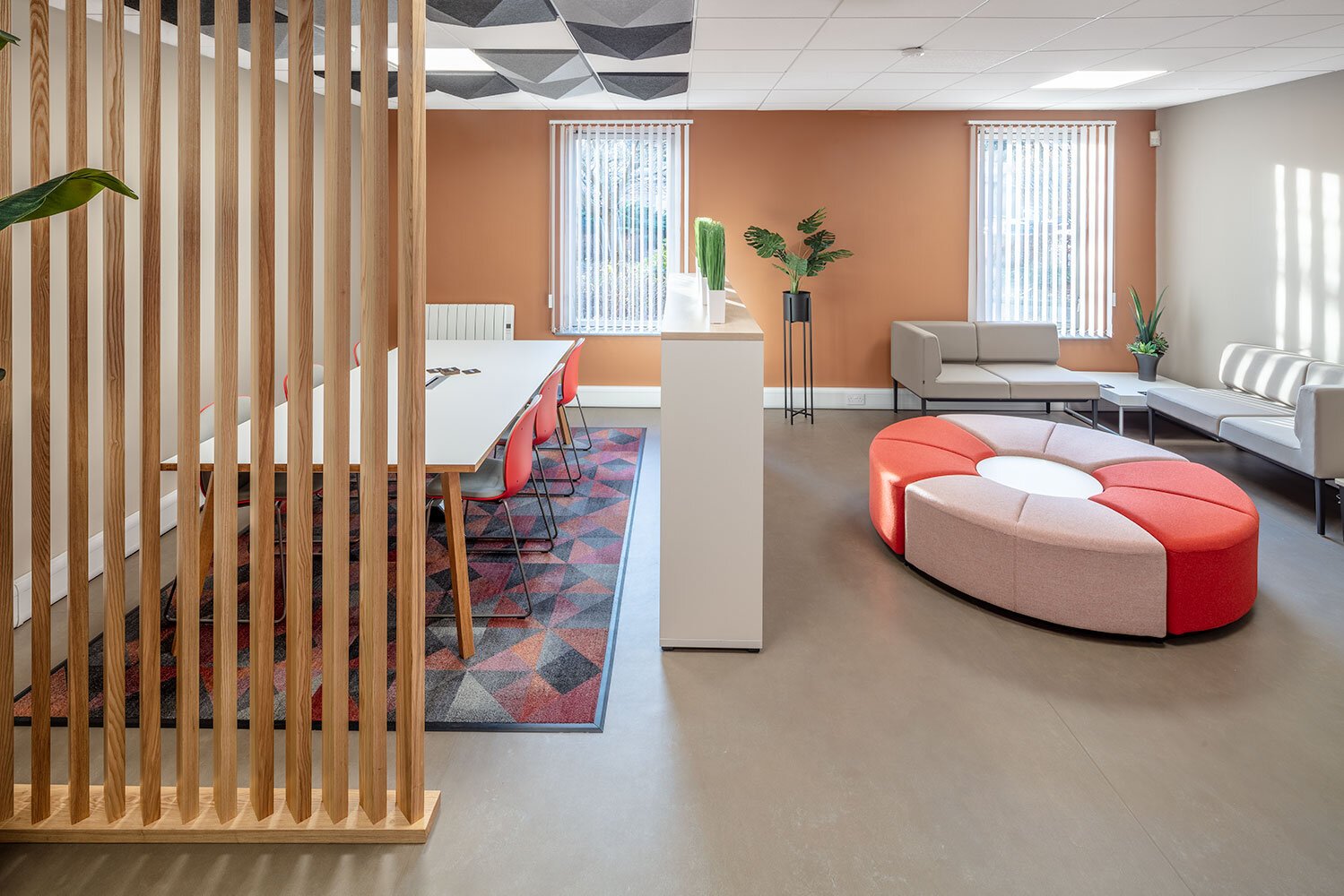
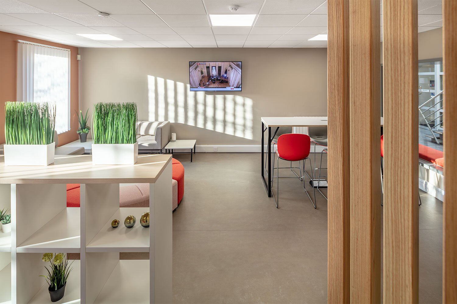
The social space has been designed to have a completely different look and feel to the traditional office. Warm, deep tones complete the almost homely interior which is split into a meeting area, lounge and sit-up poseur bar. The range of office furniture complements the concept with timber finishes, comfortable seating and the introduction of biophilia.
“We, as humans have a deep rooted attraction towards nature. The presence of plants is also known to reduce stress, enrich physical health and improve comfort. Additionally the notion of comforts has many indirect experiences with nature to achieve biophilia, such as simulating natural light and air: they must be appropriate to each setting to help ensure functional well being at work.”
Acoustic ceiling tiles have been added above the meeting table to aid the absorption of sound and a visual barrier created with an ash timber screen which mimics the atrium cladding. Open storage with planting surrounds the space to keep it separate but still create an informal open ideal.
New office furniture, decoration and branding to UKSE’s office and reception brings the space up to date and in line with the atrium. The warm, muted palette continues into the shared conference room. The end result delivers the ‘wow’ factor the client was hoping for and makes the refreshed offices more appealing to potential tenants in the Glasgow area.
Text: Deborah McAulay
Photography: Vincent Hartman


