A new flexible, hybrid work model for Highland Spring
Great news: this project has been shortlisted for the BCO Regional Awards 2024!
Also, phase 2 of this project has now been published, so scroll down 👇!
Highland Spring specialise in bottled water straight from the natural source, drawn from Scotland’s Ochil Hills. The brand harvests the purest all-natural rainwater – organically filtered during a 15-year process through many layers of basalt rock. The end result being the fresh and clear taste that characterises Highland Spring water.
Phase 1
The company’s head office resides in Blackford, which is located in the heart of the Ochil Hills – where the magic happens. Highland Spring were looking for ways to better utilise the first floor office and improve the current facility here. After the covid pandemic, they were considering space saving and hybrid options as a way to re-work the office space and bring it up to date with recent workplace strategies, which better reflect the company’s sustainable, contemporary brand and ethos.
The ceiling grids were removed completely, and the existing structure exposed.
The “wow” factor for the new office space
The office space Highland Spring had was very much a traditional cellular office arrangement with lots of built-in underutilised storage. Teams were separated along a long corridor and there was no central or open space for people to gather together within the office.
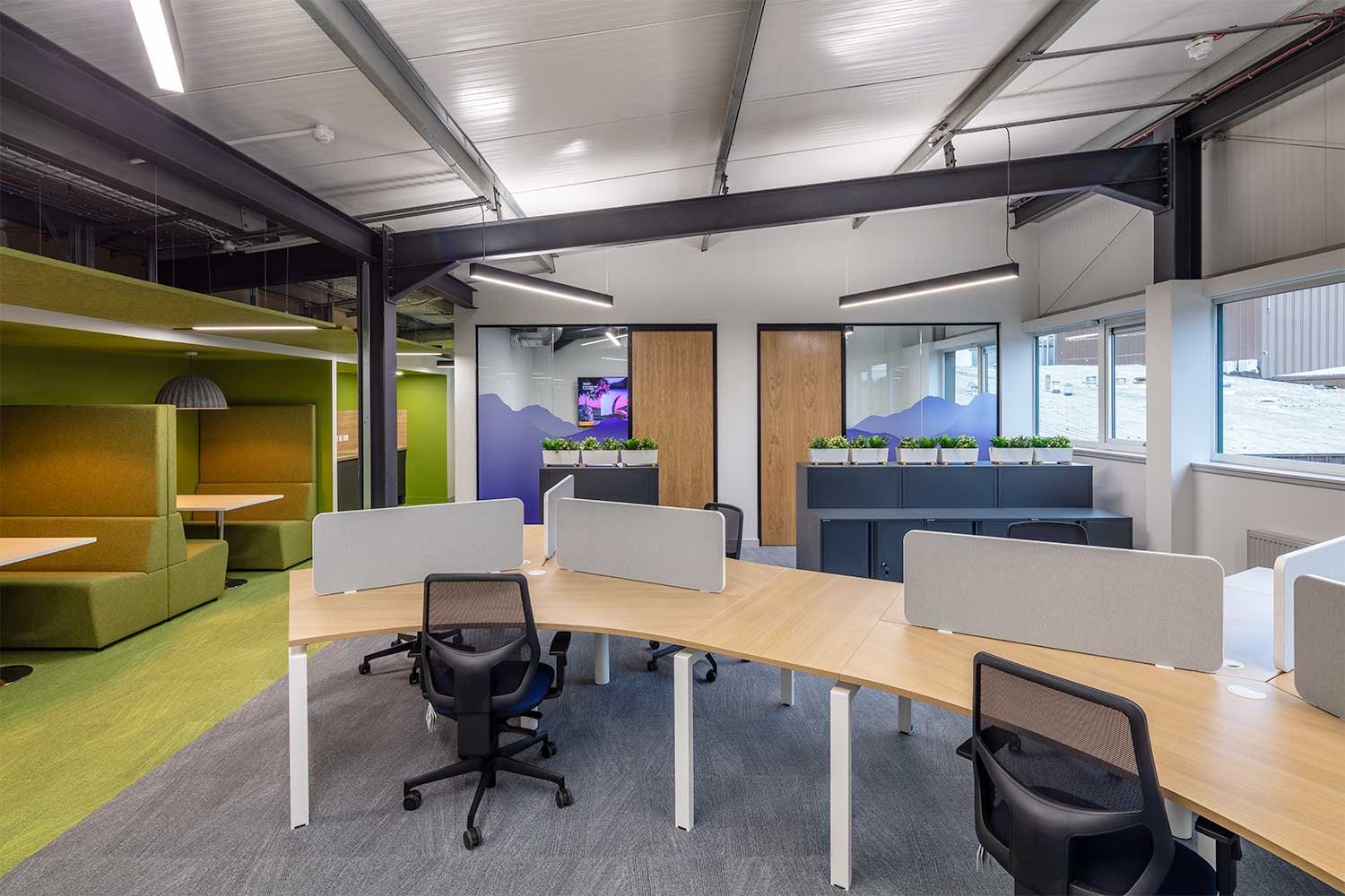
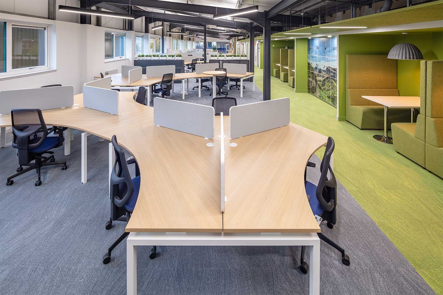
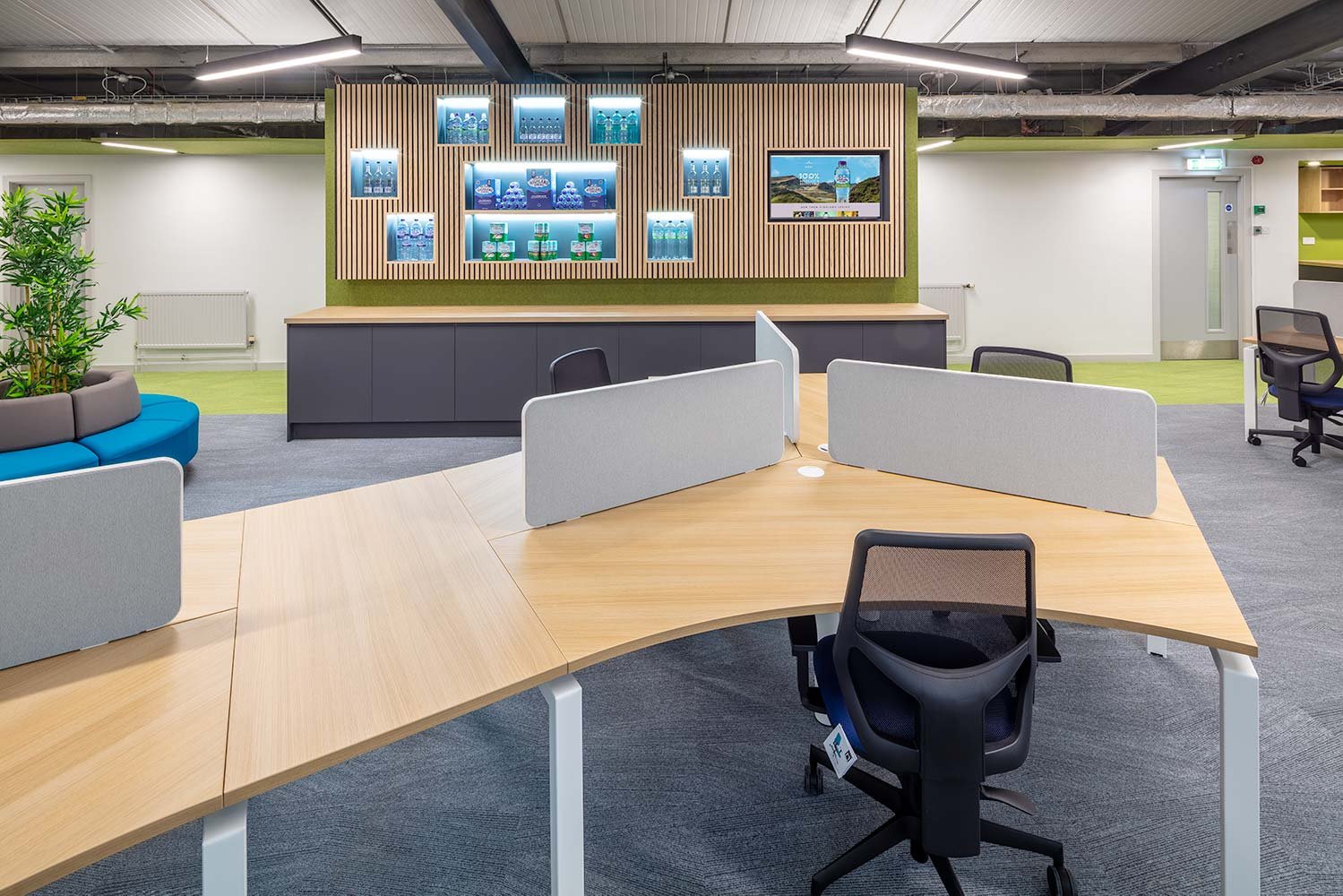
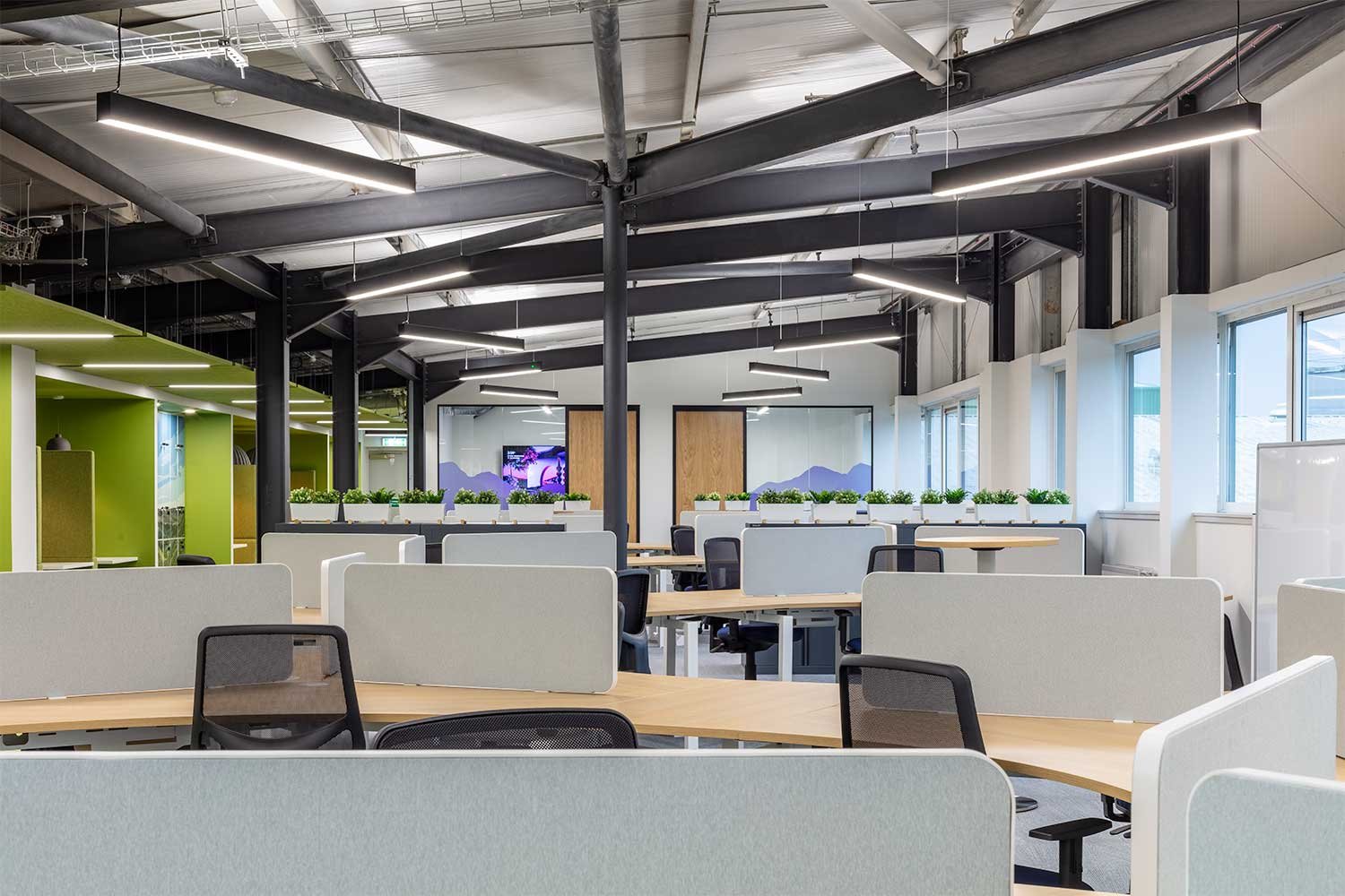
Organic shaped office desks
Highland Spring worked alongside Amos Beech to deliver the “wow” factor to their new office space. Design and aesthetics were important during the journey but even more so was making it all about the people. They knew the reality of coming back to the office post Covid and enhancing the team spirit was going to be difficult unless they did something amazing and different with the space. In terms of practicality of how they now work as a business – the old arrangement did not suit this new flexible, hybrid work model.
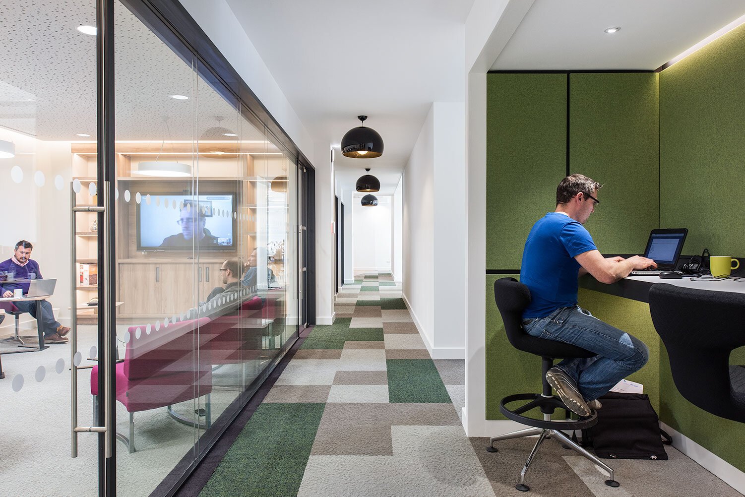
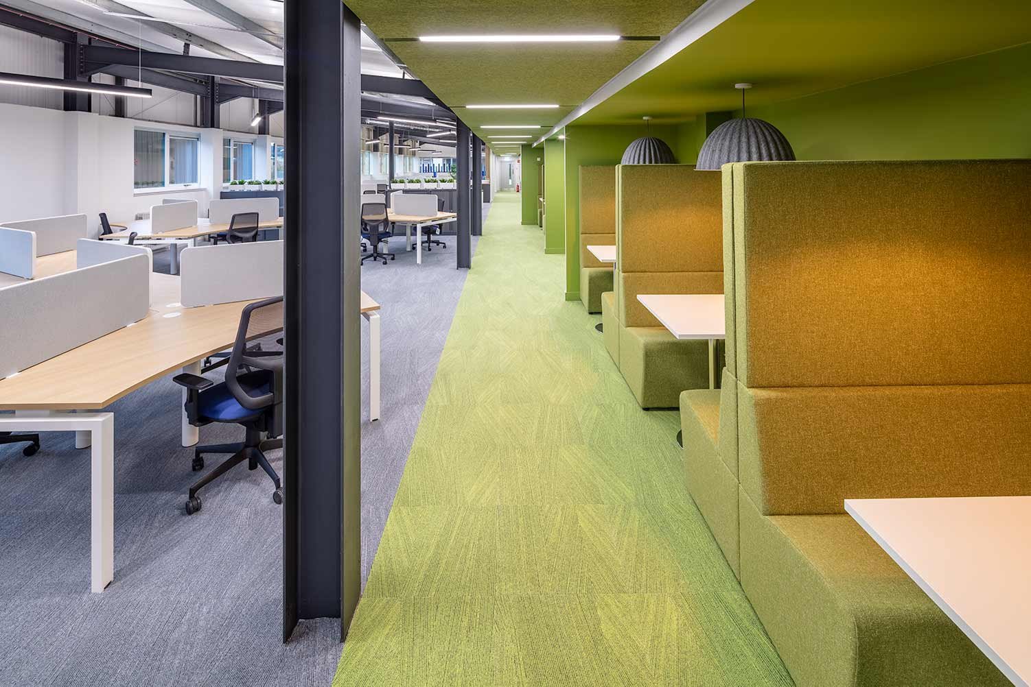
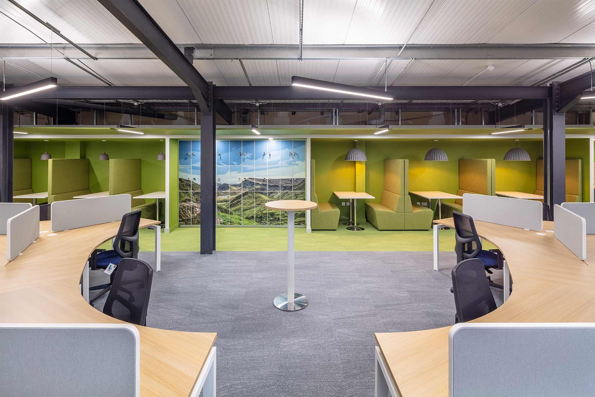
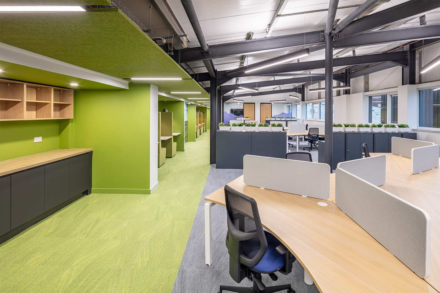
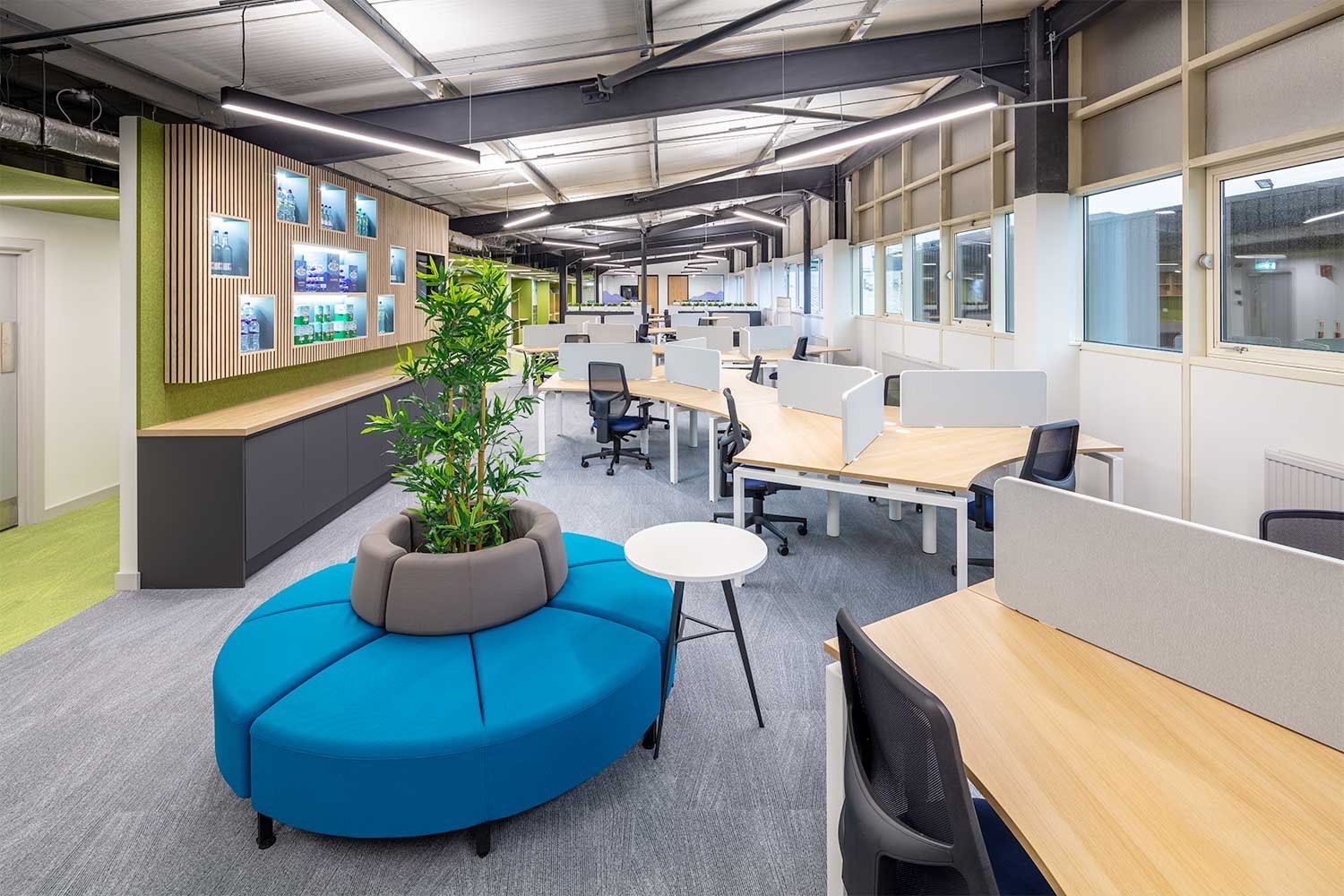
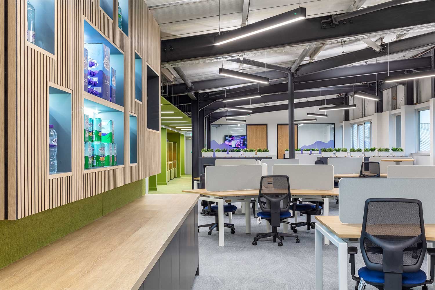
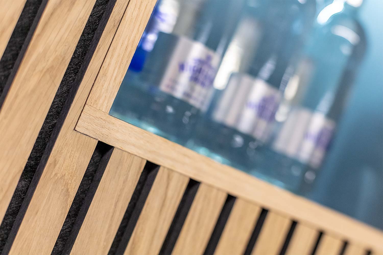
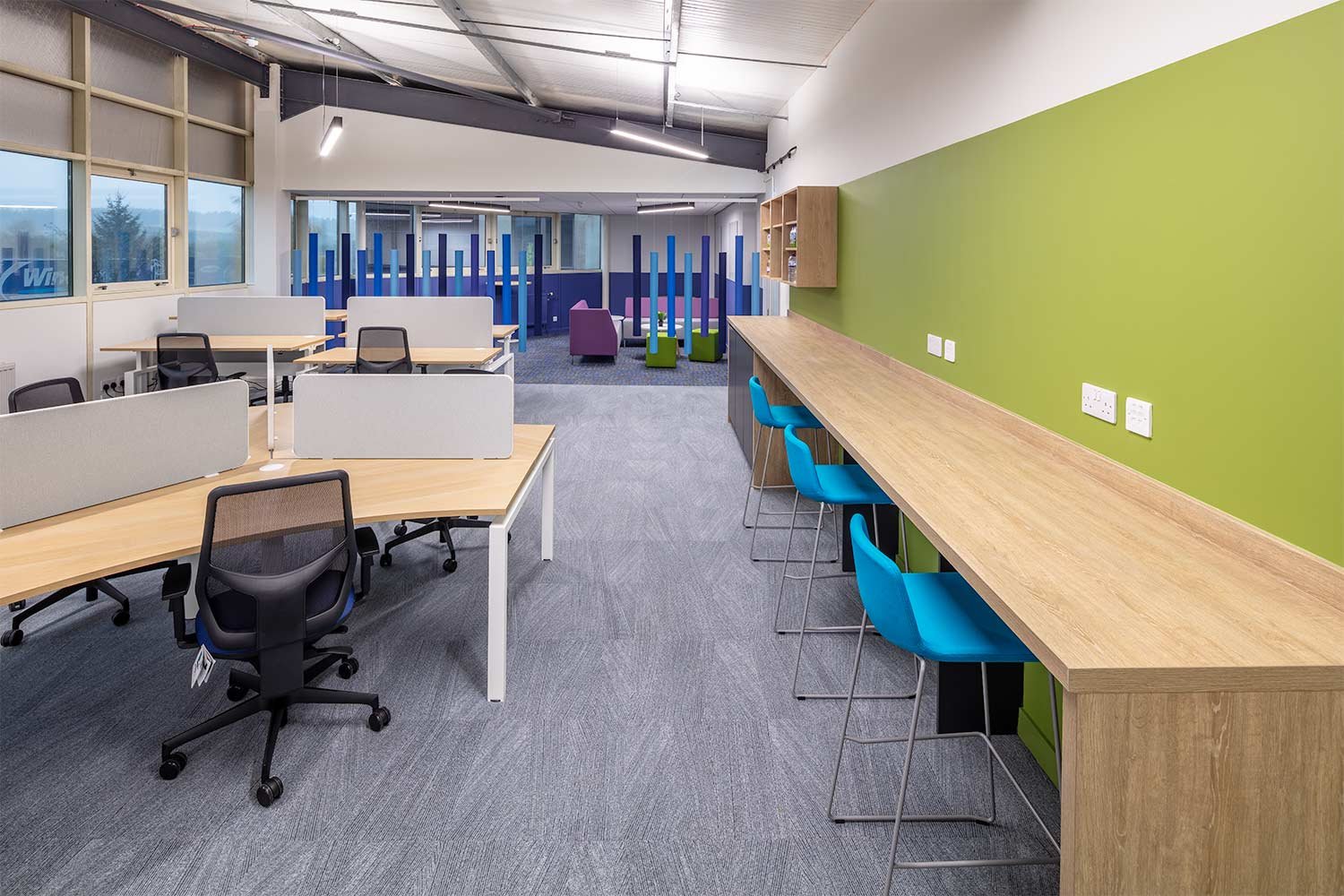
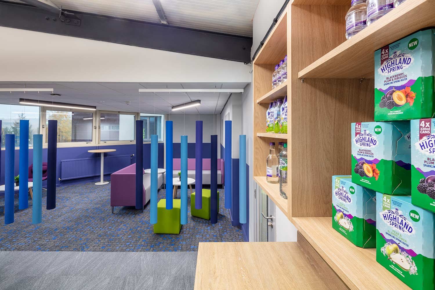
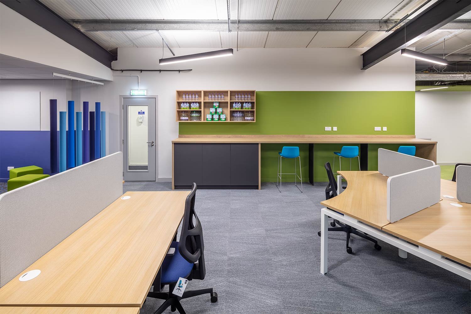
The design removed all internal walls to create a completely open plan office for all teams to share equally. Collaboration and meeting rooms were located at either end with the central workspace becoming the main hub, complete with feature wall display to showcase and store Highland Spring products.
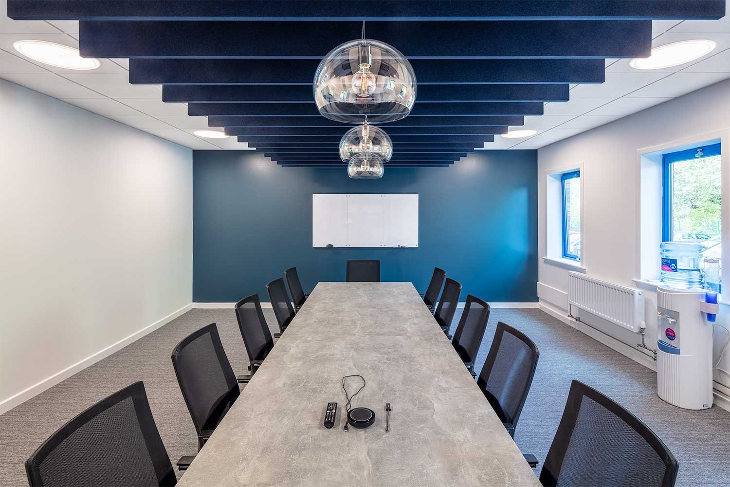
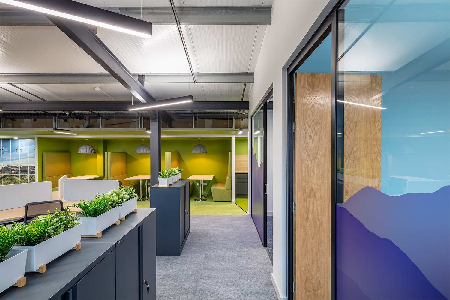
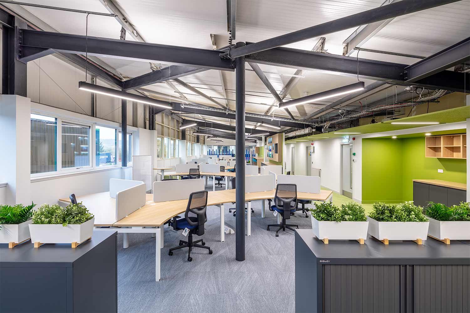
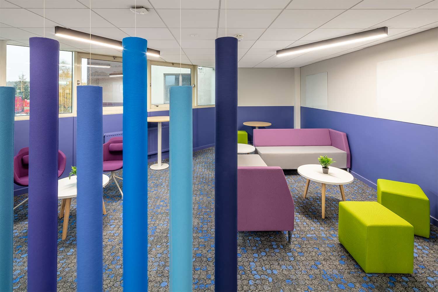
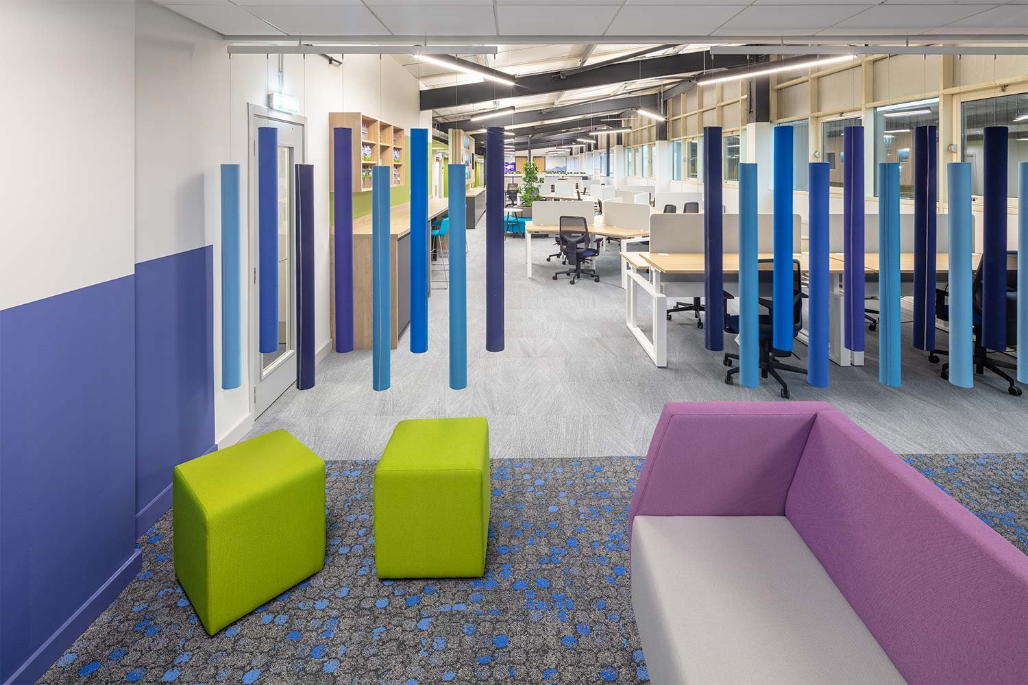
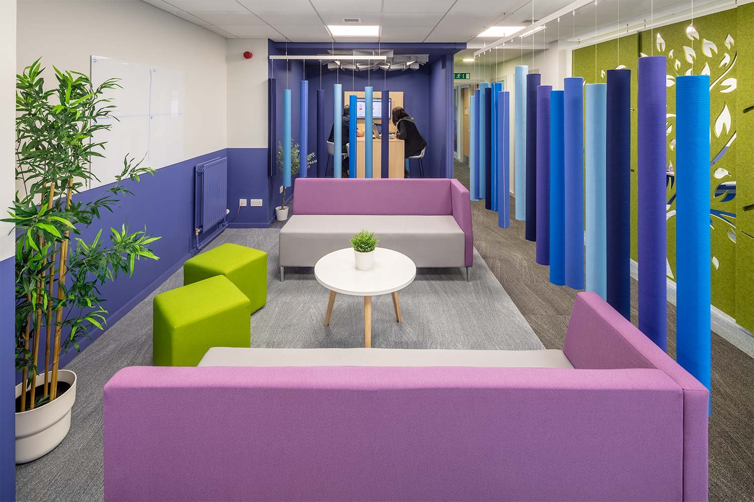
Clever division of the space using acoustic Soundsticks, storage and planters break up the linearity of the long space. The use of organic shaped desks and angled lighting also aids this concept.
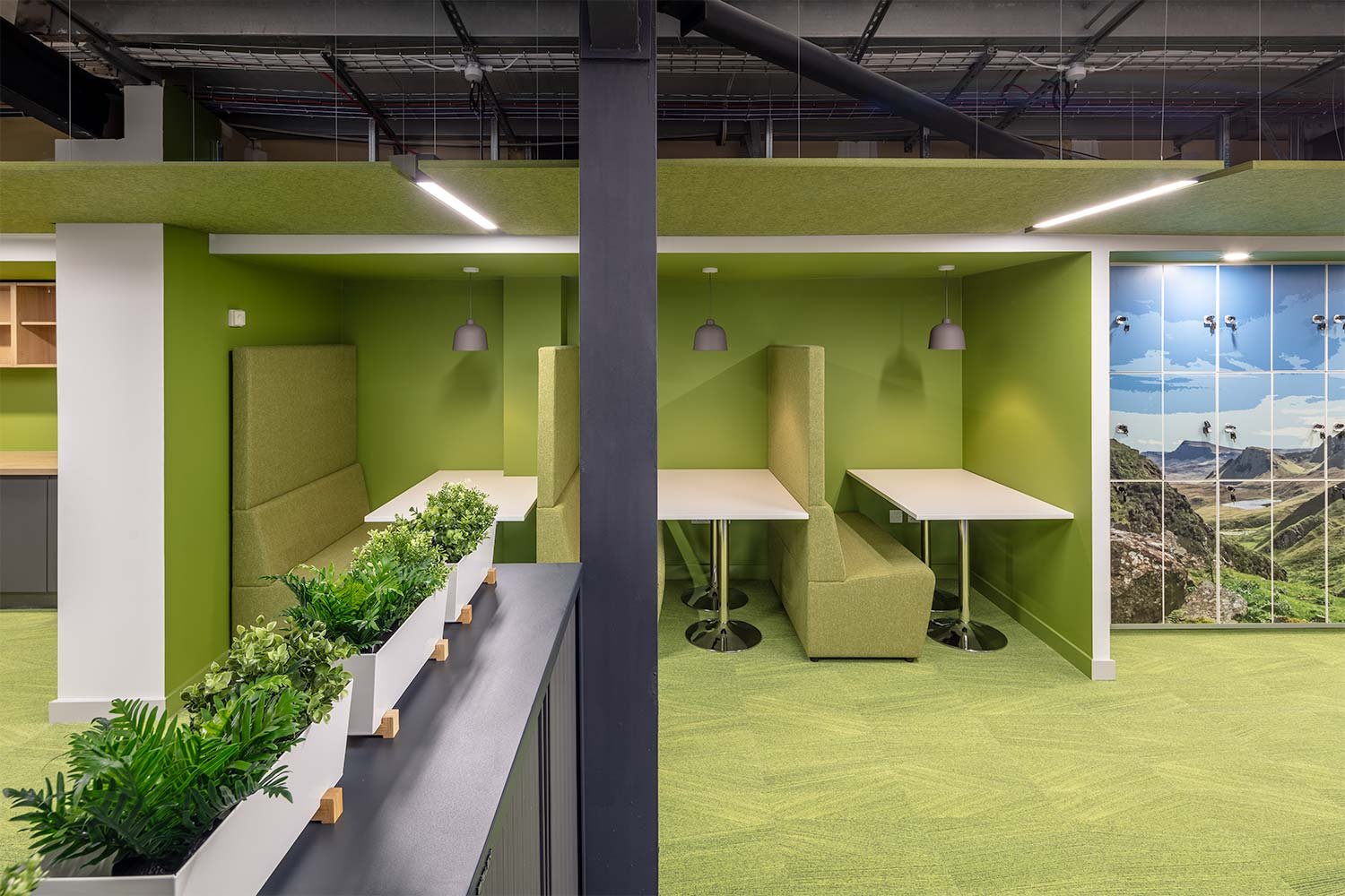
The built-in storage was removed, and the alcoves used to create meeting and focus booths, new functional tea prep and print hub. These facilities tuck in to one side of the circulation route and it are defined by a block of colour.
The green of the Ochil Hills is brought in
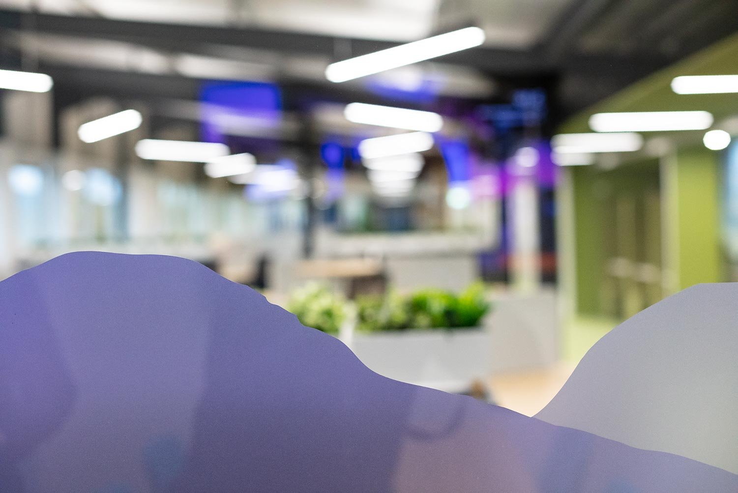
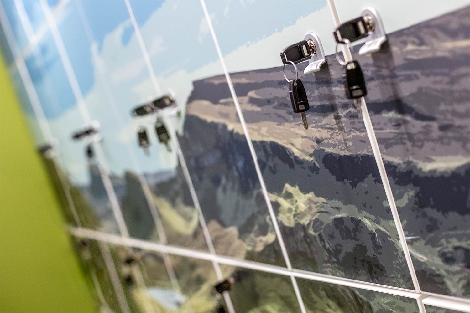
The green used on the walls, flooring and acoustic ceiling rafts echoes the green of the Ochil Hills outside the windows bringing the outside in. Further biophilia is mimicked in the landscape branding images used on the glass manifestation and the lockers.
The ceiling grids were removed completely, and the existing structure exposed and enhanced. The new ceiling height aids the feeling of openness throughout.
Use of sustainable materials
Sustainability was a key factor when designing the new space and had to be in line with the environmental strategy set out by Highland Spring to reach net zero emissions by 2040. They are well on their way to this target including the 2022 opening of the new on-site rail freight to reduce the number of HGVs on the roads.
The use of sustainable materials is also a concept Amos Beech try to incorporate within the projects we deliver and this one was no different. The upholstery on the booths is a natural fabric made from wool and hemp fibres – no plastics therefore it is renewable and compostable.
The ceiling rafts are made from recycled PET material which is made from used plastic bottles. A cause close to their own heart, Highland Spring have developed their own Eco Bottle which is made from 100% recycled plastic whilst still being 100% recyclable.
Soundsticks separate the collaboration space from the office
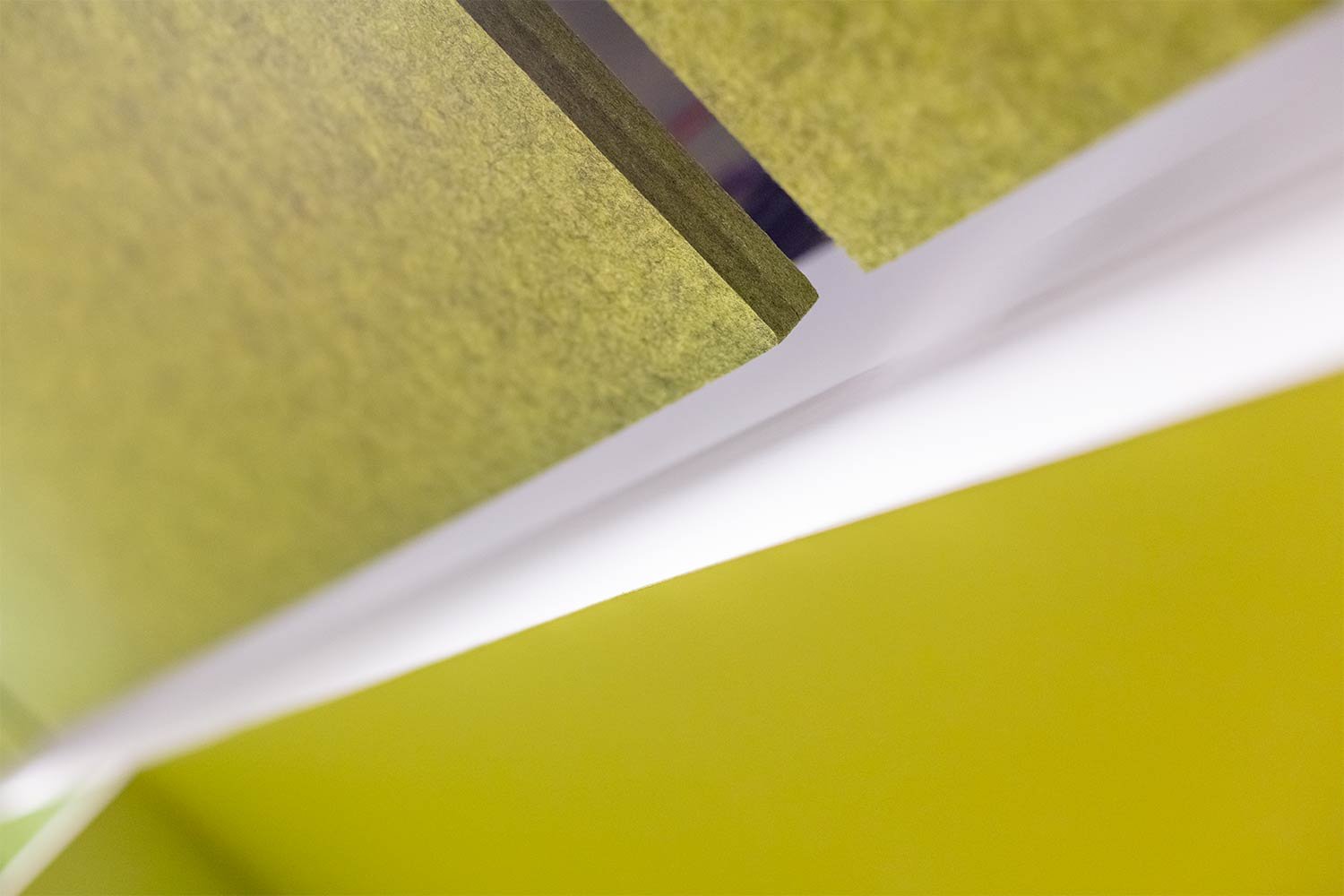
The ceiling rafts are made from recycled PET material
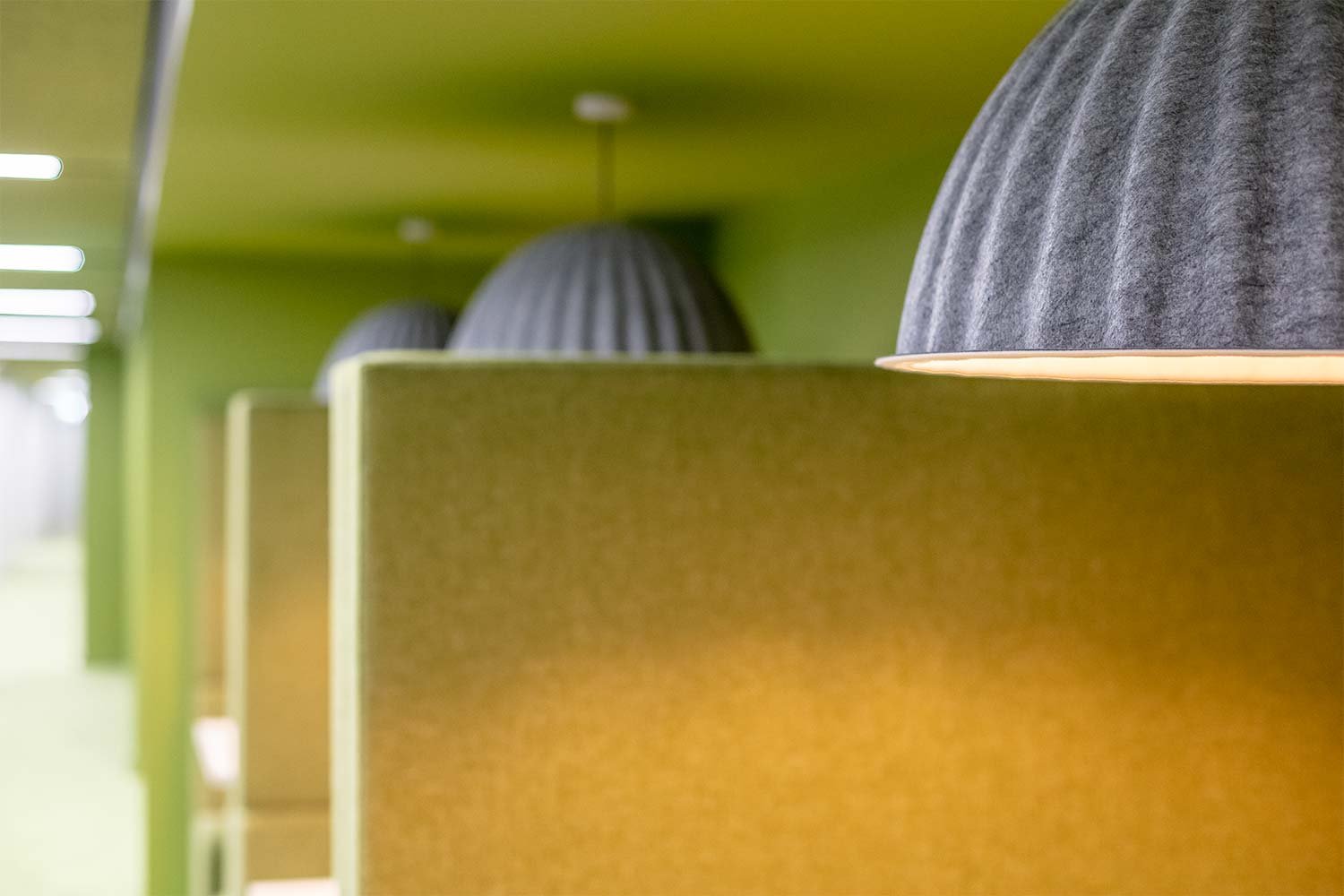
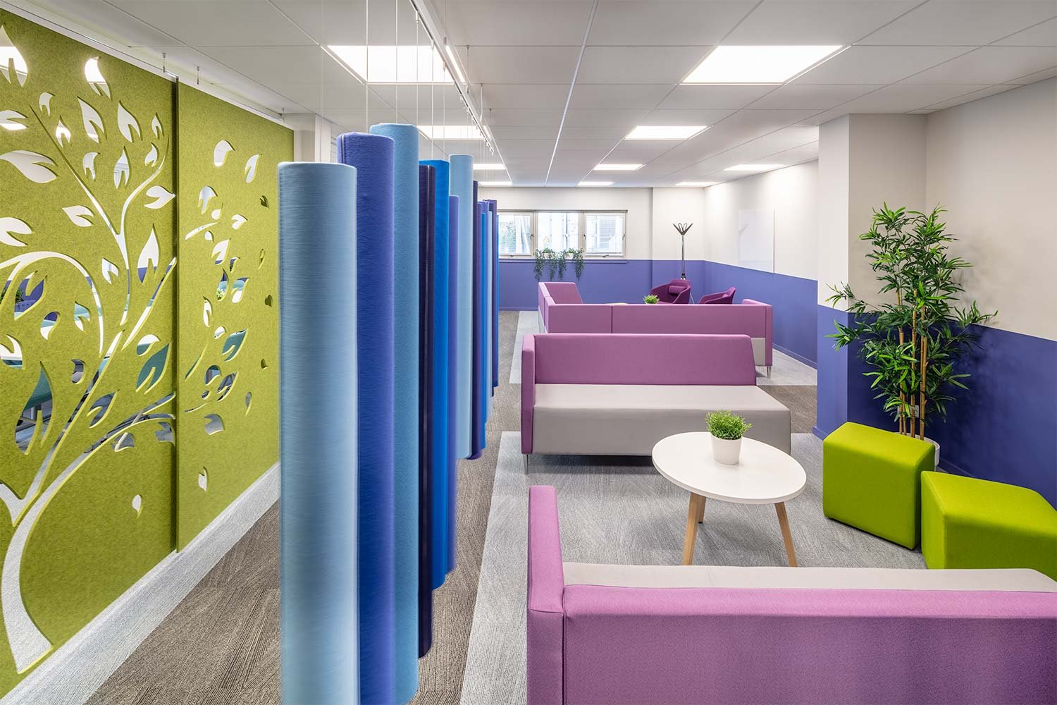
The acoustic hanging Soundsticks that separate the collaboration space from the office are made from upcycled fabric offcuts – a by-product of the manufacturer’s own furniture production. With a sound absorbing core of recycled moulded left-over fabric and PET bottles, these hanging sticks not only look good and introduce colour, but they also have great acoustic properties.
The launch of the new office proved to be a success with a large staff turnout eager to start working in their new space. Amos Beech were delighted to be asked along and it was a real celebration of the hard work by both companies. The social aspect of the planning really shone through, and we can see it being a success story albeit a culture change for many.
A fresh start back in the office, fresh new ways of working!
Phase 2
Following the success of the Phase 1 first floor refurbishment, more staff returned to the office than expected and it became apparent more workspace and collaboration space was required. Amos Beech together with Highland Spring embarked on a new stage of their journey to continue to upgrade the facility at Blackford.
Phase 2 had more parts than the initial project and it was important to address each space seamlessly and logistically so that the staff were not affected by the refurbishment works.
The brief consisted of the following:
Introduce more desking to the first floor workspace to meet capacity demands and re-locate the small collaboration area to a much larger space on the ground floor which is accessible to more staff.
Collaboration area
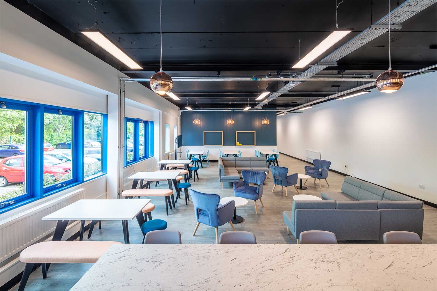
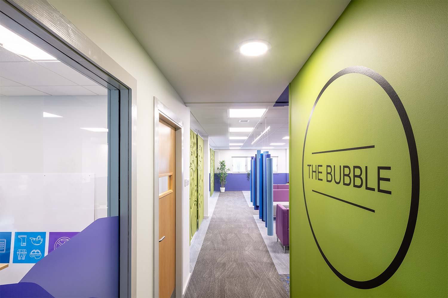
This space, appropriately named “The Bubble” allowed more varied settings than what they originally had space for and has created a much more flexible and well used space. A space to get away from the desk and work individually in a comfortable environment or collaborate with colleagues in an informal setting.
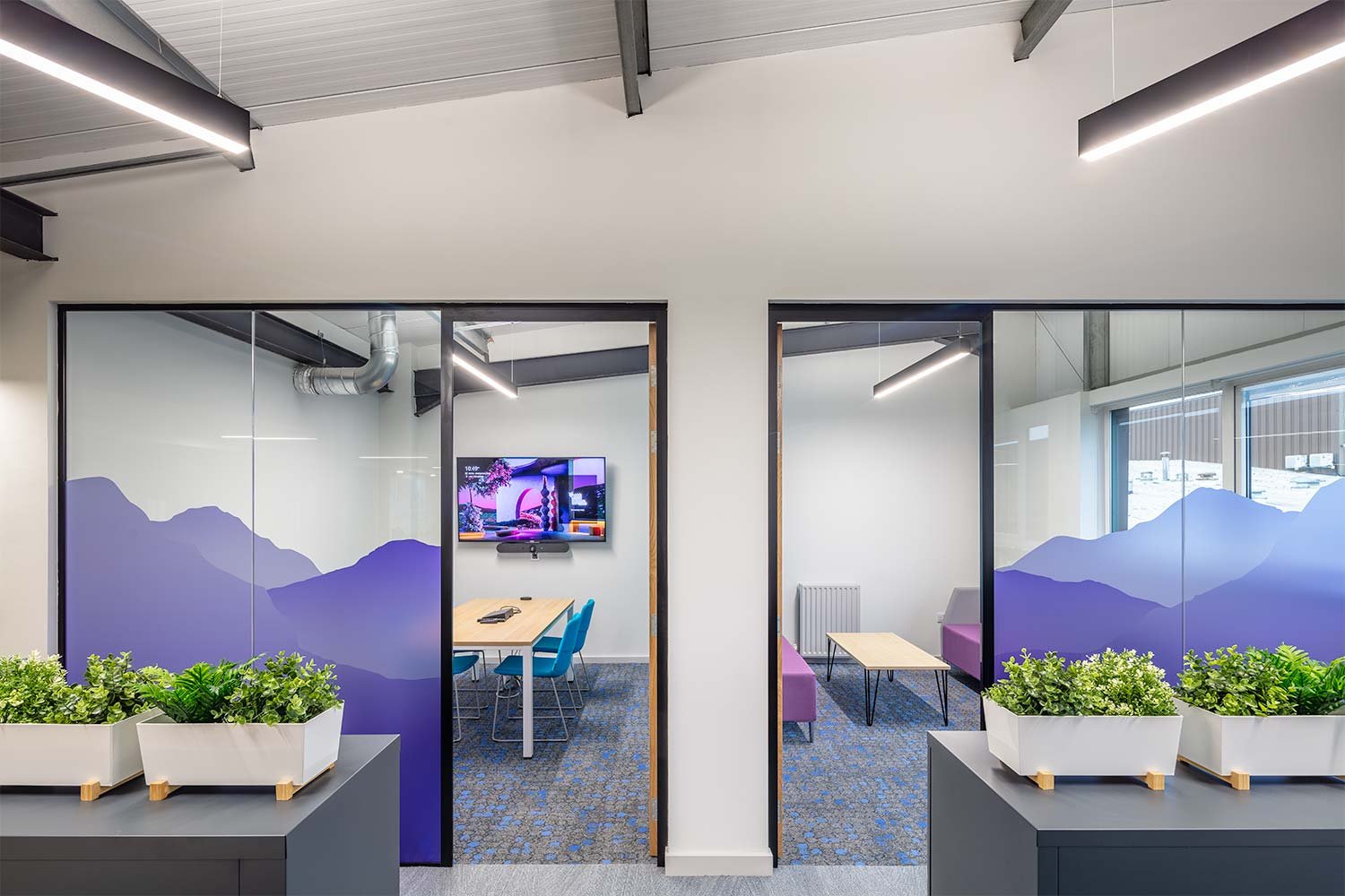
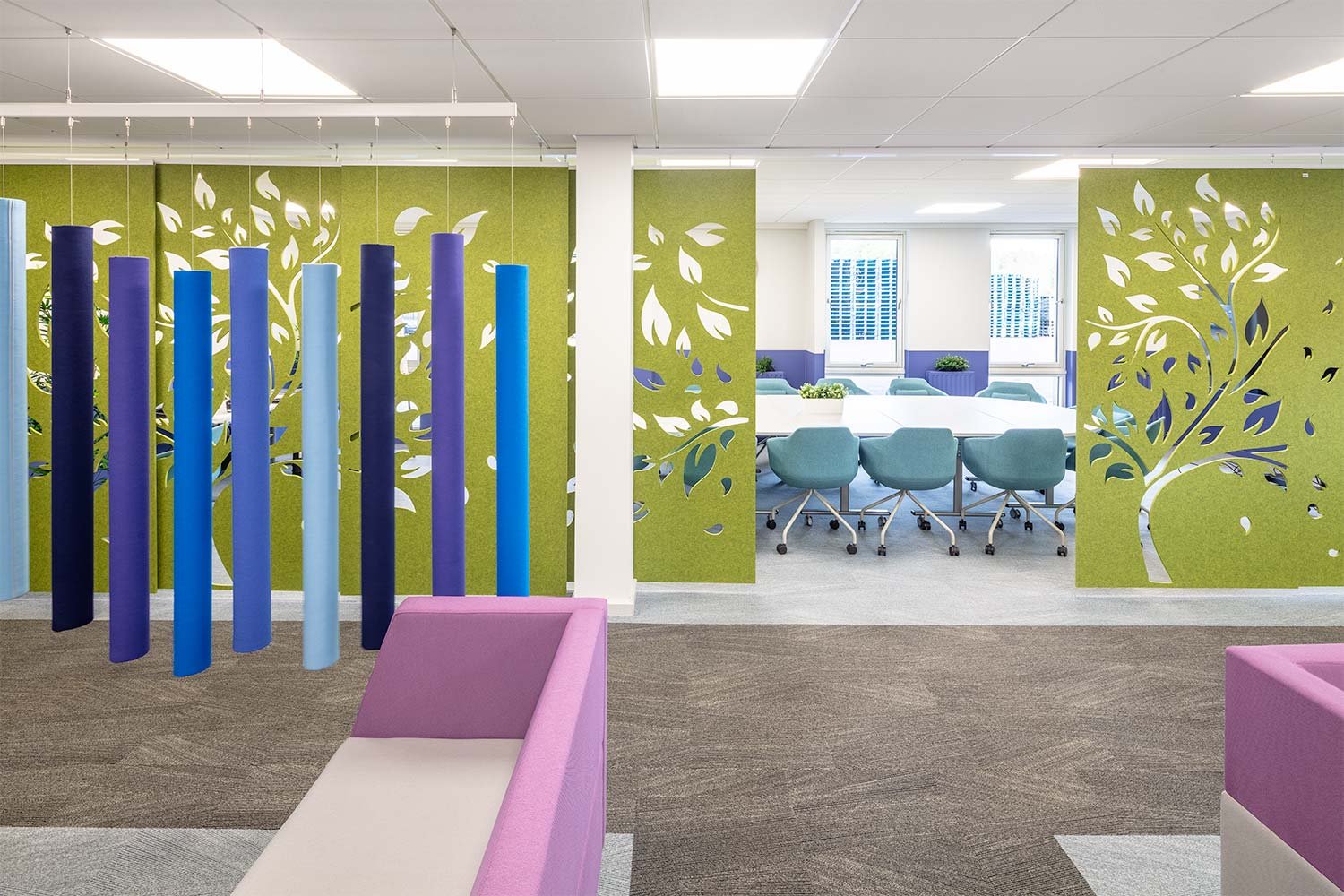
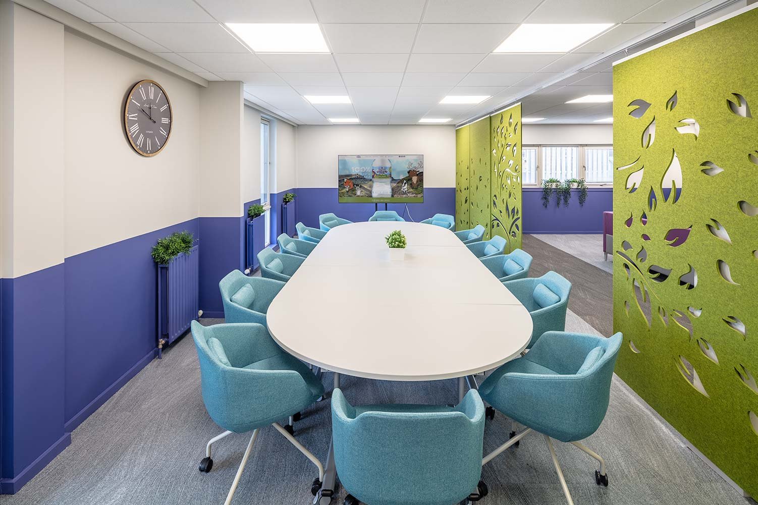
A large flexible meeting space with mobile furniture is separated from the rest of the space with recycled PET acoustic screens on a sliding track. This gives the option to have the space closed off or open for more informal meetings. A tree pattern on the screens and use of the same green as first floor acoustic rafts enhances biophilia within the space which is again mimicked in the purple hills branding used on the glass manifestation.
The soft seating and coffee tables from the first floor were re-located to form a new lounge/informal meeting area with glass whiteboards. The acoustic Soundsticks were also re-used to cordon off a small nook with high media table and stools.
Strong pops of colour suited the space together with the first floor fit-out and gives a sense of the Highland Spring brand running through each area.
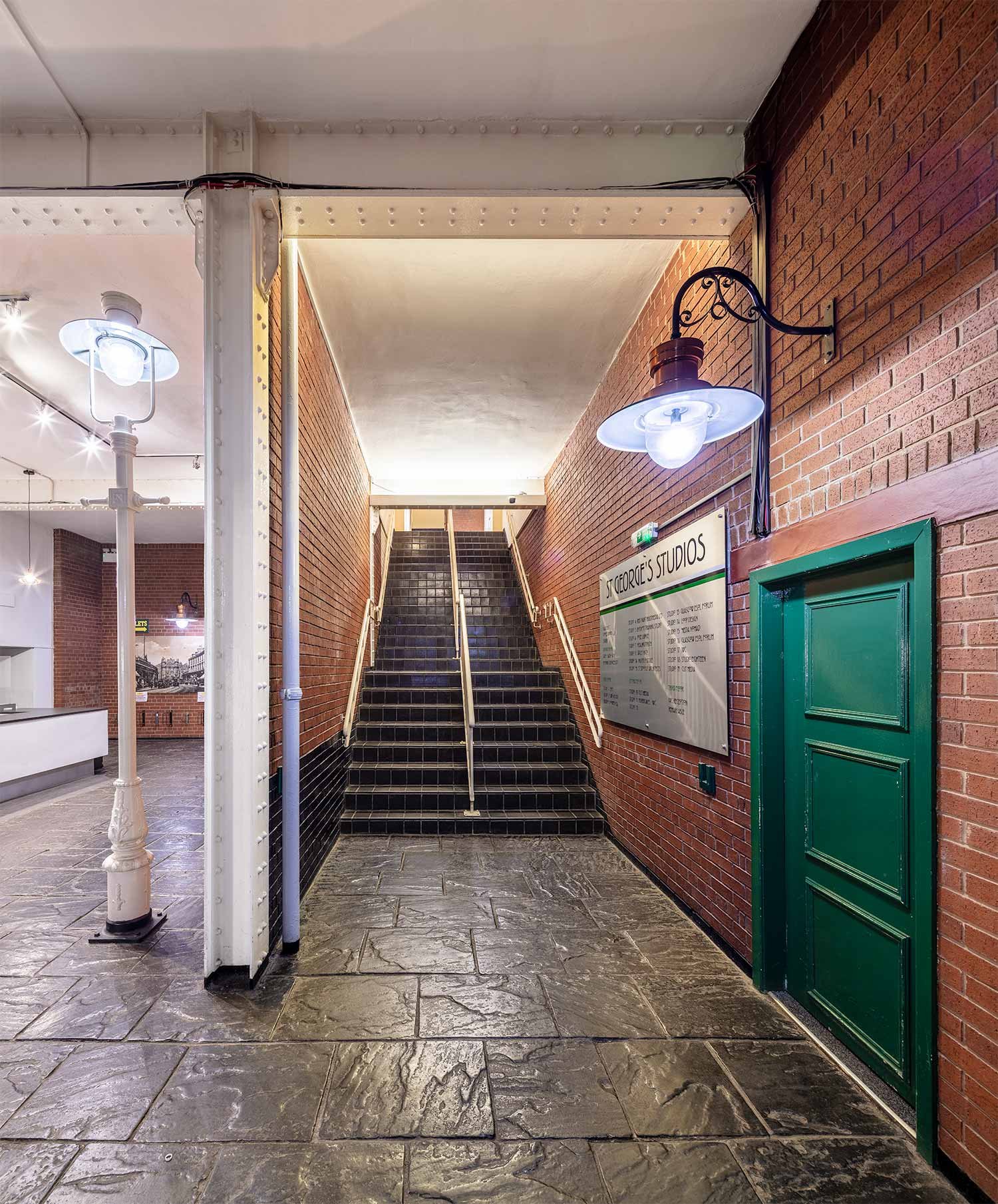
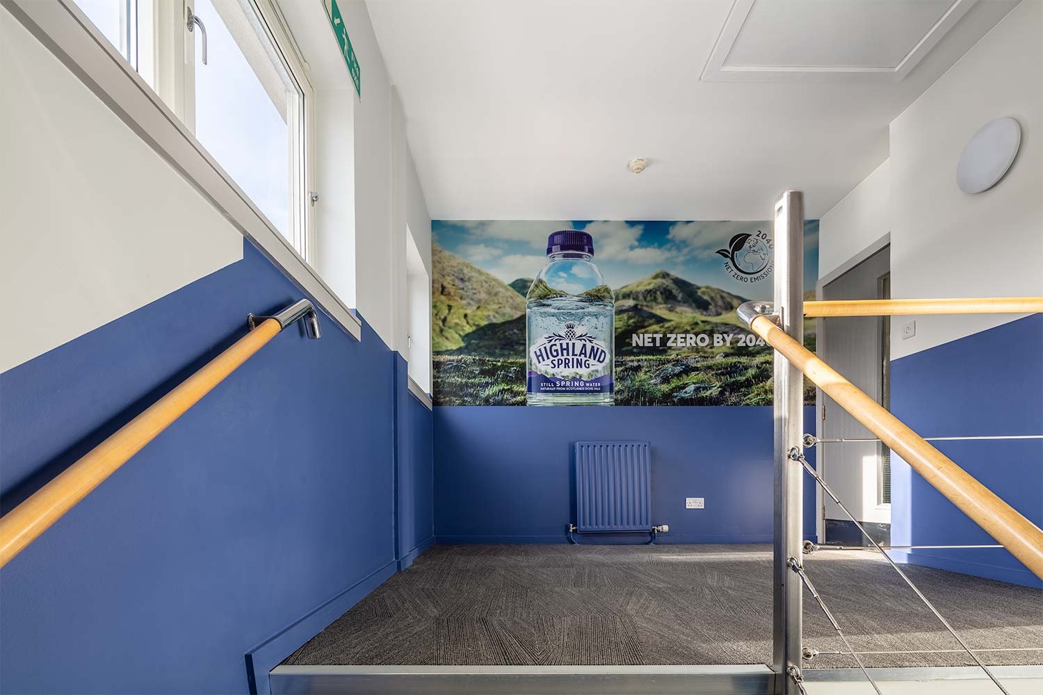
The second part of the brief was to address the main stairwell connecting the ground floor all the way up to the Second Floor Ochil Suites which is where the majority of visitors would be heading.
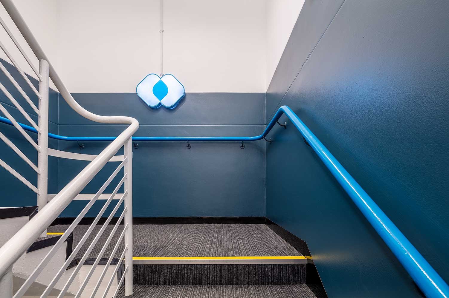
Feature colour branding was implemented at dado height up the stairwell to give a practical yet aesthetic solution to the scuff marks which tend to appear on well trafficked areas. A new carpet, feature halo lights and landscape branding image give this transition space the “wow” factor that reflects the rest of the refurbished office space.
Corporate space with operable wall
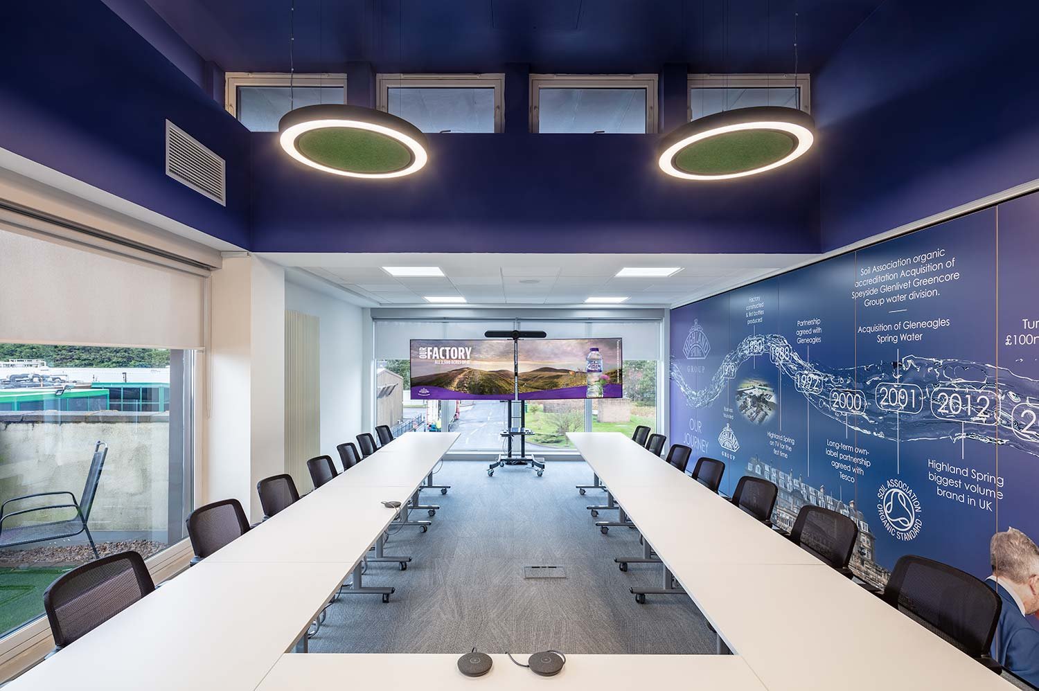
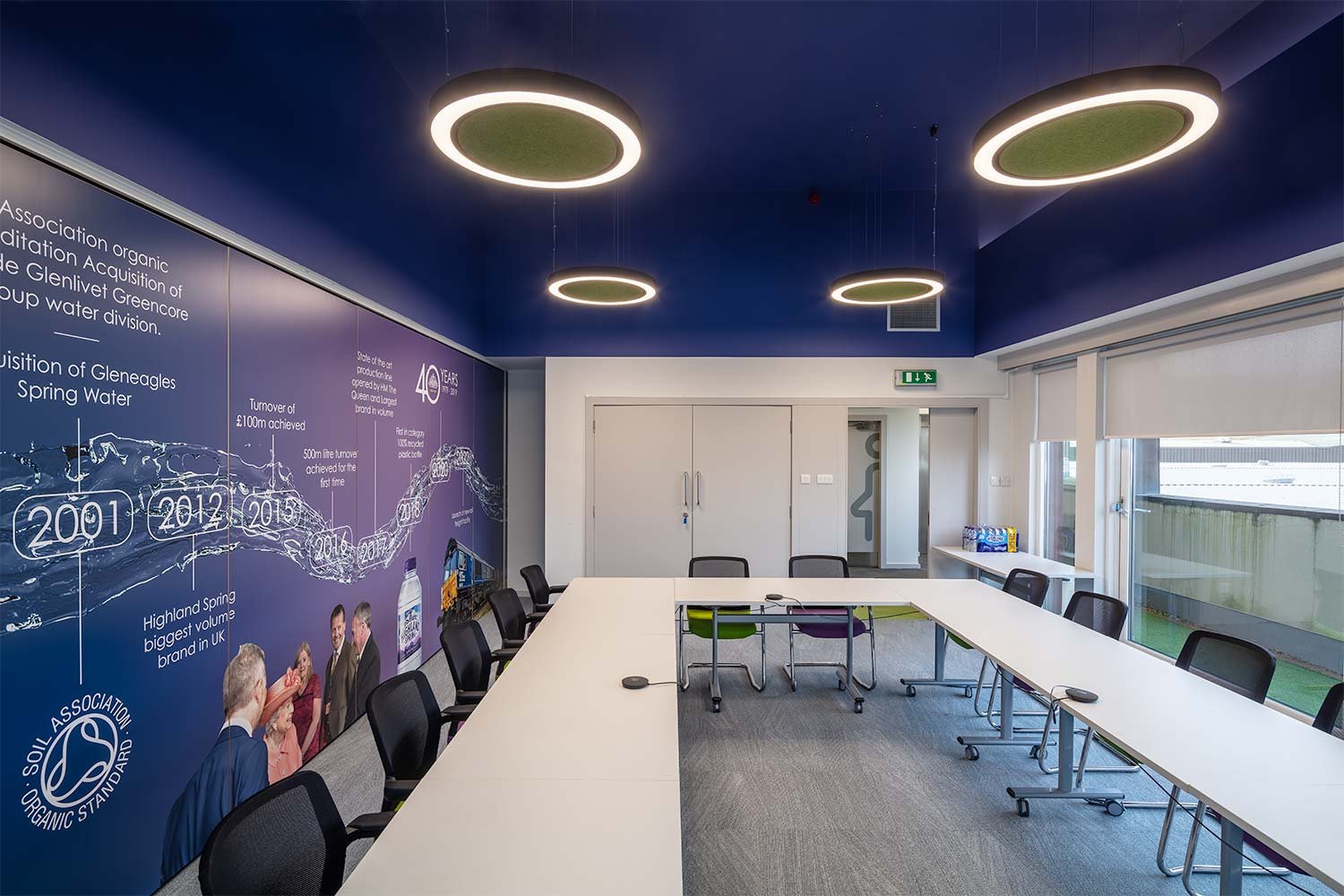
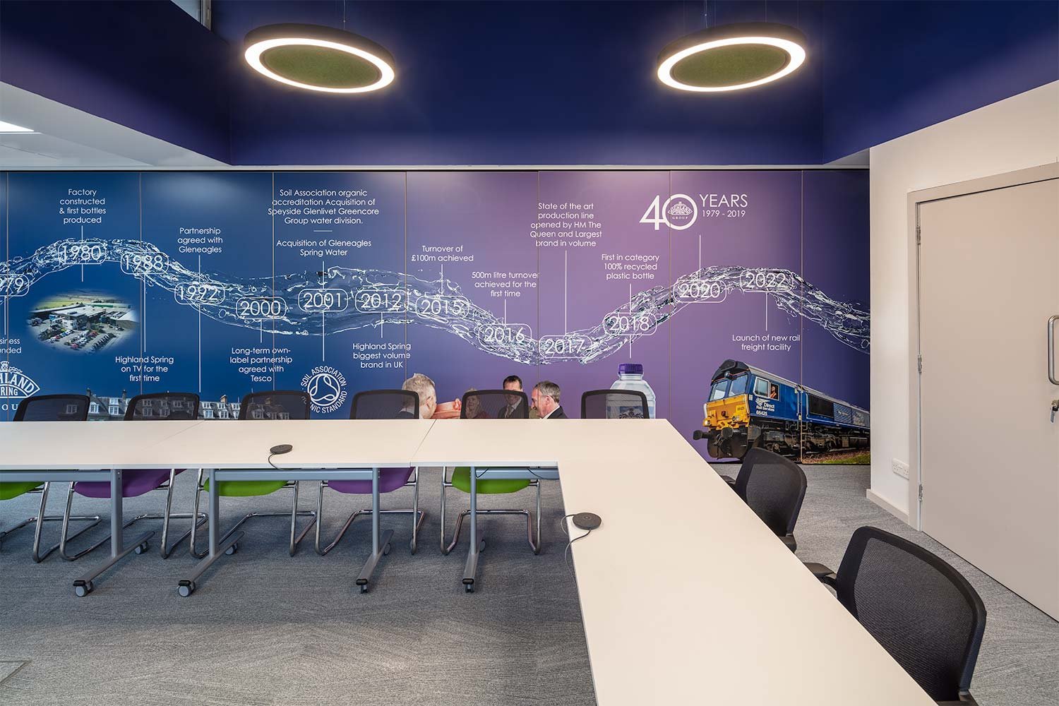
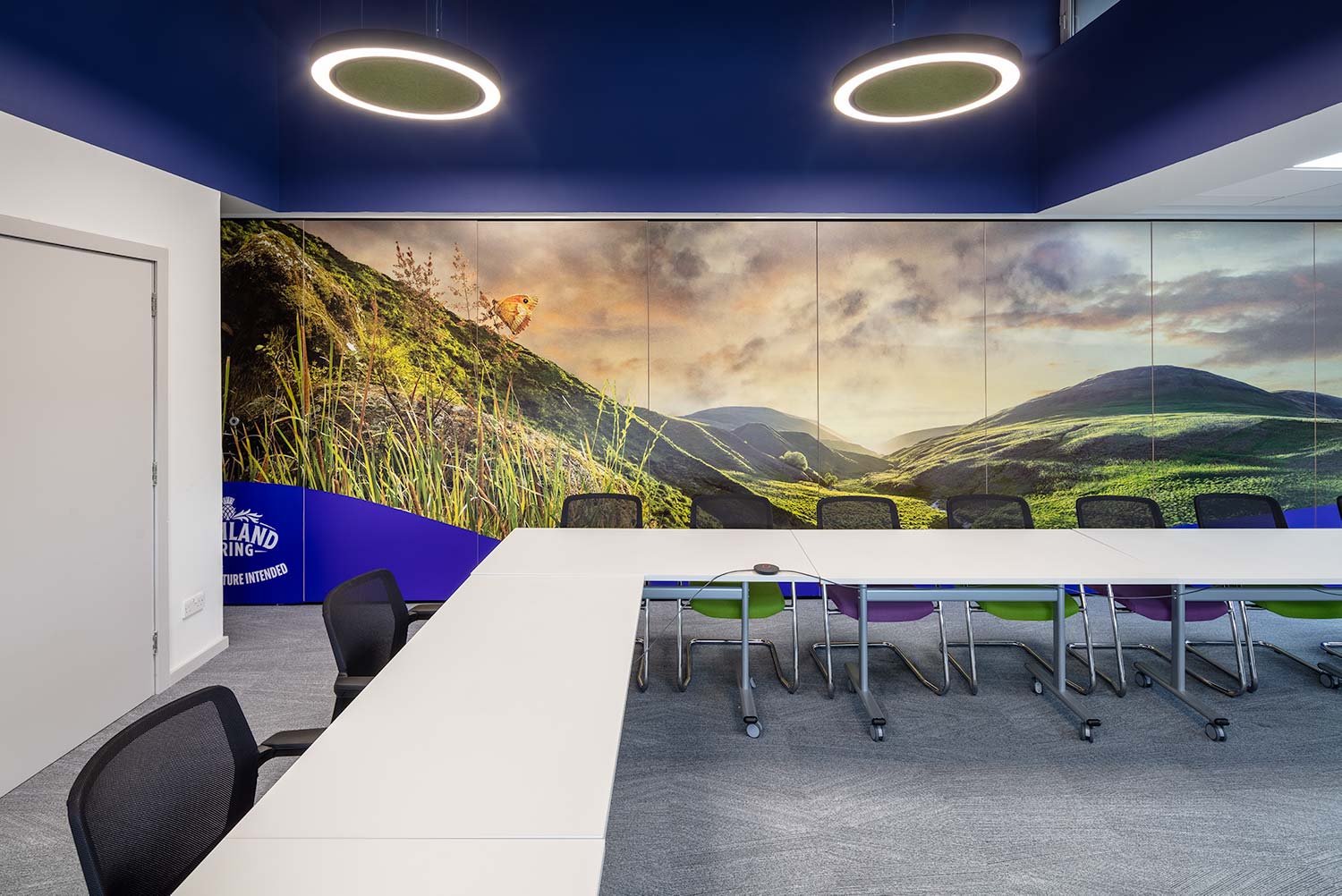
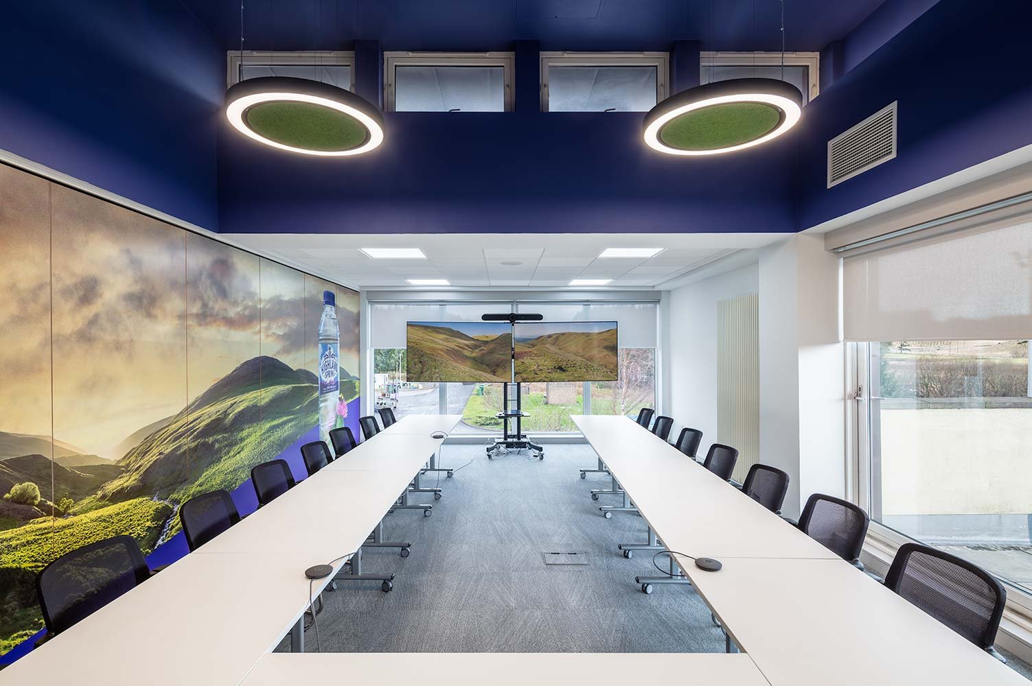
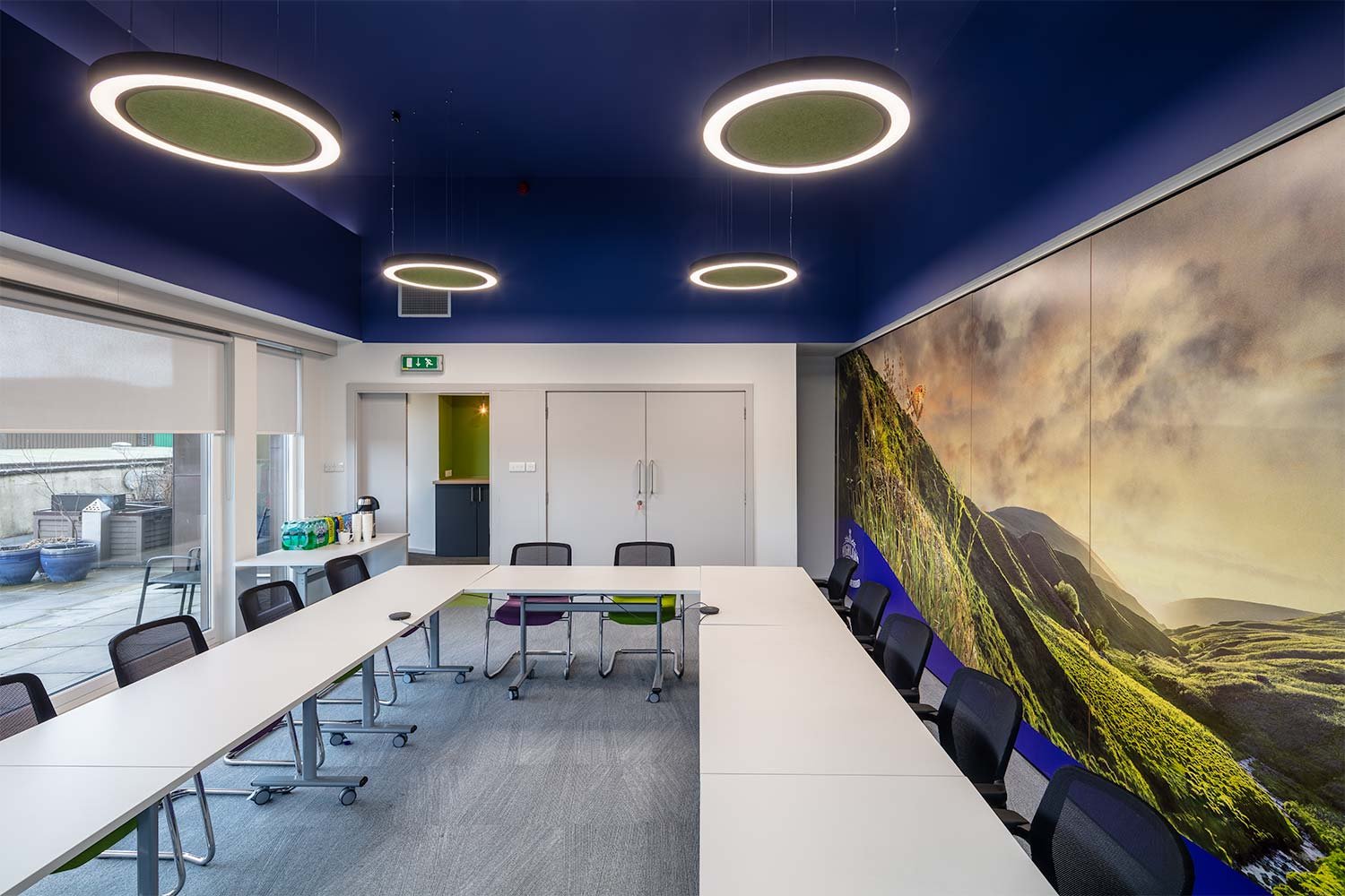
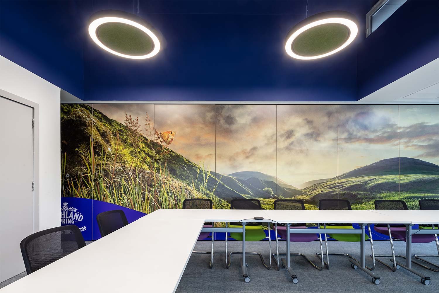
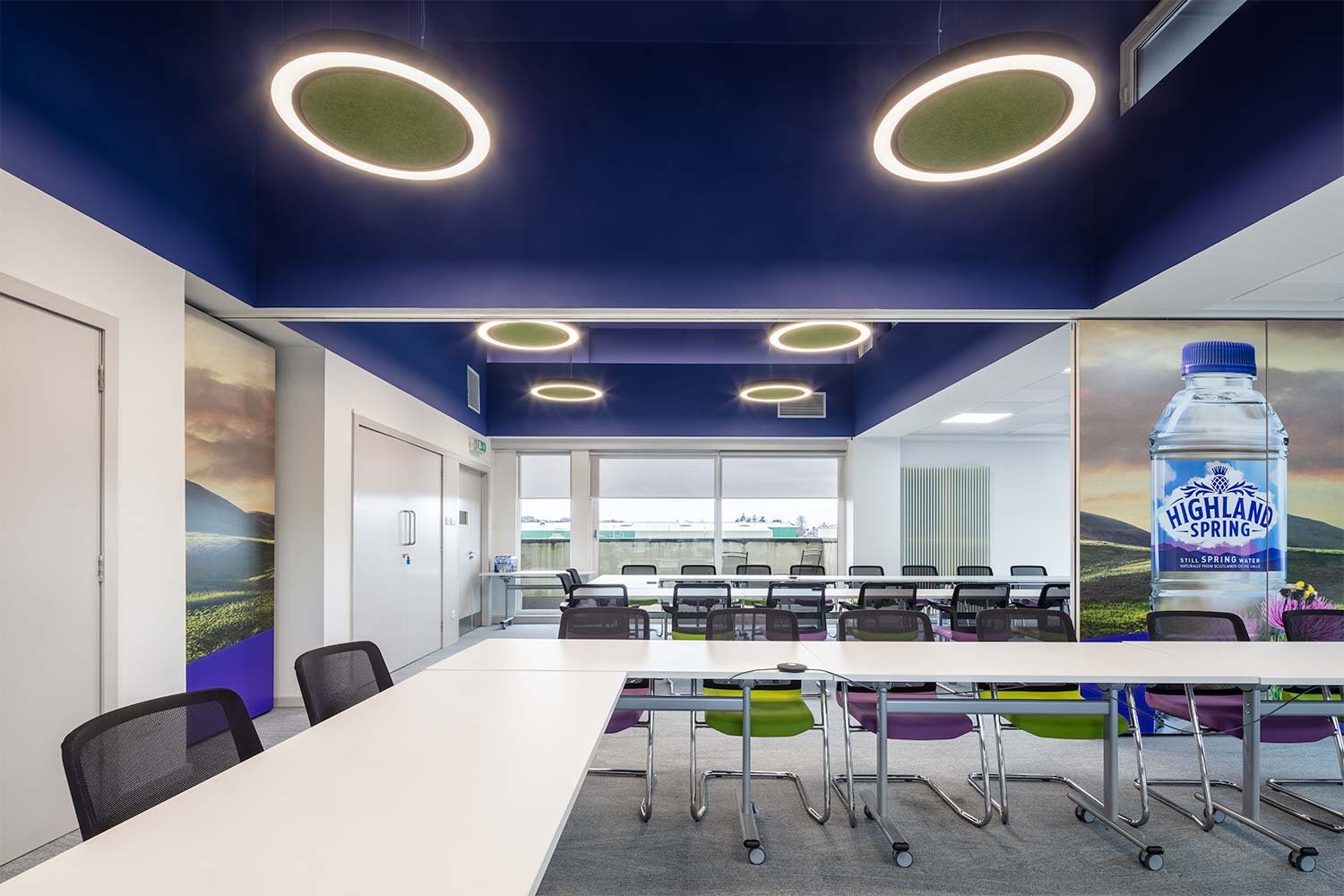
The second floor Ochil Suites and adjoining corridor were the next stage of Phase 2. These traditional and corporate spaces needed a lift whilst remaining within the budget. A high ceiling height in the suites afforded the opportunity to paint the upper wall and ceiling a dark purple in line with the brand colours. This had a two-fold effect of making the spaces immediately more intimate whilst adding that “wow” factor by using halo lights with acoustic rafts inset.
A large vinyl graphic print was applied to either side of the existing operable wall depicting the Highland Spring timeline on one side and bringing in the surrounding landscape on the other - echoing the green of the Ochil Hills which can be seen from the windows.
An upgrade of the existing storage unit in the corridor, creates a coffee point to cater to the Ochil Suites. By painting the existing joinery and vinyl wrapping the worktop it reflects the tea prep space on first floor in terms of look but in a more affordable manner! Re-using and being clever with materials enhances both Highland Spring and Amos Beech’s strive for sustainability which has been a key element in both phases of the project.
Published: Phase 1: 10 January 2023, Phase 2: 28 March 2024
Text: Deborah McAulay
Office re-design for Fred. Olsen in Stirling
Fred. Olsen Renewables
Fred. Olsen Renewables is an energy producer operating 12 wind farms with more than 338 wind turbines in Scotland, Norway and Sweden and one under construction south of Fort Augustus.
Amos Beech were approached by Fred. Olsen to re-design their expanding office space in Stirling. In this case-study we describe 3 phases finished in 2021, 2022 and 2023.
Office fit-out and refurbishment Fred. Olsen, Stirling
With the country slowly coming out of lockdown and with the hope of eventually heading back to the workplace sometime this year, the client felt it was the ideal time to introduce a more flexible way of working and refurbish the office space and facilities. A fresh start in a fresh space for staff to return to.
Stirling office refurbishment
Phase 1
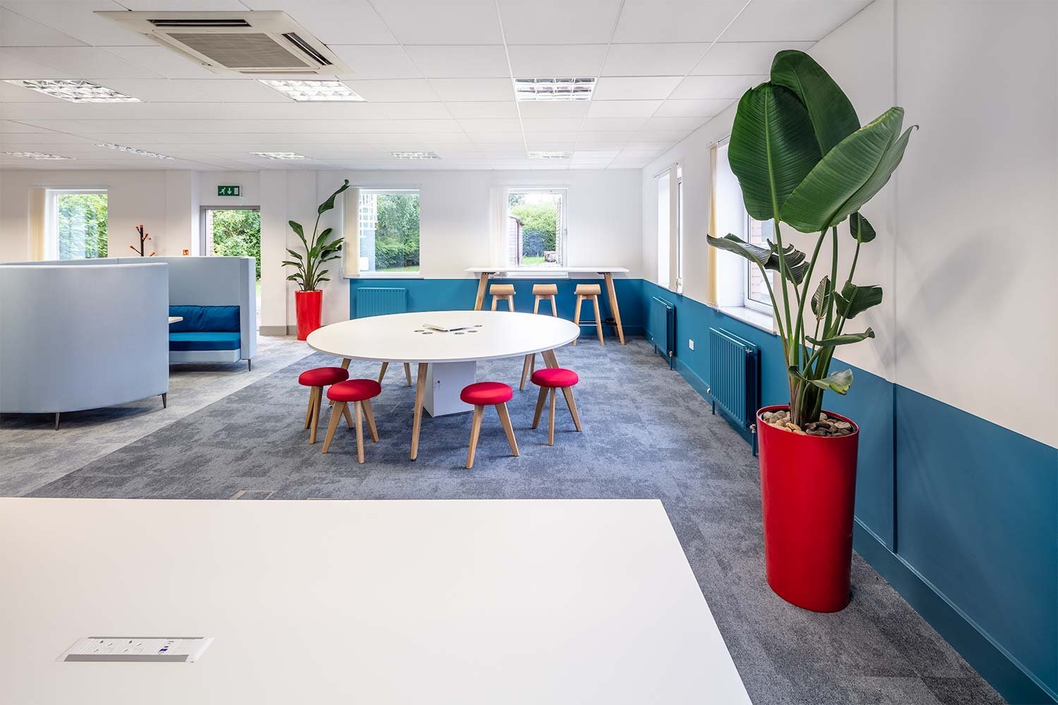
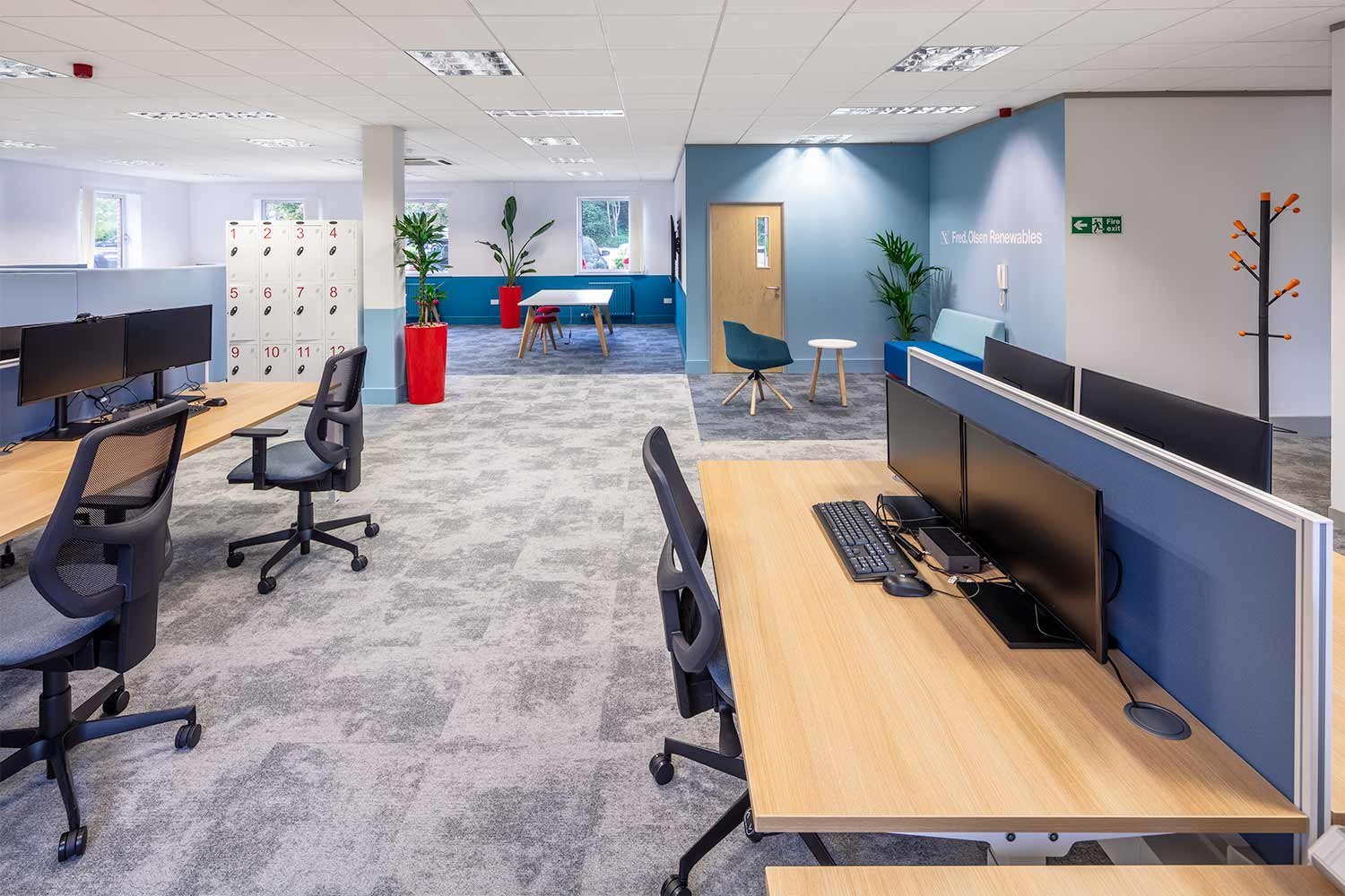
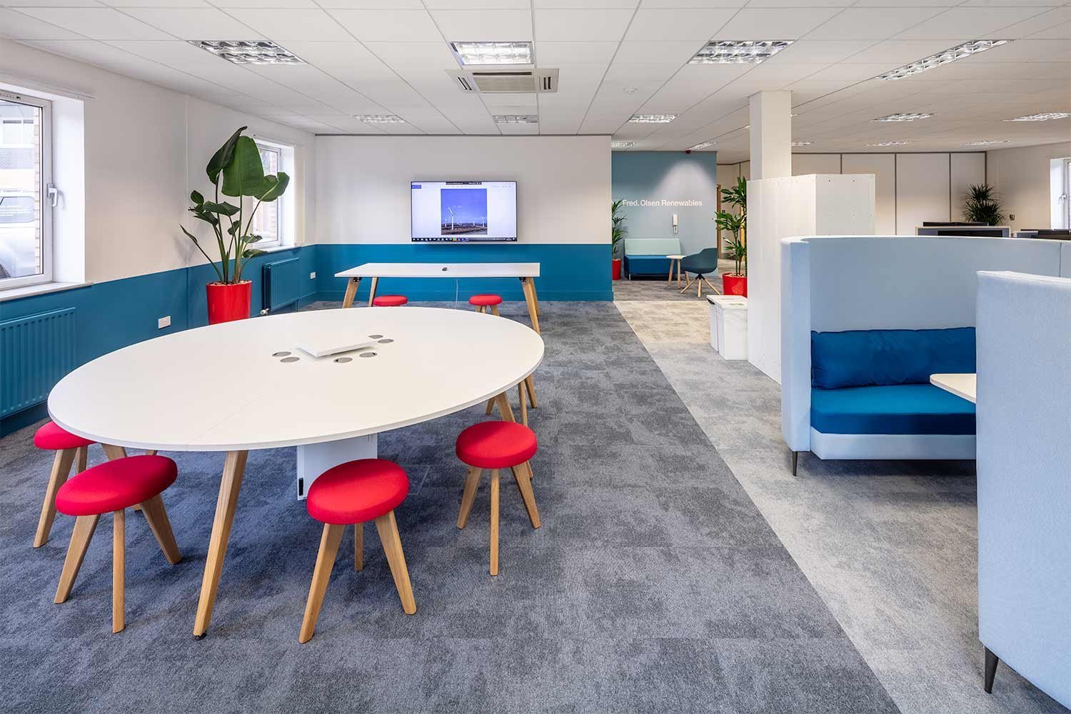
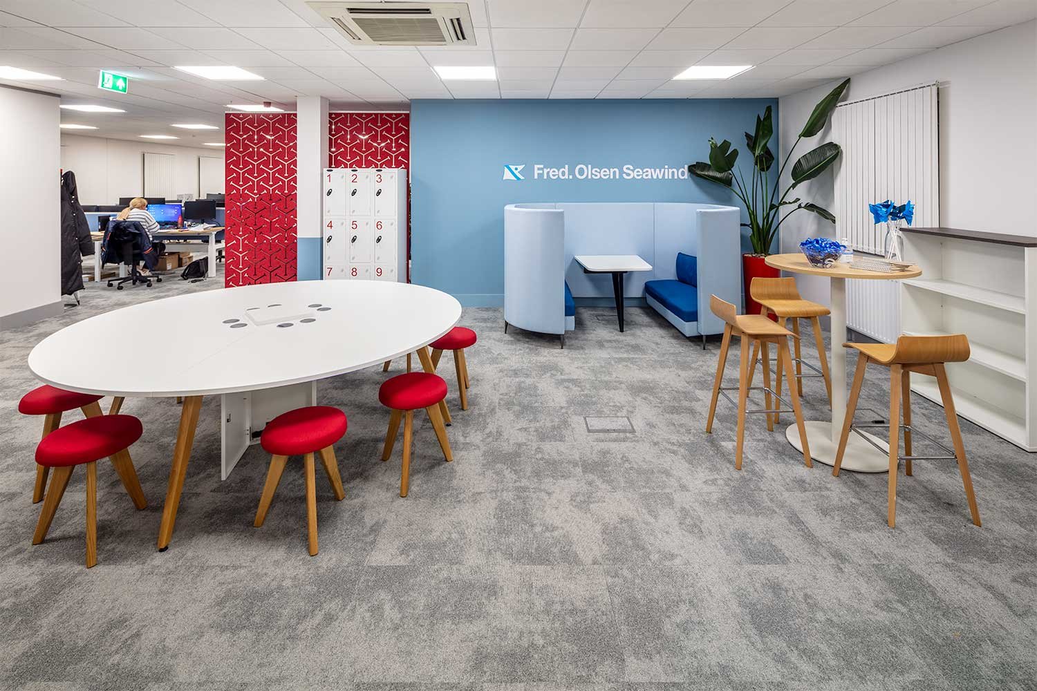
Half of the office space is dedicated entirely to a variety of collaboration and break out areas. The introduction of large collaboration tables and a large media screen for presenting, allows staff to come together in a vibrant co-working environment. High hot desk benching along the windows allows views out to the surrounding green spaces.
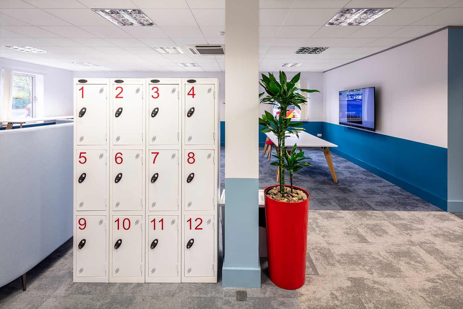
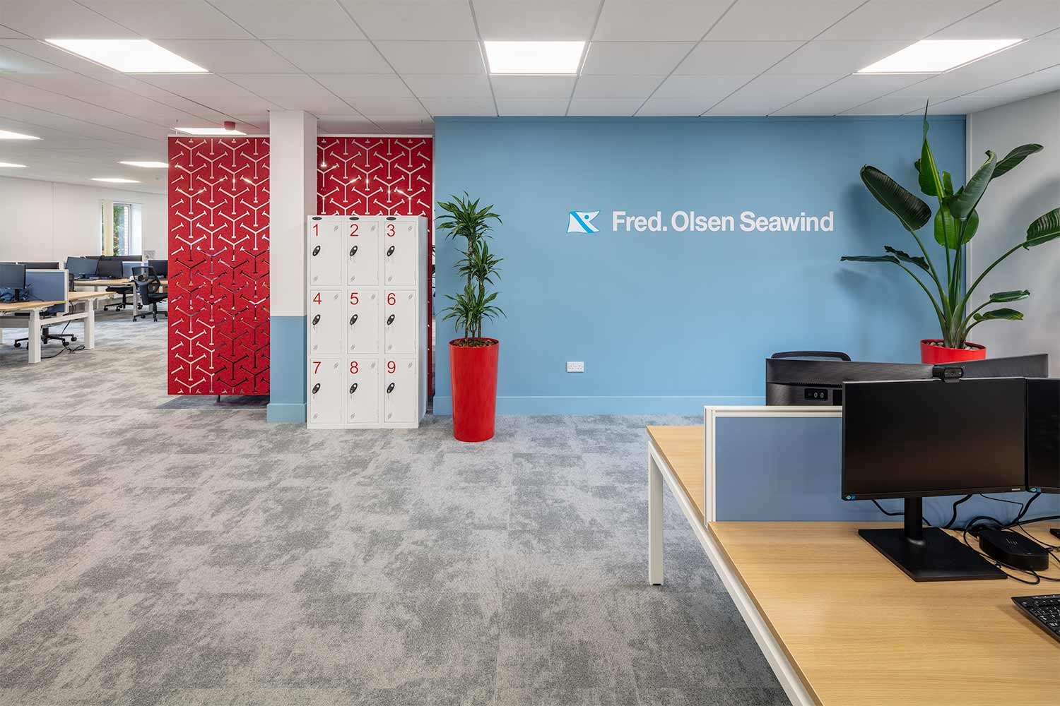
Lockers and a high back meeting booth divide the office without the use of walls. A mix of fixed benches and height adjustable desks make up the more focused workspace. The furniture allows a complete ergonomic selection contributing to a healthy working environment.
New shower and kitchen facilities
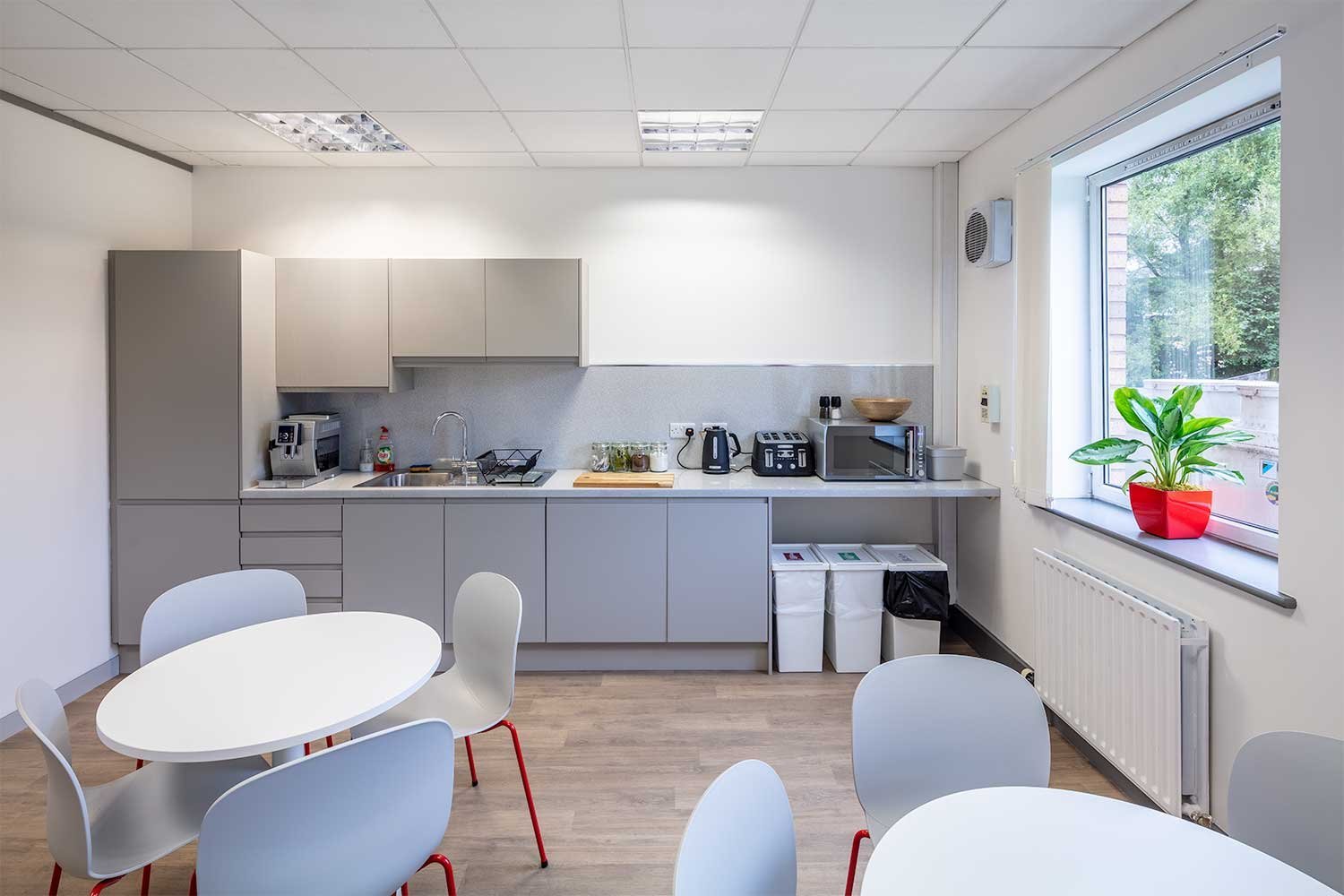
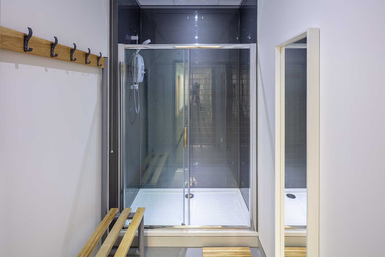
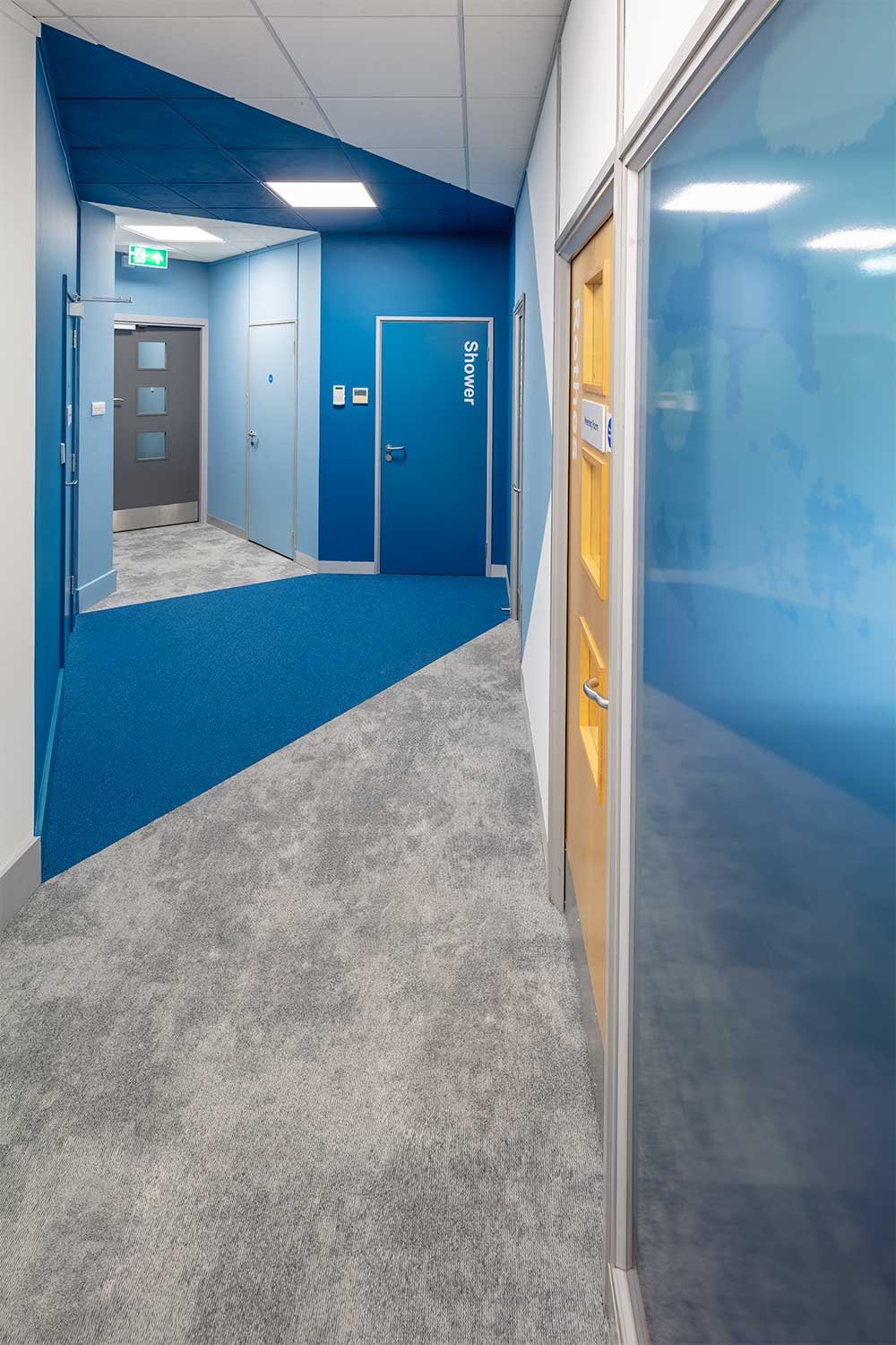
New shower and larger kitchen facilities have been introduced, providing staff with cycle to work options and an area to have breaks out with the workspace. The focus on staff well being is apparent and truly reflects the company’s ethos and values.
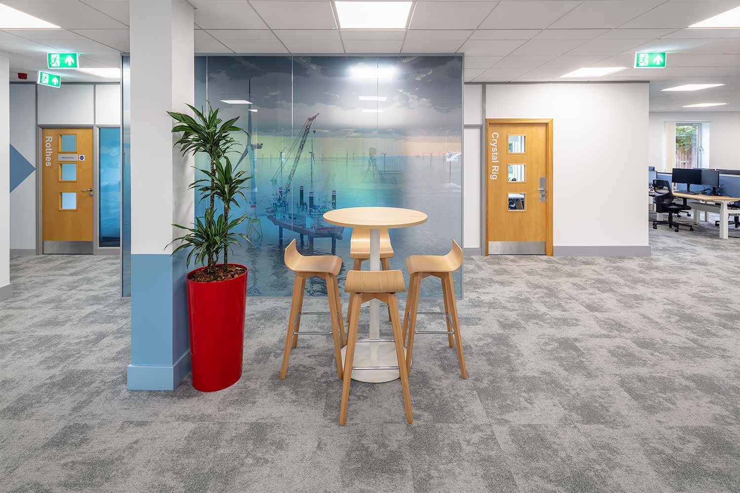
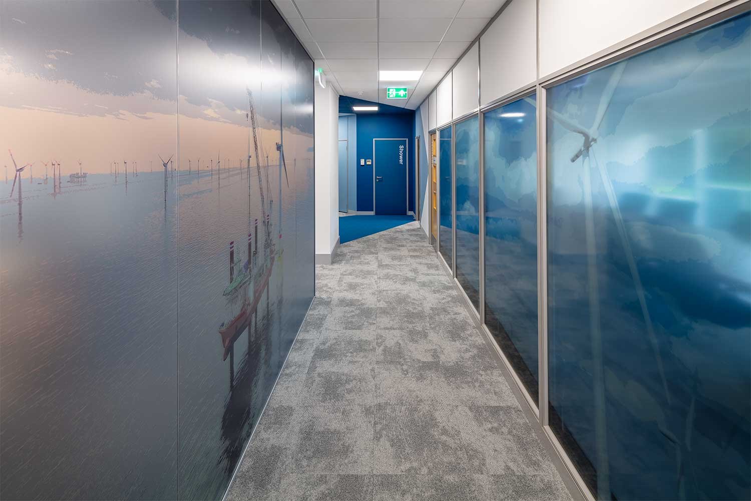
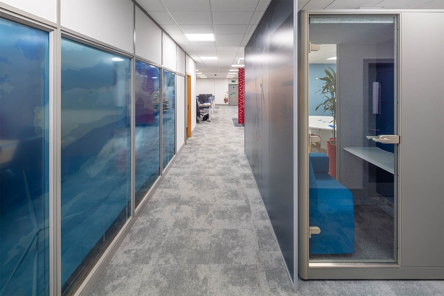
The design finishes reflect Fred. Olsen branding in the colours and images selected. A large wind farm graphic dominates the glass on the Boardroom, adding interest and colour to the entry corridor. Colour blocking to the walls define spaces and a splash of much needed colour to the walls. Colour pops in the furniture continue the branding throughout the space.
Phase 2
After the success of the initial office refurbishment in Stirling, Fred. Olsen reached out to Amos Beech again when the requirement for additional space arose to accommodate the Fred. Olsen Seawind team.
The brief was to open up the office to create a shared space to connect the teams whilst still giving each their own designated area. The design also had to incorporate an upgrade to the entrance area and enhance acoustics and lighting throughout.
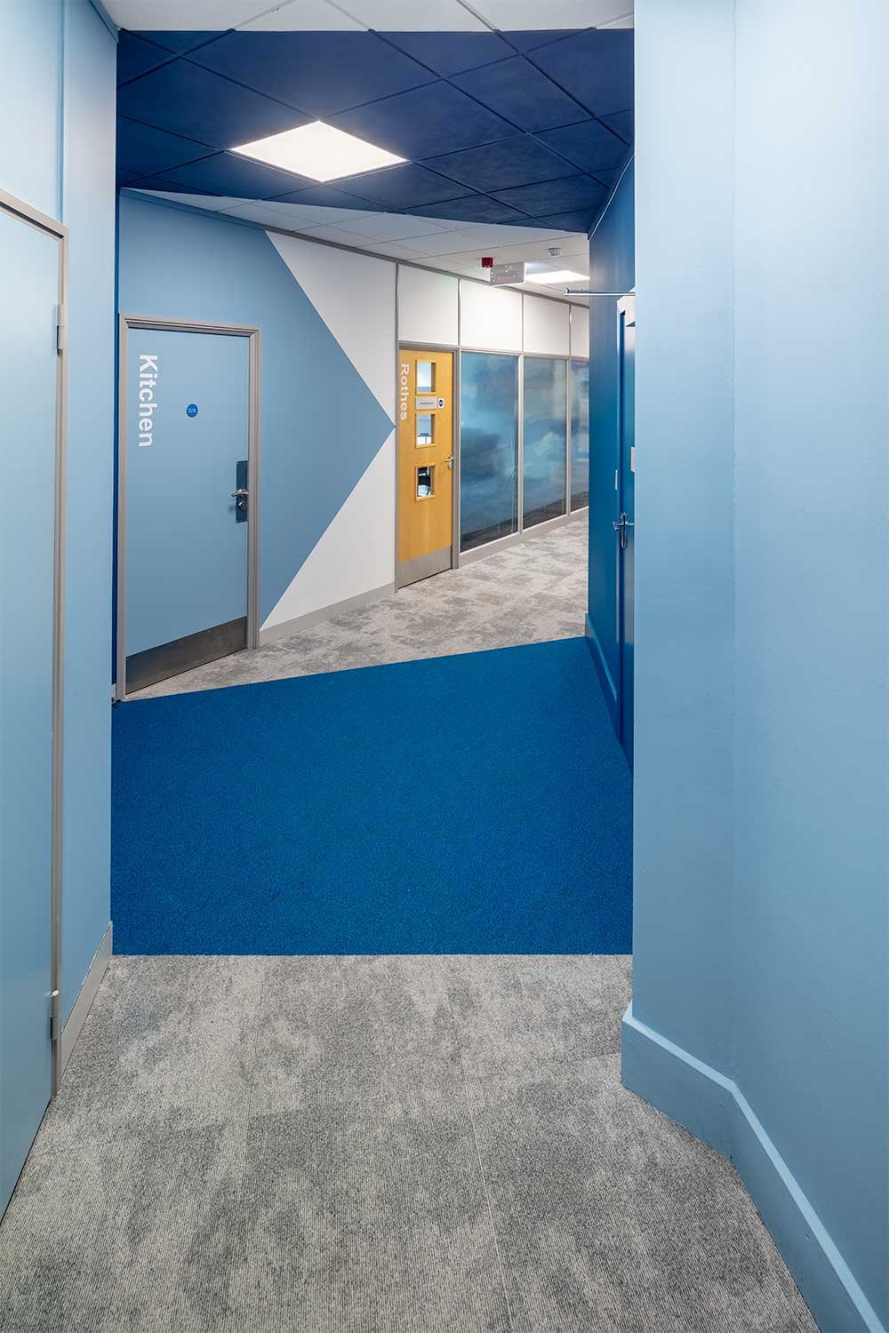
A gateway of colour:
Directional paint “points the way”
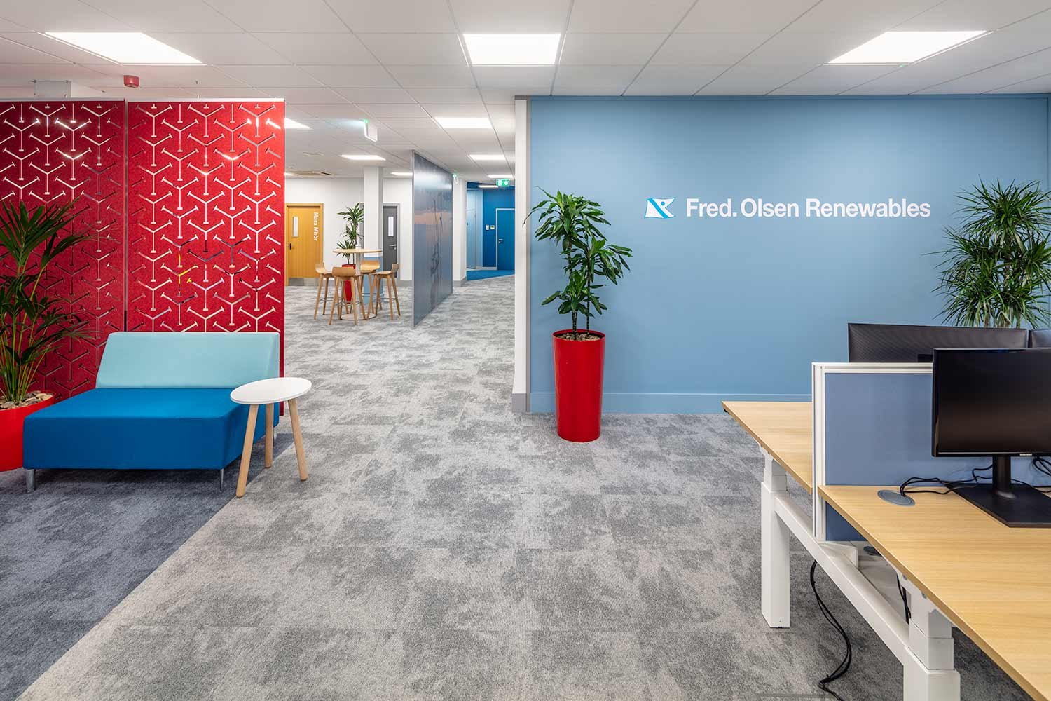
The entrance at Fred. Olsen required the same modern, contemporary imagination that the rest of the office has. There is no assigned reception desk, so the entry way must welcome any visitors and make it easy to navigate the space. The design creates a gateway of colour to walk through and draw you into the space. Clever directional paint “points the way” and is instantly recognisable as part of the Fred Olsen brand colours.
Through the “gateway” a new stand-alone glazed partition, separates the Seawind space from the corridor. Specific branding images on the glass represents the Seawind team and reflects the original Fred Olsen Renewables graphic opposite on the Boardroom glass. There is no doubt as to whose office you have entered.
It was important to emphasise the sharing of the collaboration and meeting/breakout facilities by both Seawind and Renewables teams however, the open plan desking, although not separated by partitions retains the feeling of their own identity. The finishes from the original refurbishment continue into the new space which makes it feel fresh and part of the whole.
Phase 3
Phase 3 of the Fred. Olsen project had multiple facets: the initial one being acoustics. The existing meeting room partitioning was not providing the acoustic needs required for the space. Since opening up the Seawind section of the open plan office as part of Phase 2, they were having issues with noise transfer.
Acoustic solutions
As Amos Beech did not build these rooms originally, we had to come up with solutions to retrofit products and bring the partitions up to the acoustic rating necessary. In addition to above ceiling insulation, we partnered with acoustics specialists BuzziSpace to carry out reverberation tests within each room and come up with the ideal aesthetic solutions to help the sound transfer.
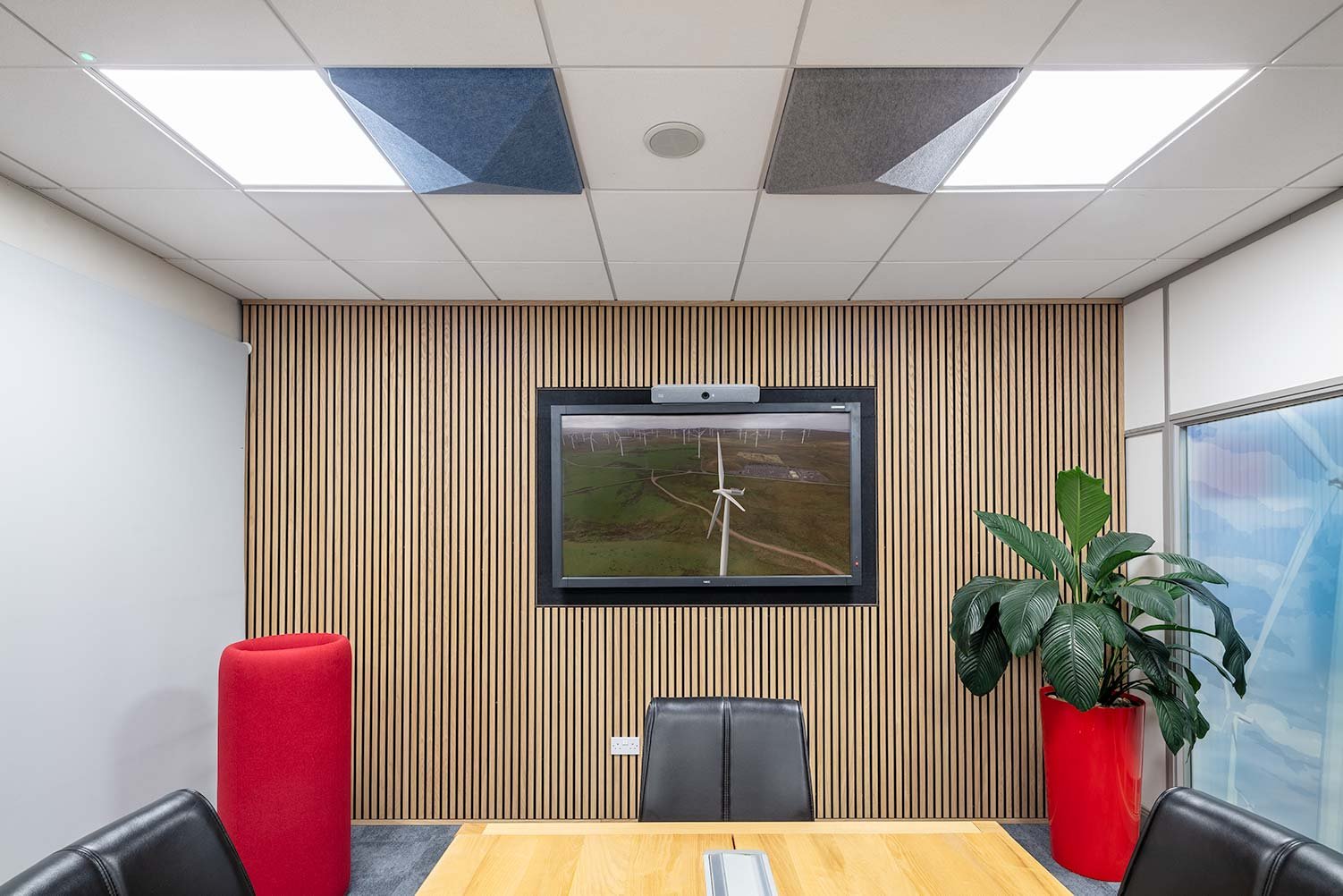
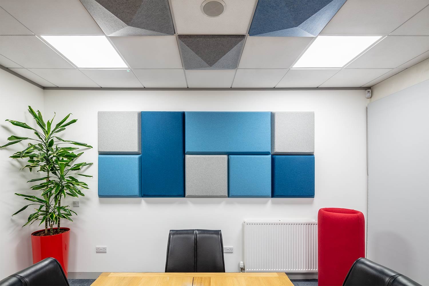
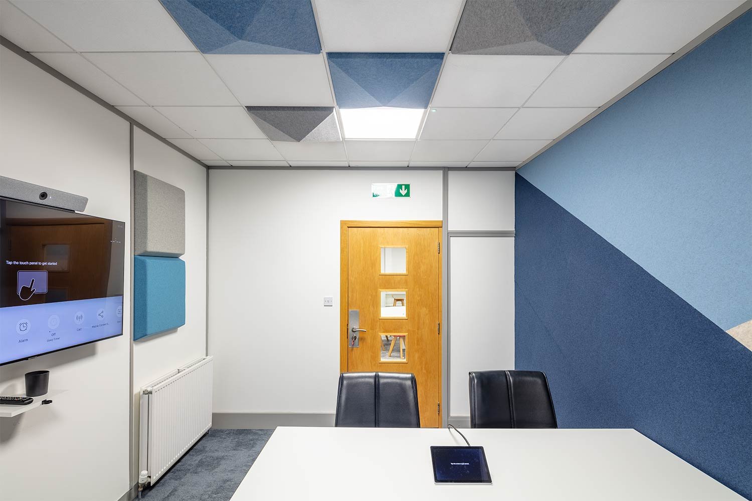
The solutions included several products: acoustic wall tiles, felt wall covering acoustic blocking panels to entire walls, acoustic planters and a timber acoustic panelling system.
Acoustic wall tiles whose foam has extraordinary noise-absorbing capabilities which work on all sound frequencies. These tiles come in different colours, thickness and formats allowing designs appropriate to the room to be developed with the appearance of a piece of art.
A felt wall covering over acoustic blocking panels allowed us to re-create the original feature wall decoration to the small meeting room using various colours. Keeping the bold colour block design, whilst improving acoustics and becoming a tackable surface. It is the perfect solution for reducing speech and high tones in the space due to its large surface with excellent absorption capabilities.
The client replaced their original planters in the meeting rooms with acoustic planters, an upholstered colourful pot made from high density foam to absorb excessive noise whilst also housing greenery creating healthier environments for people to thrive.
The Boardroom has been upgraded to a timber panelling system surrounding the wall mounted screen which not only helps the acoustics but also creates a high end look to the space. Sound insulation material was used behind to build the wall out and create the housing for the TV.
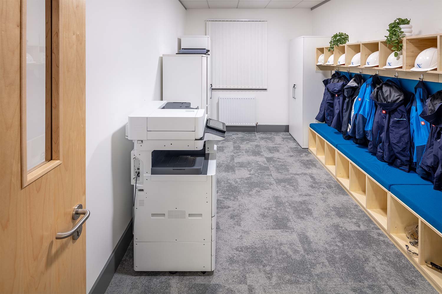
The second part of Phase 3 was to upgrade the storeroom built in Phase 1 and make practical, whilst attractive solution for PPE storage. A simple yet effective birch plywood unit was designed to fulfil storage needs whilst the seat pad offers a pop of colour to tie into the Fred Olsen branding demonstrated throughout the space.
A shared collaboration space
The third and final part of Phase 3 was to re-arrange the Seawind section of the open plan office to become a shared collaboration space.
Utilising the existing furniture throughout the office the high back booth, large round worktable and high poseur tables were brought together to form a more collaborative section of the office. This stresses even more the importance of the acoustics implemented above.
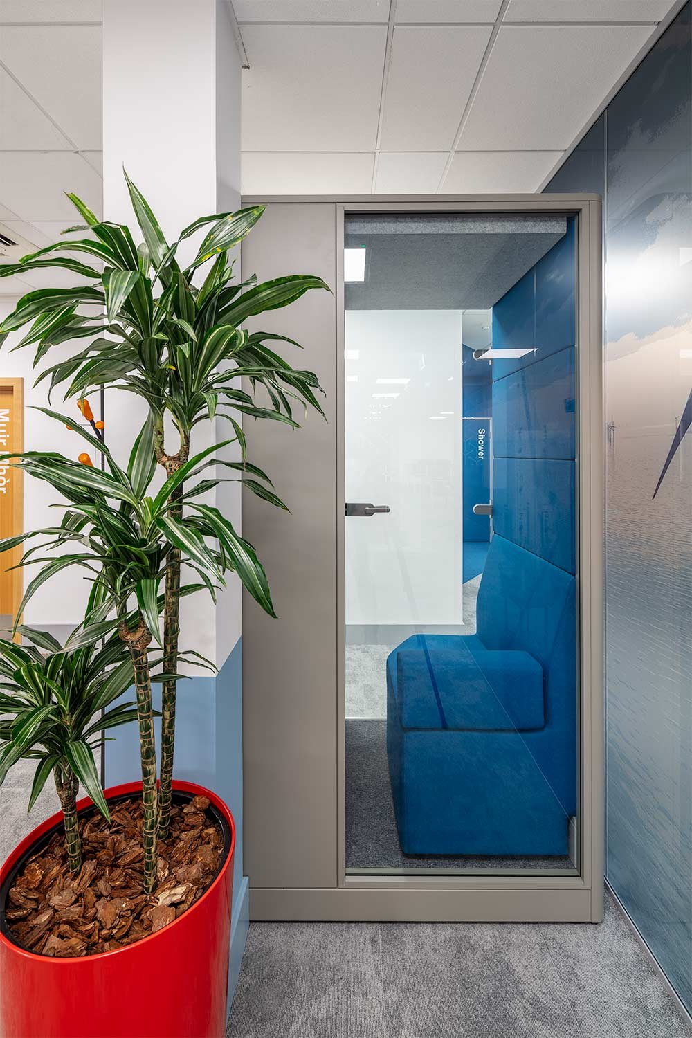
Into this zone Fred. Olsen have added a single person acoustic work pod, in which to make VC and private calls away from the desk without booking out a full meeting room. The Max Calma Z acoustic pod has its own lighting and ventilation system, desktop with power/USB and in-built soft seating. The acoustic felt ceiling and side wall ensure you won’t be disturbed by outside noise and creates a comfortable workspace for concentration.
These additions to the office have ensured a better working environment, and relatively simple changes to the furniture layout have made sure the space is functioning correctly for the current needs of the Fred. Olsen business.
Published: 23rd August 2021 (phase 1), 12 December 2022 (phase 2), 30 Januari 2024 (phase 3)
Text & Photography: The Amos Beech Team
A new office interior for Impact Solutions in Livingston
Impact Solutions supports companies to develop new technologies and services by testing the environmental impact of their offering, from concept through to commercialisation.
Impact Solutions knew they wanted to create a fantastic new interior for their offices but they also knew what ‘value for money’ really represents.
A vibrant space, full of variation and colour
The Amos Beech team were able to provide realistic pre-project high level figures based on the look and feel that they wanted to create and gave them the confidence to work with our Design & Build Team to deliver the project.
We worked closely with the Impact Solutions management team, providing many colour and product samples to ensure there were no surprises and that everything would meet their expectations.
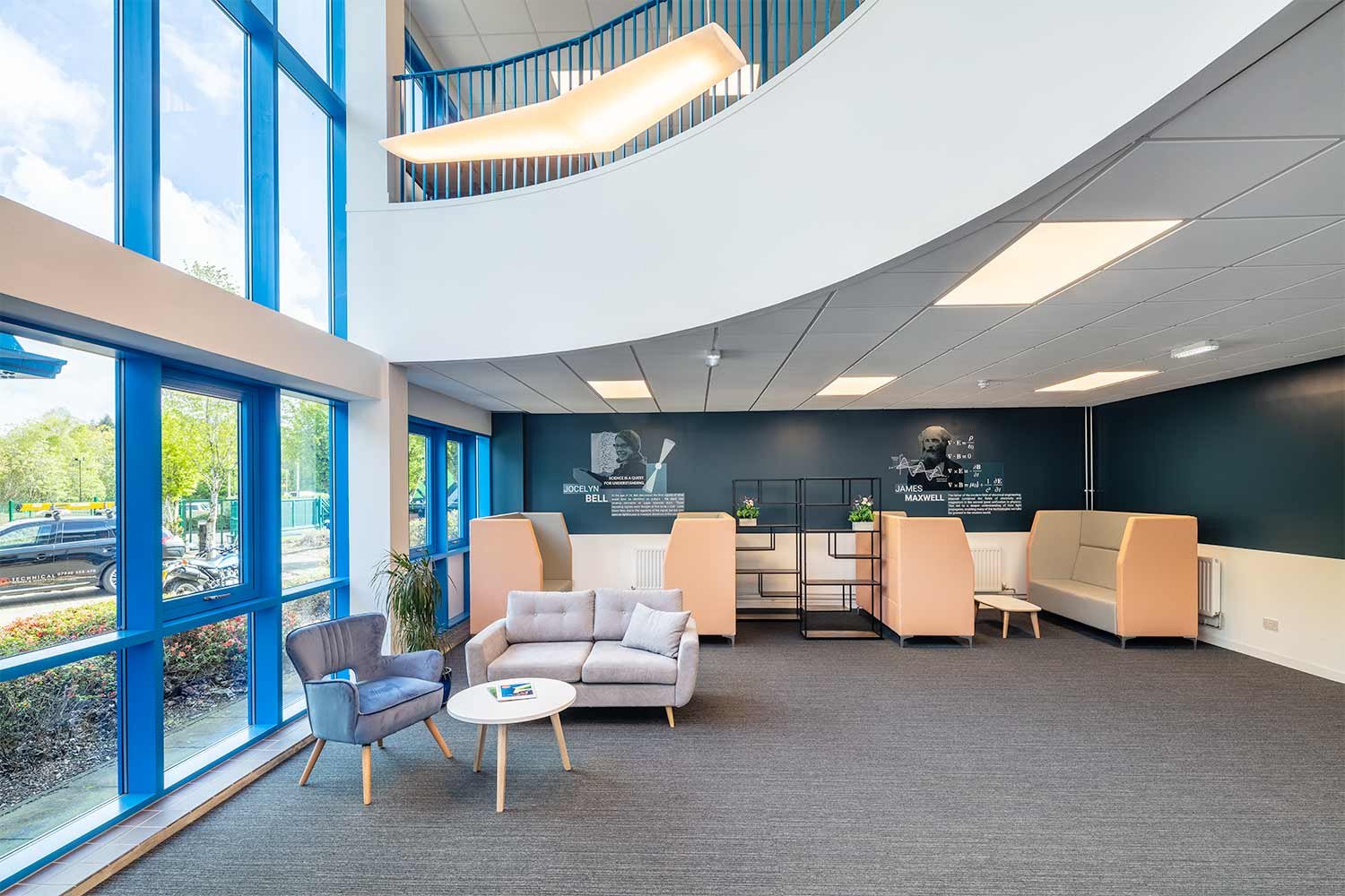
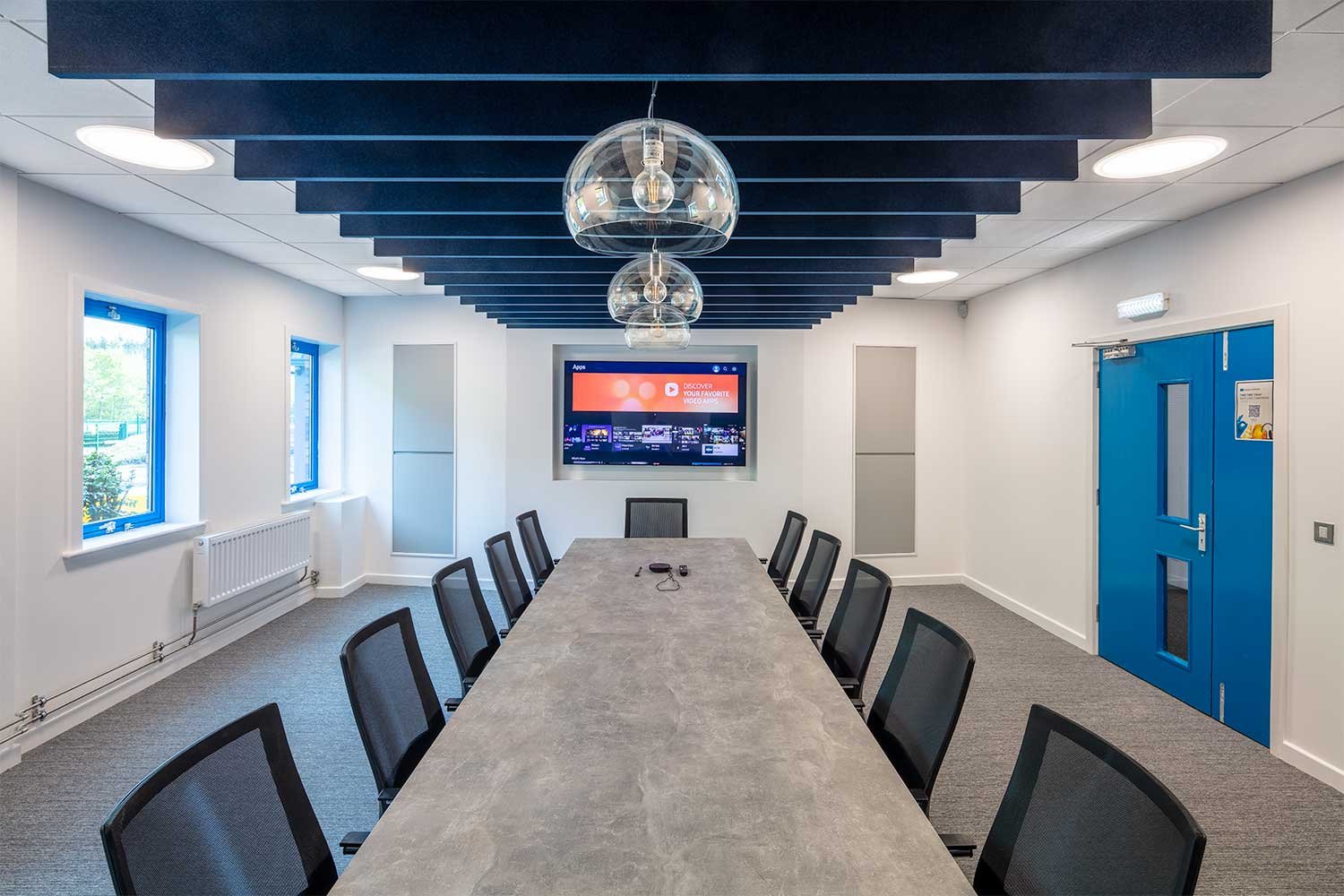
The result is a vibrant space, full of variation and colour yet retaining a sense of cohesion and professionalism that can only be achieved when you employ the services of great interior designers.
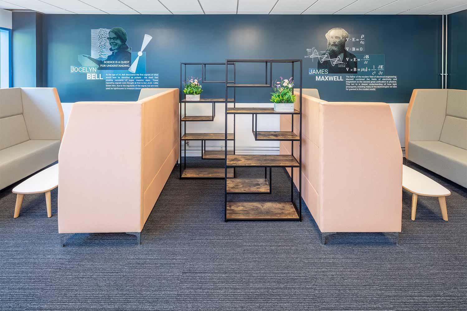
Quiet/concentration working areas are sympathetically merged alongside more creative/collaborative space with the clever use of acoustic screens and open shelving units. These create the feeling of rooms without building solid partitions, saving cost and time on site for the installation.
Impact solutions now have a facility and service offering that clients are continually blown away by whether they have seen their previous premises or not. The building and the people puts them in a great position to grow further over the next 20 years.
