Highlights Clerkenwell Design Week 2019
Another year, another Clerkenwell design week – Here are a few highlights!
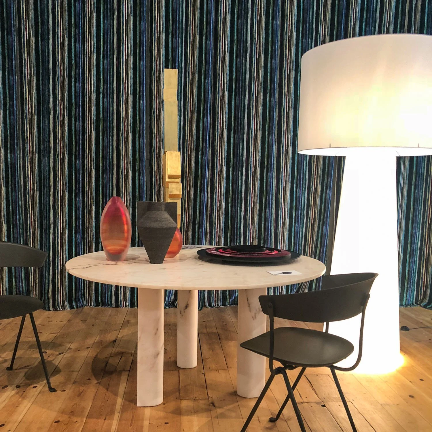
Amongst the bustle of the Clerkenwell buzz, a 360 approach was taken by Lintex realised by Lotta Agaton, a renowned interior stylist from Sweden, where she carefully considered each material and object in the curation of the showroom. The Lintex products stood proud in the warm and calm environment. The glass paired beside long-standing natural materials such as wood, clay and leather created a great mellowness to the overall space. The essence of biophilia was present, without the littering of plants, by the thoughtful use of the natural materials and neutral colour palettes. In the rise of well being in the workplace, this design approach lends itself to being more mindful, allowing us to take a step back to rest and think. Also highlighting, to never to undervalue the importance of curating spaces with well-chosen objects. In terms of new products, Lintex manages to take a fresh look at the ‘analogue’ with the A01 designed by studio Afteroom. The product had geometric shapes sandwiched between glass and framed within a square. It performed a floating illusion with quite a magical effect.
Lintex Showroom – Styled by Lotta Agaton
The geometric composition continues on to the Spacestor showroom, notably the reinvention of the storage wall and shelving unit. This development, in the current flood of grid shelving, is warmly welcomed. The elongated structure formed of cuboids rather than cubes provides an elegant silhouette, especially when finished in brass. The matte panelled shelving units paired with the large round mirror adds a sense of sophistication, complimenting the storage wall newest addition of the arched alcove. The choice of colour and finishes was inspiring. The matte materials produced a soft and slightly retro look, in rich solid tints added drama and allure.
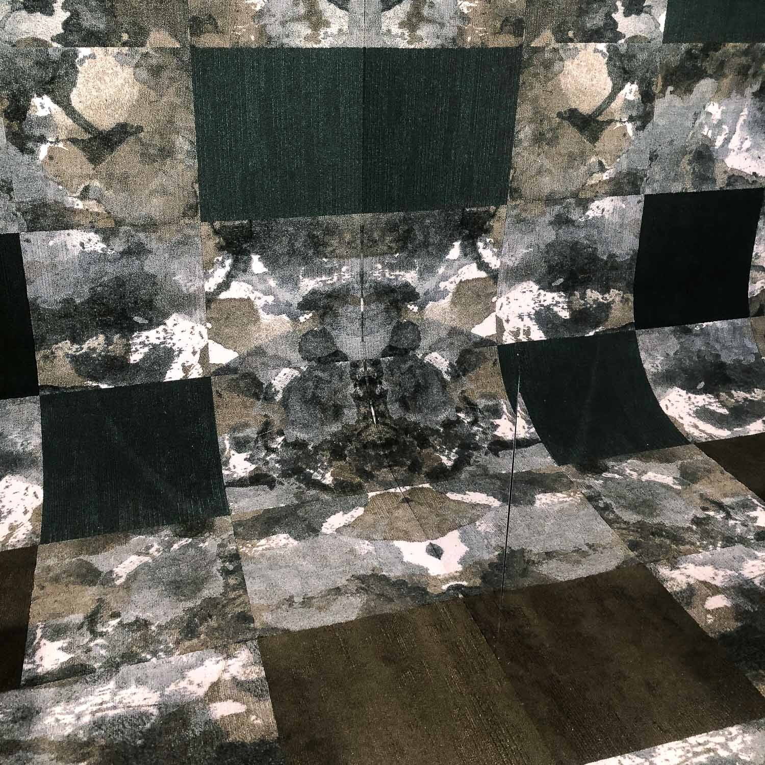
Modulyss made a statement in the Project Pavillion by focusing on the carpet tile FLUID& in the dark green tone and pairing it with Velvet&, a great example of the &-Collection. The tiles curved up to the top of the back wall, and the two mirrored sides reflected the carpet into infinity. The reflections were reminiscent of the Rorschach test, and Fluid& is appropriately tagged ‘Perfectly Imperfect’.
Modulyss – Fluid
Workplace environments shift to more emotive and wellness-centric
As the workplace environments shift to be more emotive and wellness-centric, there is a growth in creating a softer and more comfortable working landscape with essences of home. Many pieces of furniture showcased had plumper silhouettes, accentuate curves and the awakening of fluid draperies forming partitions as similarly observed in Milan 2018, yet to a less exaggerated extent.
Frovi’s latest product ‘Home’ is precisely that. It is available in various typologies that include most of the setting you could want for an informal meeting from the booth seating, a high media bench, screens and even a single seated armchair with an integrated laptop table. This product certainly makes it easy to implement the feeling of ‘Home’ in all senses.
Another product with similar effect was a Verco meeting booth. The screen was formed by an acoustic sheer delicately ruched around a wooden frame, which created rhythmic ripples. The screen cocooned around the loose furniture pieces perfectly formed inside, which produced a very dreamy ambience, a perfect retreat for when stress and anxiety levels are high.
Frovi
Verco
As employees explore how and where to achieve a greater work-life balance with genuine well-being initiatives. The design pieces released are a reflection of our time and where we are heading. A workplace has to produce a sense of belonging, where we are comfortable enough to reflect, recharge and grow without being stunted.
And this is just the start of things to come!
Text & images: interior design department
SALONE DEL MOBILE . MILANO 2018
As Clerkenwell is fast approaching, it’s only appropriate I write my review on Salone de Mobile and Fuorisalone to compare findings and inspiration for the year ahead. The design trip was last minute; a now or never opportunity regarding 2018 so I was grateful to join the wave of people that jet set from every corner of the globe.
SALONE DEL MOBILE . MILANO 2018
With the flood of designers, exhibitors and creatives, accommodation was initially a slight struggle with business owners and money makers hitching up prices almost quadruple the price. However, I managed to book an apartment with a beautiful terrace in the Tortorna District of Milan. If your time is limited, I would recommend staying in Tortona as it is one of the more highly concentrated areas of ‘Fuorisalone’ crammed with exhibitions, cafes and events. The Brera district is very similar in this respect too, if not more so. But to really see as much as possible, confirmed as the world’s largest furniture furniture and design fair, Salone del Mobile at Rho Fiera is a must. Although, it’s easy to get lost in the labyrinth of displays and multiple halls, so be sure to make note prior of the exhibitors you’d like to see.
From an overall viewpoint, I noticed there was less of a focus placed on new product launches but rather exhibitors making a conscious effort to create memorable experiences, in fact very shareable as well. Particularly in the age of the selfie, mirrors and reflective surfaces was a prevalent player performing as a disruption to the spatial realm generating paradoxical type arrangements. COS supported the work of the California-based artist Philip K. Smith to bring ‘Open Sky’ an installation to Palazzo Isimbardi. That comprised of a series of mirrored panels each tilted at a 47-degree angle, which respectfully gave a nod to the experience, the architecture and Milan itself.
Continuing the theatrical-like illusion, the emergence of larger-than-life translucent and see-through products that act as a divider in any setting, a flexible alternative to facilitates our everchanging needs and wants. One of the most magical experiences was visiting HAY at Palazzo Clerici, the location oozed with historical features poetically juxtaposed with a series of installation that conveyed examples of past and future living scenarios; with a human-centric approach to interior design, rather than focusing on the structure. The Rayures modular screen in fluted glass for Glass Italia designed by the Ronan and Erwan Bouroullec was a notable highlight. A recurring expression of drama also took the form of translucent floor to ceiling draperies, which would add a show-stopping, yet fluid and soft tactile feature to any environment.
Many pieces of furniture acquired the shape of an exaggerated figure with plumper silhouettes, inflated curves and ballooned proportions. The Tacchini exhibition was a great example of softness and the continuing fluidity in mix of dusty pink, pastel yellow and off-set geometrics, all adding to the cocooning type feeling prevailed. I had taken a similar emotional response to CC-Tapis, especially the rug designed by Patricia Urquiola with the comparable tonal colour composition and a hyper tactile surface.
The integration of biophilia within products, exhibitions, and displays experience remained strong throughout Salone de Mobile and Fuorisalone, the recognition of the well-being benefits of biophilic design as reached a global scale, and the outlook being the trend is here to stay. The miniforms collection plays with shape and form to provide a seamless stand to place your plants, whether be it on the wall, floor or reflecting against a mirror. A perfect opportunity to add height and interest to any environment.
As well as nature, designers are looking up to the skies for inspiration as they explore the symbolism of the sun, moon, and space. This could be due to increasing cultural interest in spirituality, which can be seen to inform objects and settings to ignite people’s wonder and delight through magical and cosmic-like shapes. Equally, many exhibitions featured the use mismatching of materiality, furniture shapes, and products through styling, which also envelopes a similar unusual sense of awe due to the unexpected and uncanny (a.k.a the googly eyes).
Milan took me through an unexpected and unimaginable journey, I didn’t know what to expect. With just over 48 hours in the city, I consumed an incredible amount of design, good food, some wine and walked around 40km. Even now it’s still taking some time to digest everything I saw and experienced.
A blog post by Flora Hogg
A little trip to Actiu in Castalla Spain
What a brilliant idea that was! When we were brainstorming about a suitable location to film a particular scene for our new company video, someone here in the office (sorry Sam that you were too busy to go yourself:) suggested to ask the lovely people of furniture designers and manufacturers Actiu if we could do that in their offices and gardens.
The particular scene was dependent on good weather and although we love it up here in Scotland the weather is, in fairness, hard to predict..
Castalla has a lot in common with Scotland. It reminded us of Stirling but then in the colour beige.
Actiu, always on the move
Always on the movie? Not quite, but when it comes to visual appeal we here at Amos Beech in Scotland had to include them in our little film. The visual appeal doesn't only apply to their products though:
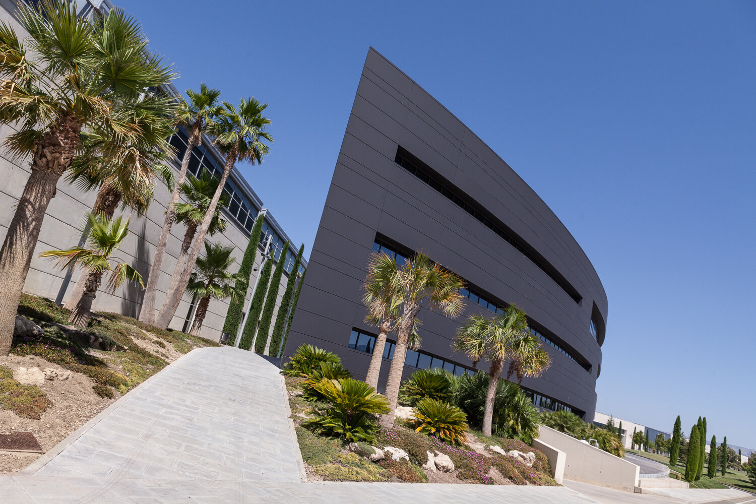
Architecture and sustainability at the technology park in Castalla
You don't suddenly wake up and start producing stunning design furniture. You live it and breath it and when you look at Actiu, they certainly do! It therefore doesn't come as a surprise to us that Vicent Berbegal, the president and founder of Actiu, has been awarded 'European Entrepreneur of the Year 2017' at the European Business Awards (EBA) ceremony, during a gala in Dubrovnik (Croatia). We have seen many factories, showrooms and offices over the years, but Actiu is certainly up there with the best. The design of the Actiu Technology Park, created by José María Tomás LLavador, was based on sustainability and the self-sufficient use of natural resources right from the outset. Rain water is collected from the roofs and stored in cisterns for irrigation and industrial use. It is also worth mentioning that Actiu is in fact an energy plant as it supplies 6 times more electricity into the grid than it needs itself.
Biophilia
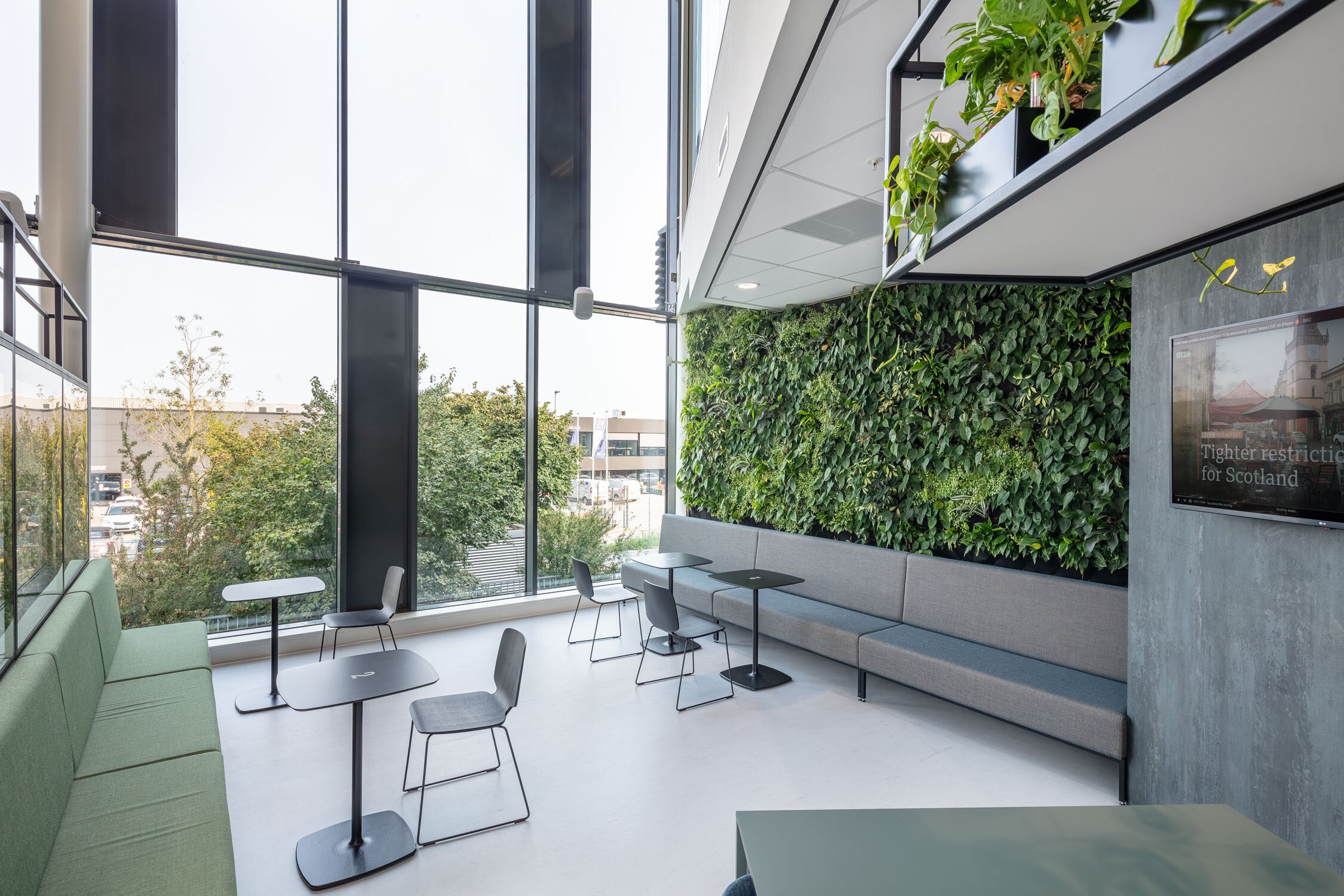
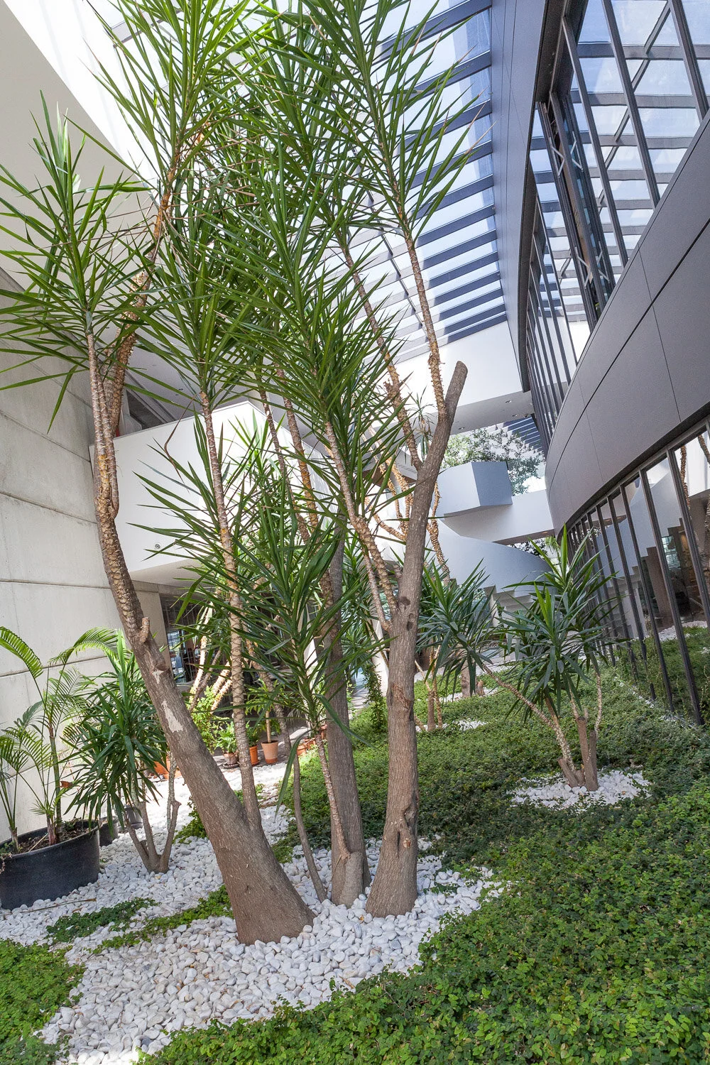
Biophilic interior design (meaning love of nature) focuses on mans' innate attraction to nature and natural processes and brings elements of nature into the built environment. We have used this in our designs a couple of times and are currently working on a stunning idea for one of our clients (watch this space!). Actiu however, is at the forefront of it in their own offices:
One of the indoor gardens at Actiu
Biophilia suggests that we all have a genetic connection to the natural world built up through hundreds of thousands of years of living in agrarian settings. It is a term popularized by American psychologist Edward O Wilson in the 1980’s, when he observed how increasing rates of urbanisation were leading to a disconnection with the natural world. Biophilia is of ever increasing importance to our health and well-being in the built environment.
Our film
We are sort of halfway through the making of the Amos Beech video and can't reveal it just yet, as only the final end result can communicate what it is supposed to do. In that sense it is a bit like an interior fit out project:)
The film crew from Iris Media discussing and finalising the shots
(the film will feature two of Actiu's stars Christina and David)
The Amos Beech film will explain what we as an interior design, fit-out and furniture company are about, using what a colleague here in the office calls 'moving stills'. All of this in the attention span of an average internet user...
Serious stuff!
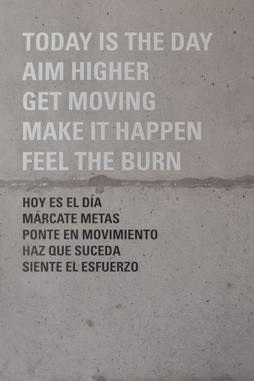
Careful planning and advice by the Actiu team meant that we were saved from the real burn that was expected shortly after midday.
Text on the wall outside the company gym @actiu
We tend to underestimate the power and heat of the sun. Some of us even set of to Castalla without suncream, shorts and slippers!
Actiu: Thank you very much!
Update: we have now (27-06-2018) launched our videos! You can see them here:
All Images by Photographer Zwolle


