Highlights Clerkenwell Design Week 2019
Another year, another Clerkenwell design week – Here are a few highlights!
Amongst the bustle of the Clerkenwell buzz, a 360 approach was taken by Lintex realised by Lotta Agaton, a renowned interior stylist from Sweden, where she carefully considered each material and object in the curation of the showroom. The Lintex products stood proud in the warm and calm environment. The glass paired beside long-standing natural materials such as wood, clay and leather created a great mellowness to the overall space. The essence of biophilia was present, without the littering of plants, by the thoughtful use of the natural materials and neutral colour palettes. In the rise of well being in the workplace, this design approach lends itself to being more mindful, allowing us to take a step back to rest and think. Also highlighting, to never to undervalue the importance of curating spaces with well-chosen objects. In terms of new products, Lintex manages to take a fresh look at the ‘analogue’ with the A01 designed by studio Afteroom. The product had geometric shapes sandwiched between glass and framed within a square. It performed a floating illusion with quite a magical effect.
Lintex Showroom – Styled by Lotta Agaton
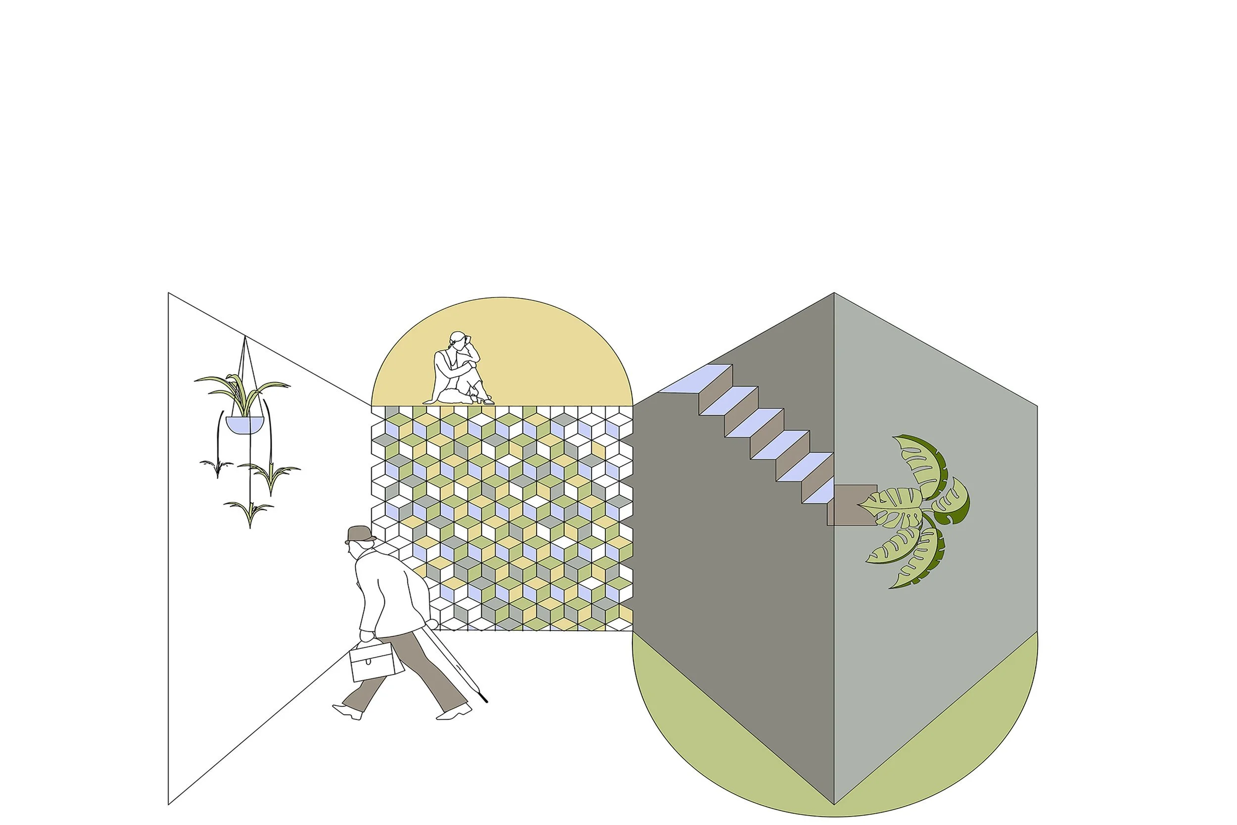
The geometric composition continues on to the Spacestor showroom, notably the reinvention of the storage wall and shelving unit. This development, in the current flood of grid shelving, is warmly welcomed. The elongated structure formed of cuboids rather than cubes provides an elegant silhouette, especially when finished in brass. The matte panelled shelving units paired with the large round mirror adds a sense of sophistication, complimenting the storage wall newest addition of the arched alcove. The choice of colour and finishes was inspiring. The matte materials produced a soft and slightly retro look, in rich solid tints added drama and allure.
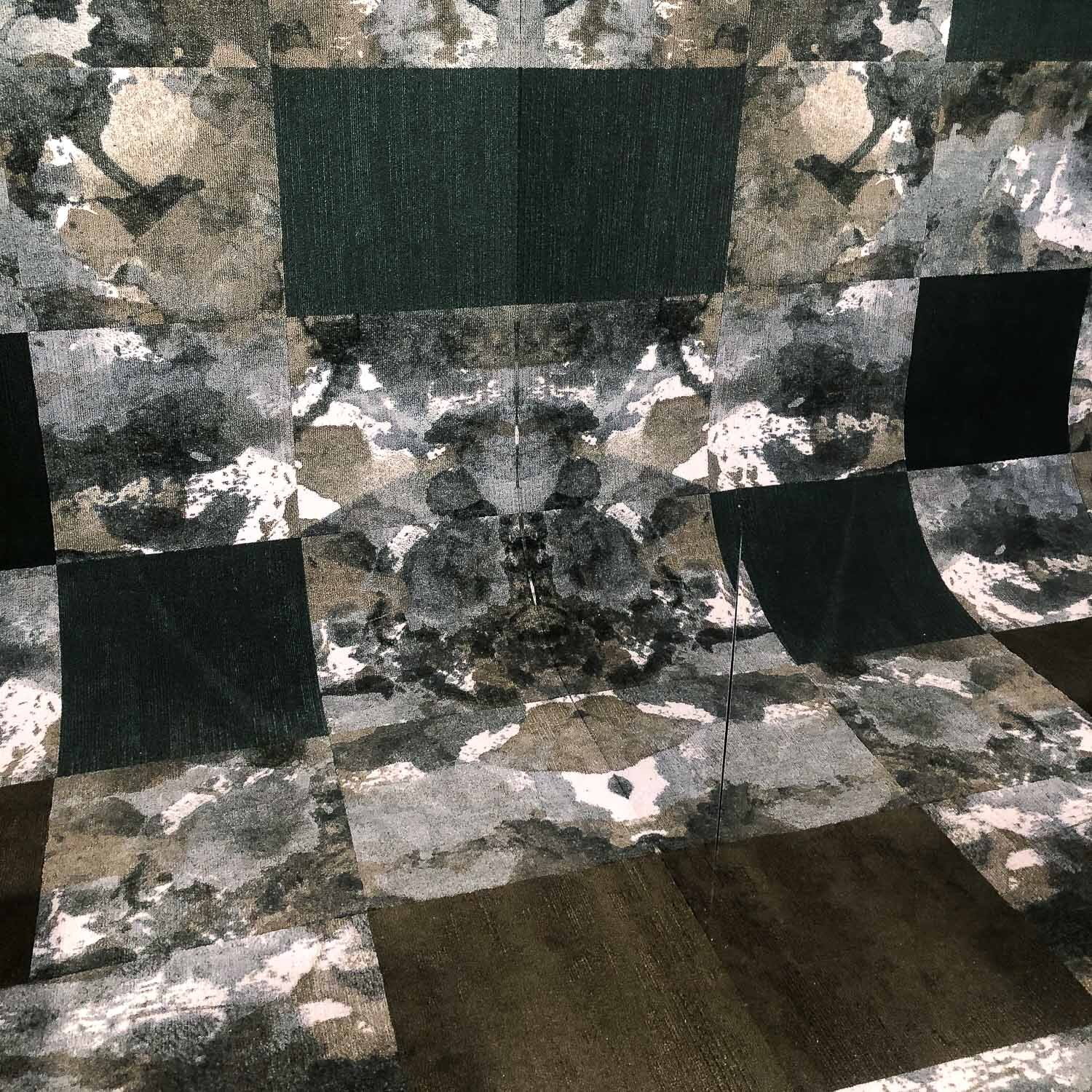
Modulyss made a statement in the Project Pavillion by focusing on the carpet tile FLUID& in the dark green tone and pairing it with Velvet&, a great example of the &-Collection. The tiles curved up to the top of the back wall, and the two mirrored sides reflected the carpet into infinity. The reflections were reminiscent of the Rorschach test, and Fluid& is appropriately tagged ‘Perfectly Imperfect’.
Modulyss – Fluid
Workplace environments shift to more emotive and wellness-centric
As the workplace environments shift to be more emotive and wellness-centric, there is a growth in creating a softer and more comfortable working landscape with essences of home. Many pieces of furniture showcased had plumper silhouettes, accentuate curves and the awakening of fluid draperies forming partitions as similarly observed in Milan 2018, yet to a less exaggerated extent.
Frovi’s latest product ‘Home’ is precisely that. It is available in various typologies that include most of the setting you could want for an informal meeting from the booth seating, a high media bench, screens and even a single seated armchair with an integrated laptop table. This product certainly makes it easy to implement the feeling of ‘Home’ in all senses.
Another product with similar effect was a Verco meeting booth. The screen was formed by an acoustic sheer delicately ruched around a wooden frame, which created rhythmic ripples. The screen cocooned around the loose furniture pieces perfectly formed inside, which produced a very dreamy ambience, a perfect retreat for when stress and anxiety levels are high.
Frovi
Verco
As employees explore how and where to achieve a greater work-life balance with genuine well-being initiatives. The design pieces released are a reflection of our time and where we are heading. A workplace has to produce a sense of belonging, where we are comfortable enough to reflect, recharge and grow without being stunted.
And this is just the start of things to come!
Text & images: interior design department


