A new customer experience centre for Signature Flight Support, Edinburgh
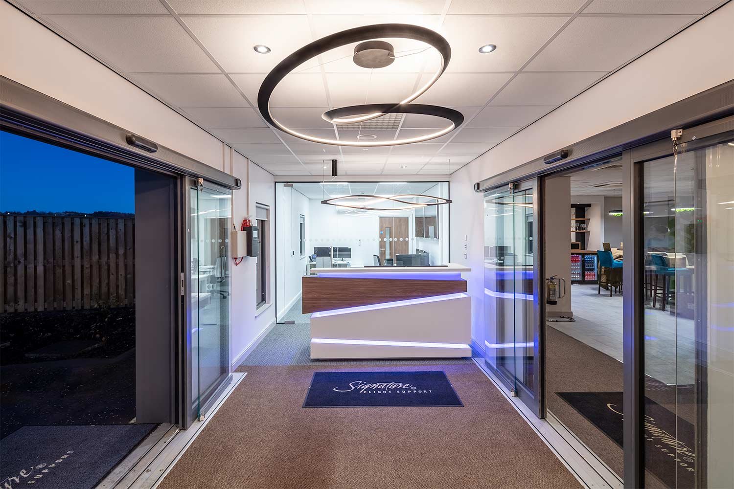
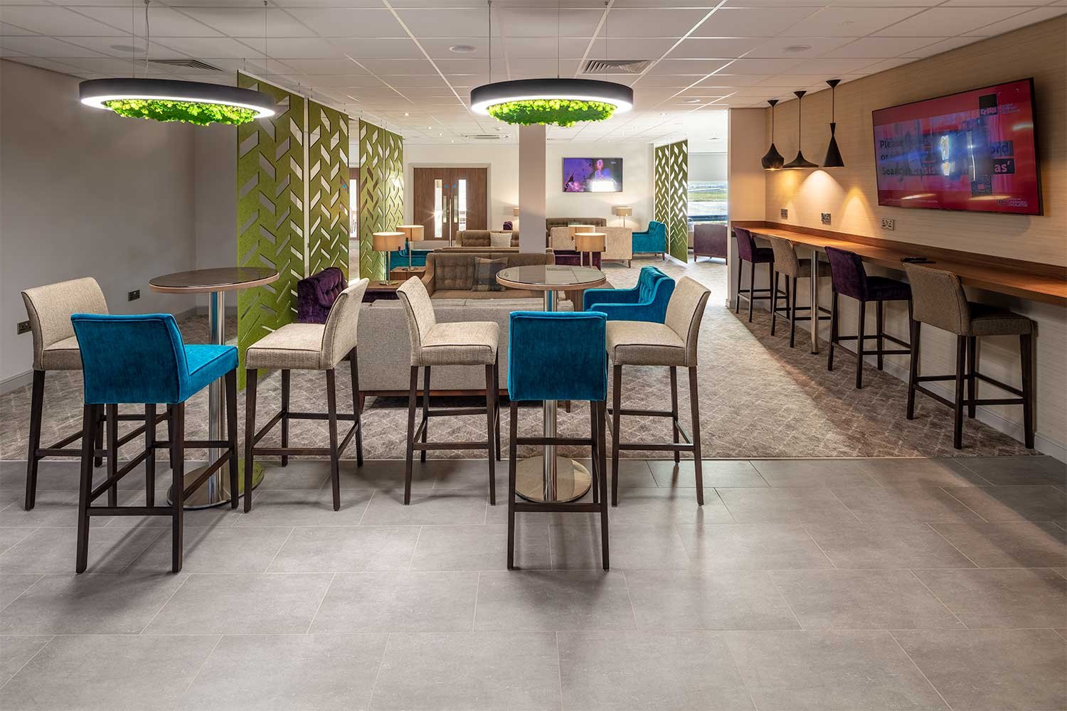
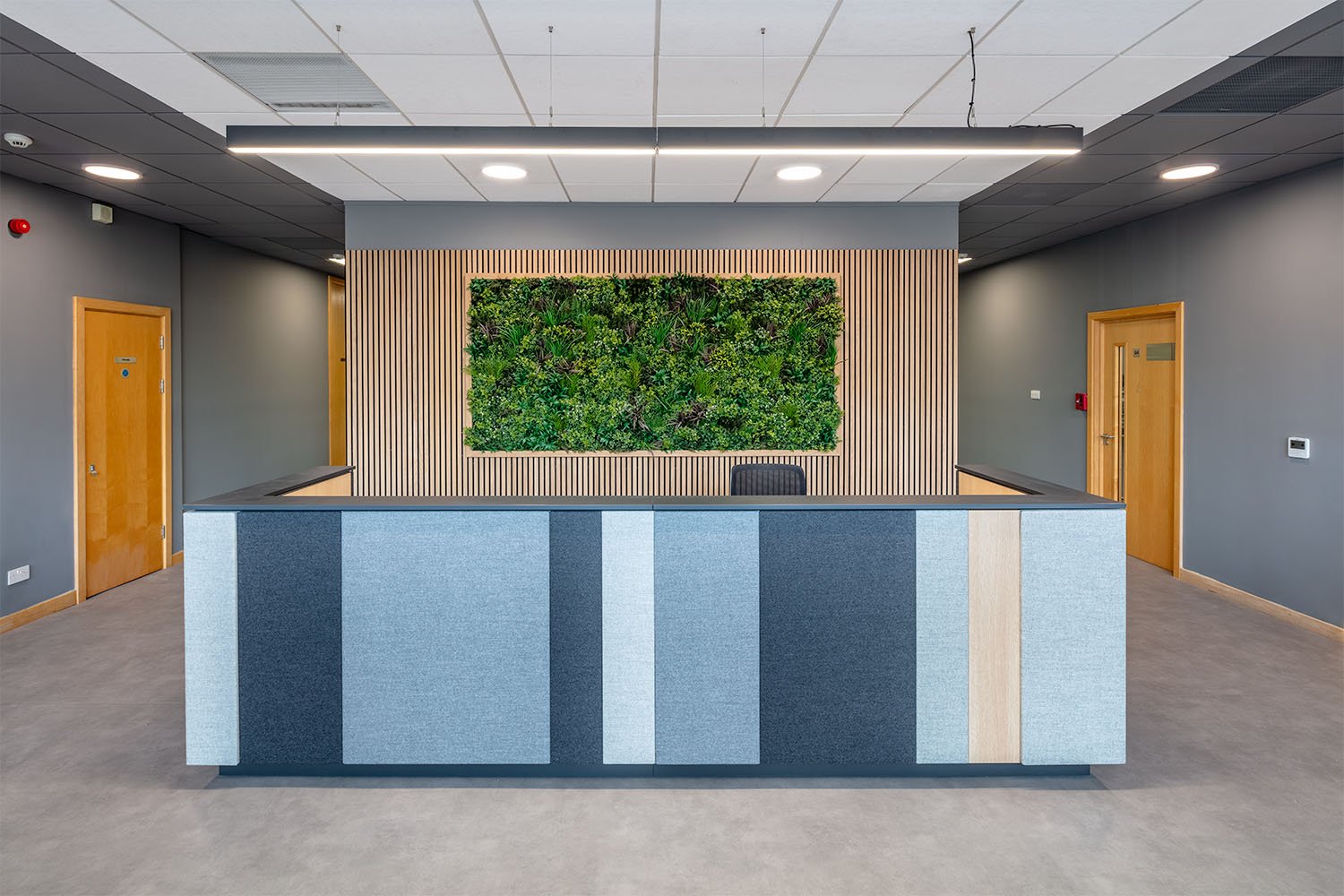
Amos Beech was approached by Signature Flight Support to assist them with the internal fit-out and finishes of their new customer experience centre at Edinburgh Airport.
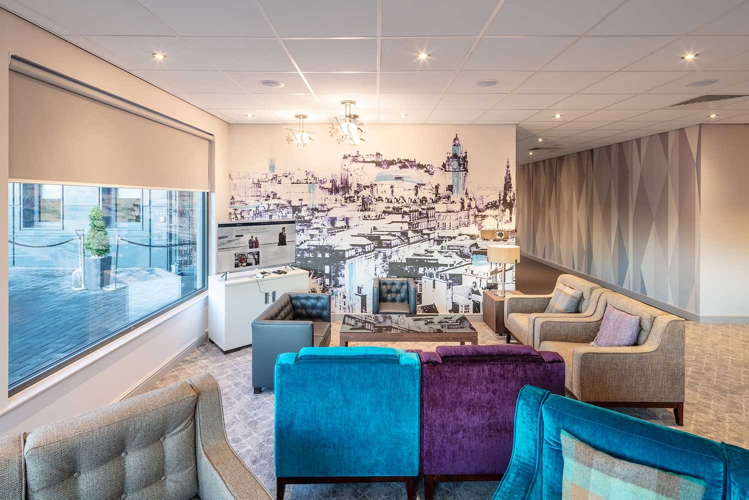
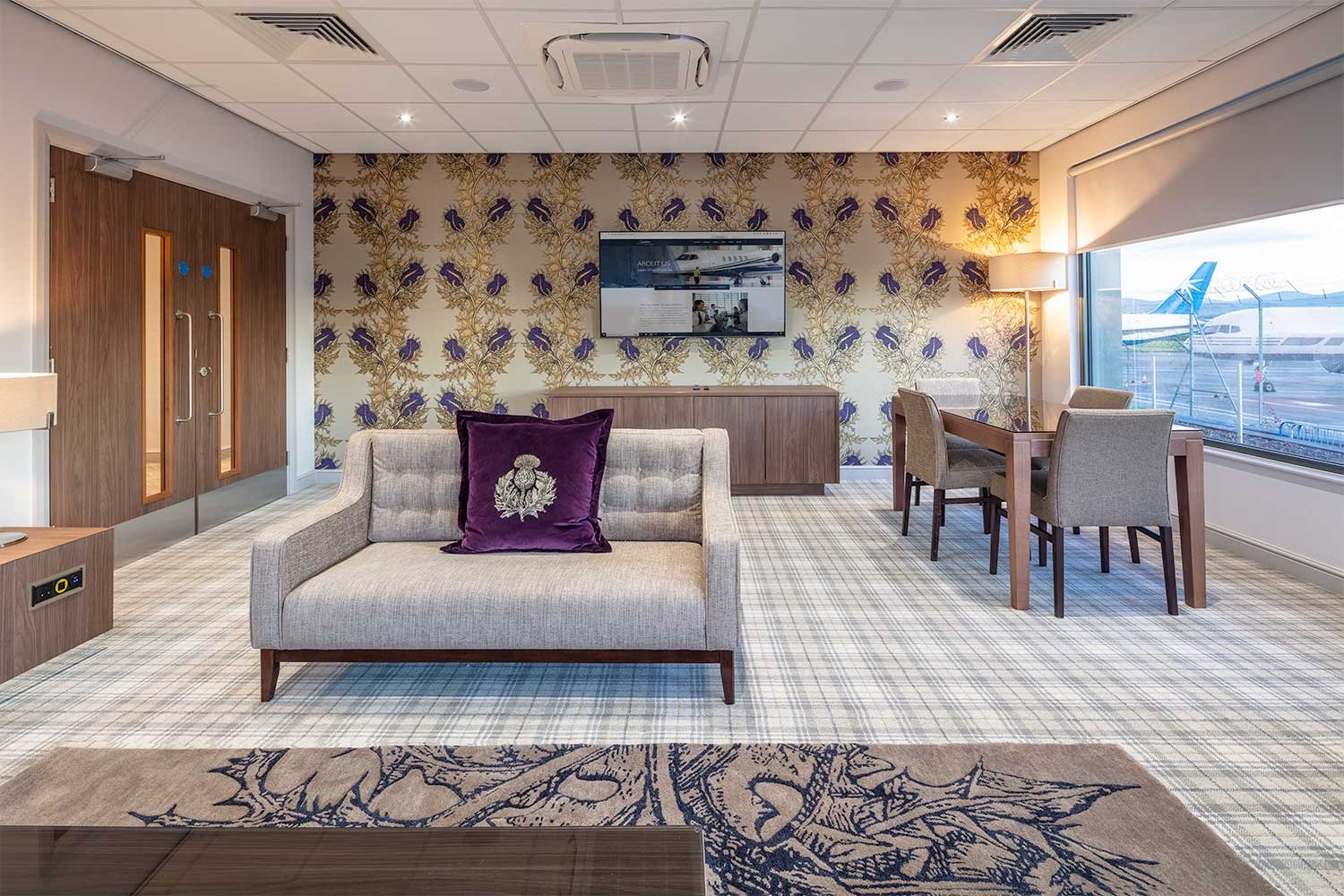
The brief was to take a modular building and turn it into a high quality finished interior that reflected the international reach of the business and subtly integrate an Edinburgh/Scottish overtone.
Our Head of Design, Alison Lyall worked closely with the client over many meetings to fine tune the detail to the point where they were delighted with the design proposals. The project was delivered by Oskar James who whilst managing all aspects of the project, also found time to assist in other areas.
This included the supply and installation of an electric charging point in the carpark and a high quality stereo sound system for the departure lounge and VIP suites.
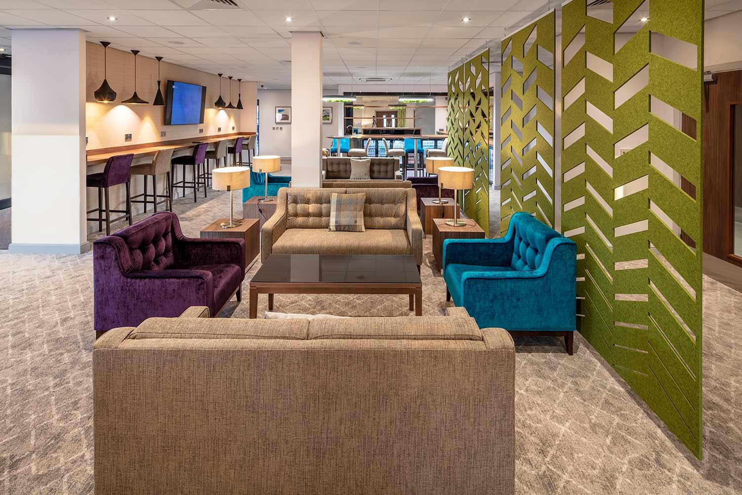
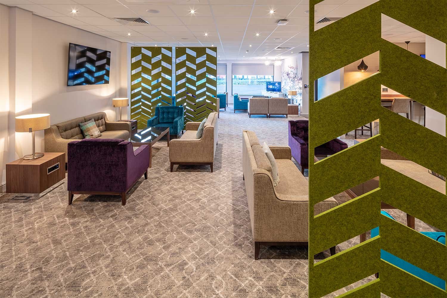
Hanging acoustic dividers
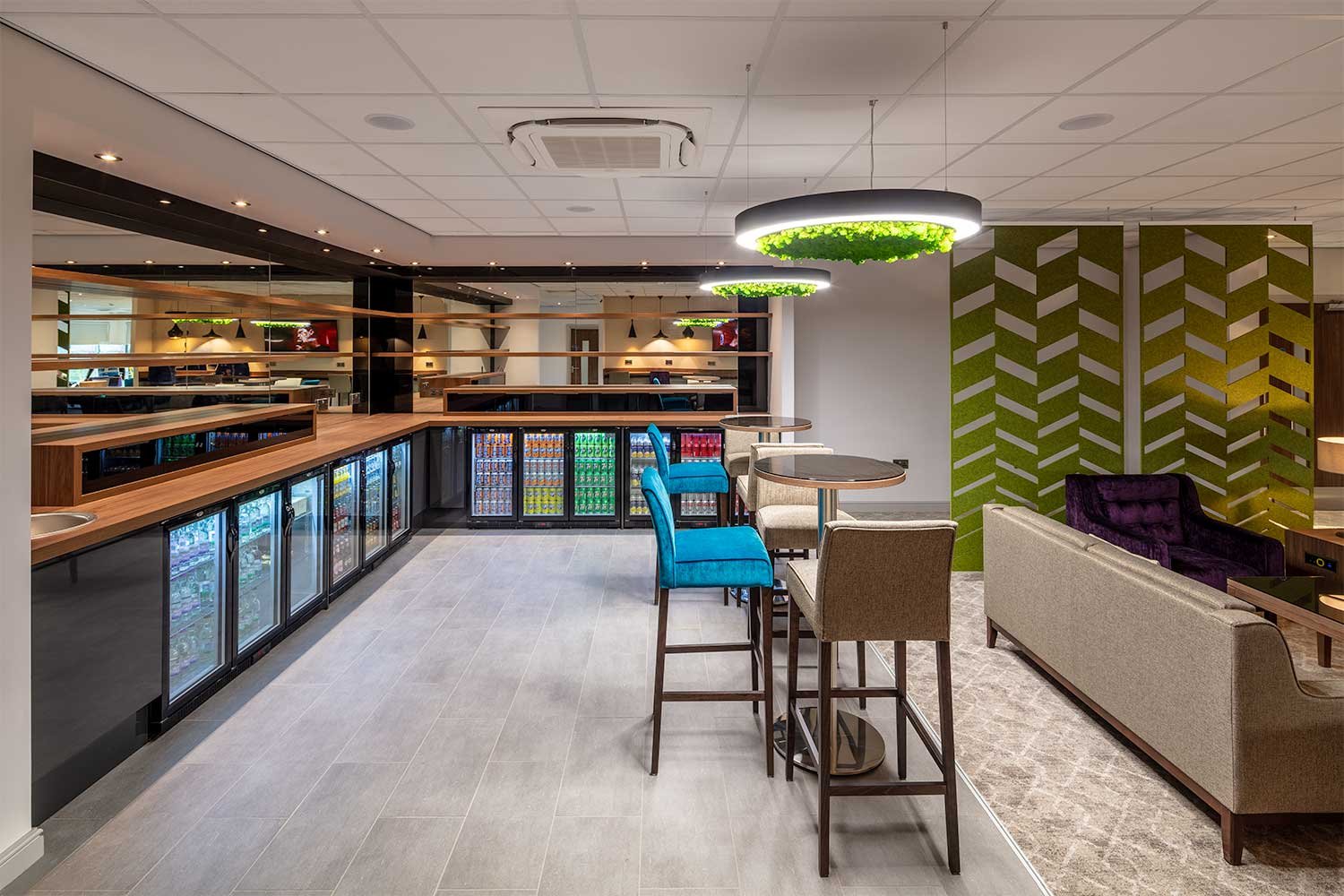
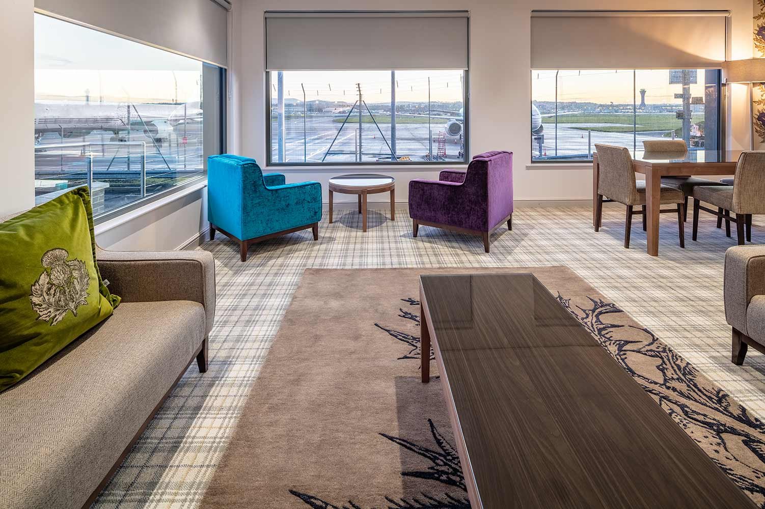
From the reception desk at front of house, moving through the self-serve bar area into a relaxing and well appointed departure lounge, travellers experience a relaxing and convivial environment whilst they wait to board their flight. Hanging acoustic dividers provide privacy between groups and the feeling of rooms without walls.
If privacy and discretion is important, then there are separate VIP lounges too. A conference room and remote workspaces are also provided for Signature’s clients.
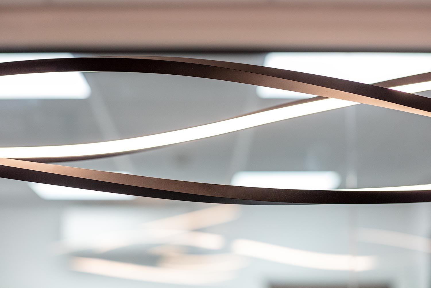
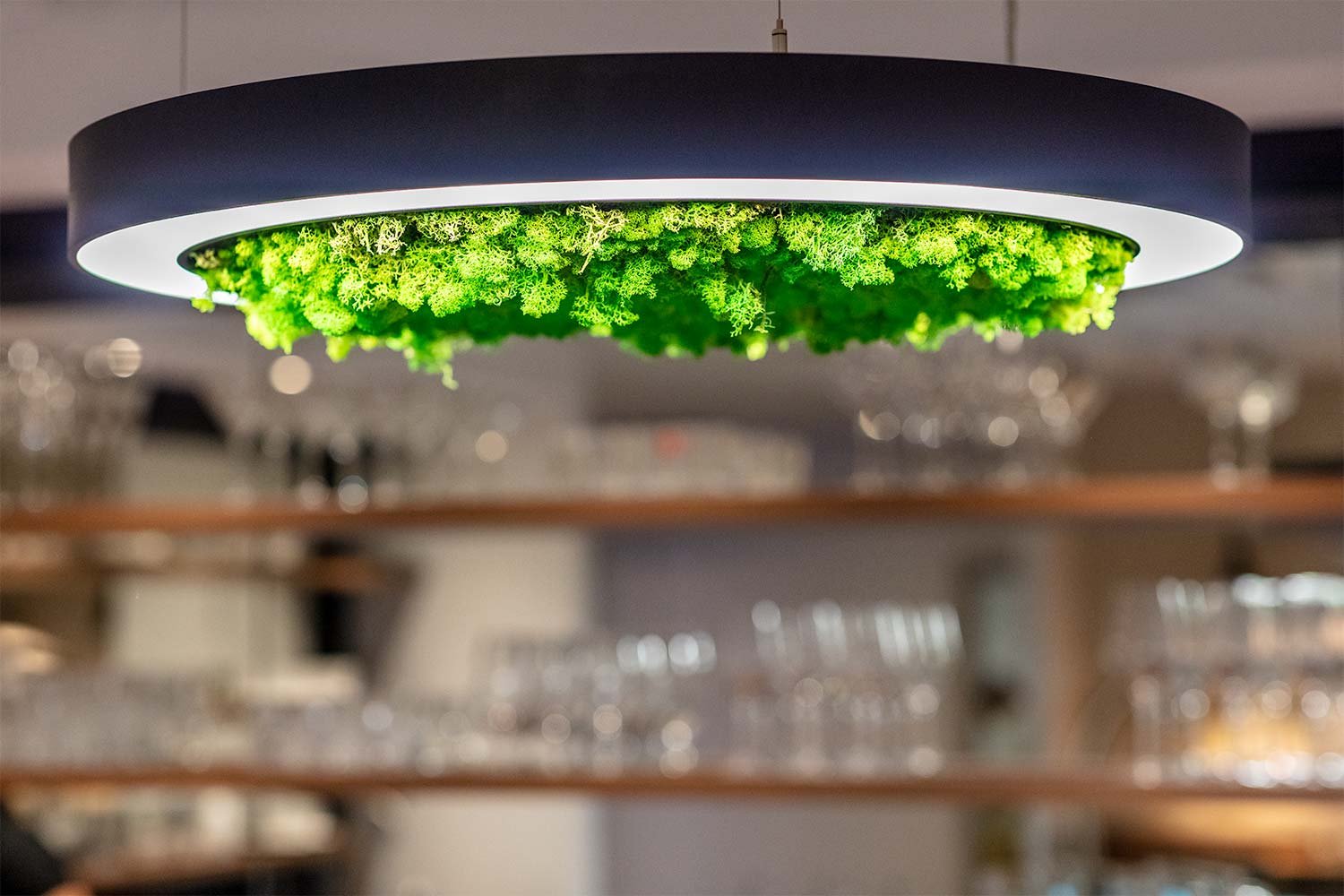
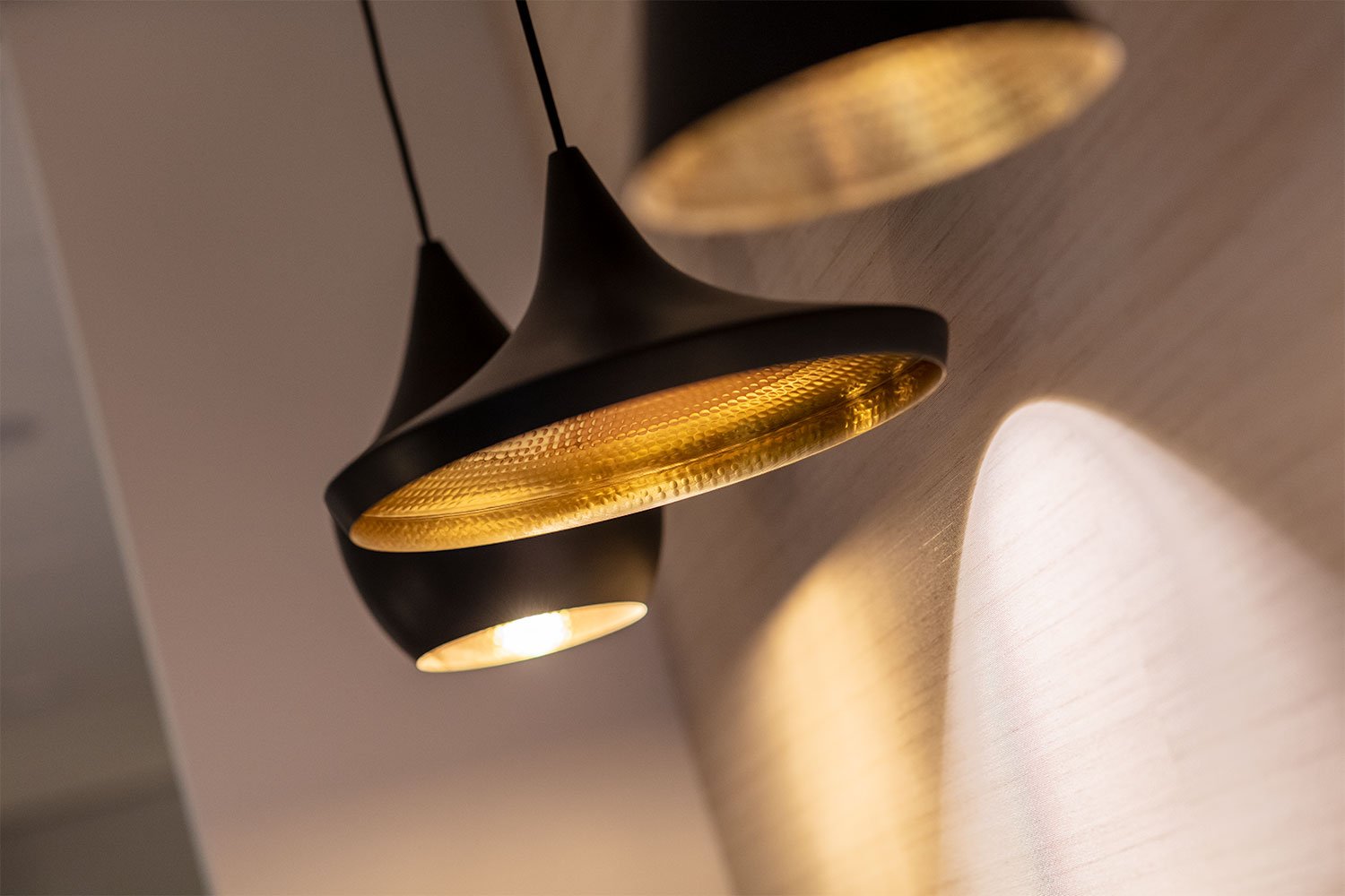
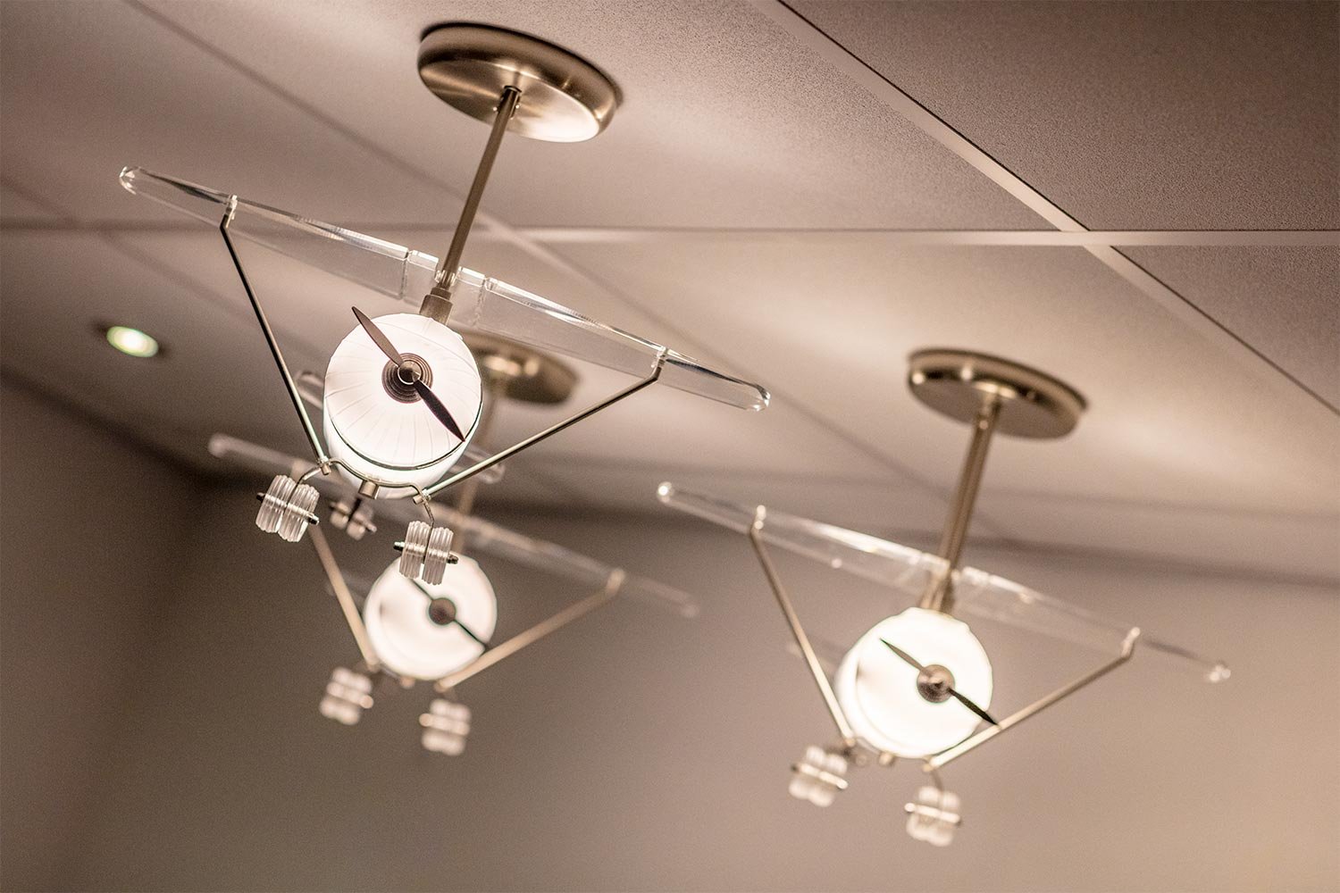
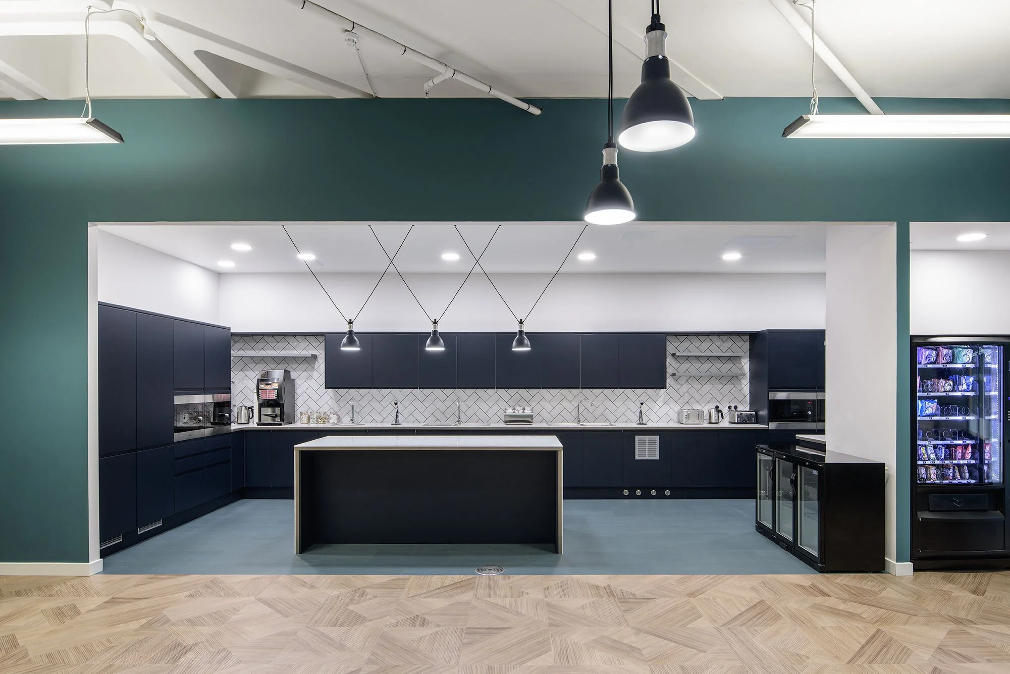
The bar area has been expertly built using both off the shelf components and bespoke cabinetry. Feature lighting and LED mood lighting combine perfectly to create the warmth and general ambience of a high end interior. Finishing items such as cushions, rugs and wall coverings enhance the overall look and provide the Edinburgh/Scottish overtones that was part of the design brief.
The finished result is a massive improvement on the previous building and has had many positive comments from Signature Flight Support customers as they have arrived and departed through the new facility.
Published: 2 March 2023
Design, Build, Text & Photography: The Amos Beech Team
A practical and efficient workspace for Close Brothers Asset Management in Glasgow
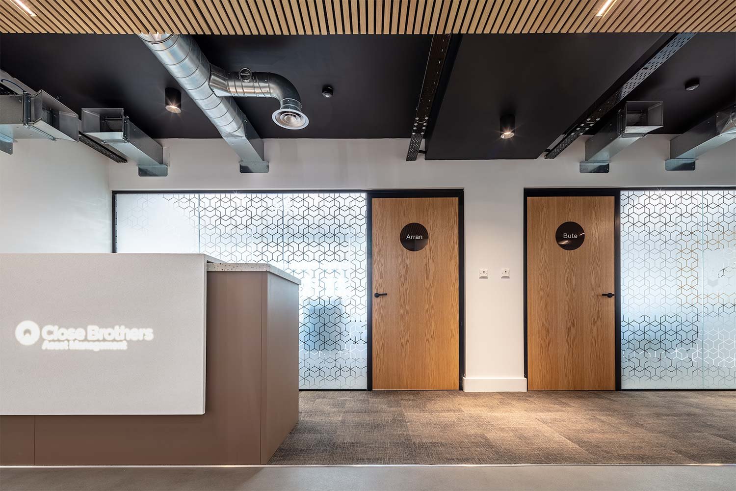
Close Brothers Asset Management decided to downsize post-covid and secured a top floor office space on St Vincent Street.
The space had been partially refurbished to a rudimentary Cat A level and required a complete fit-out.
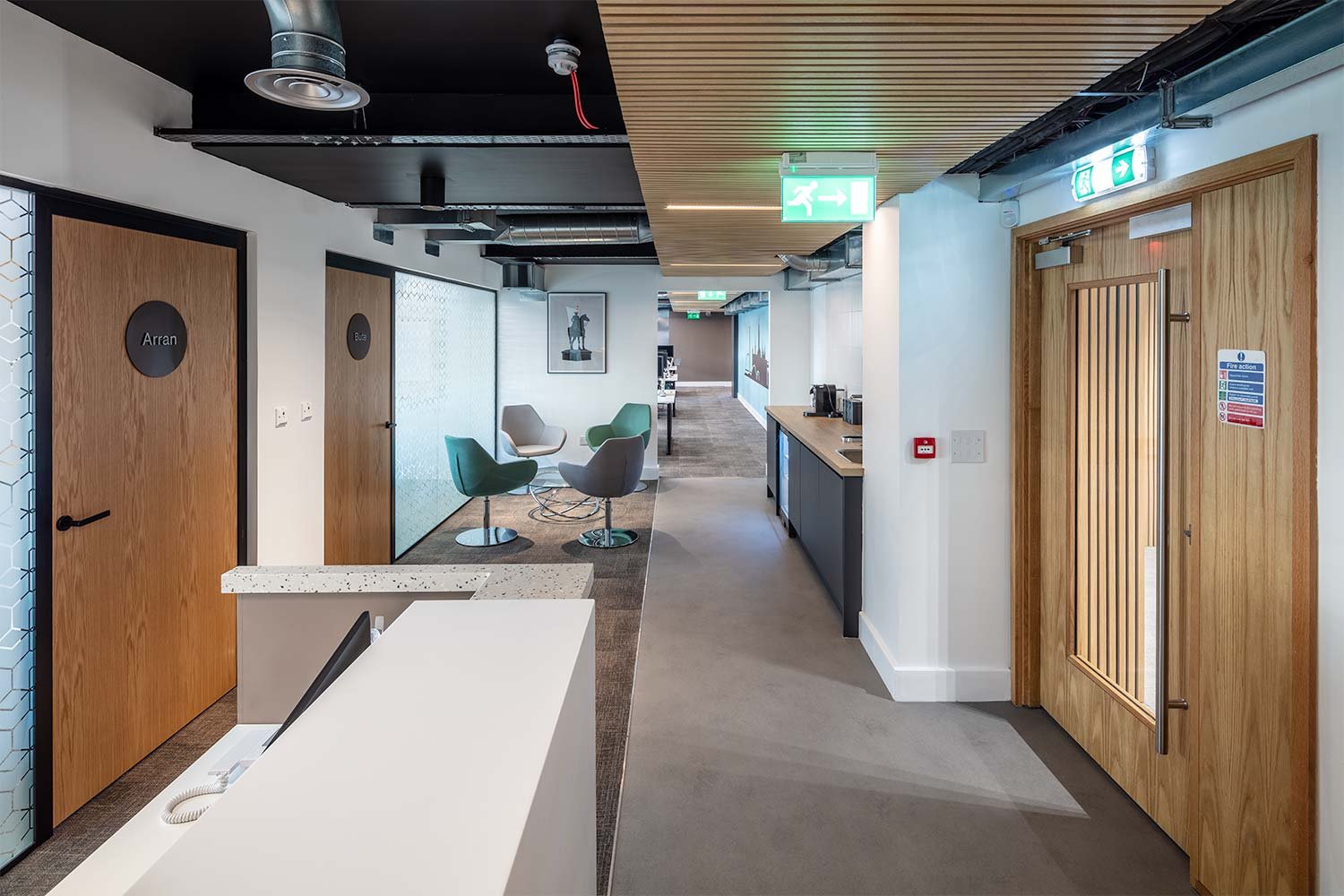
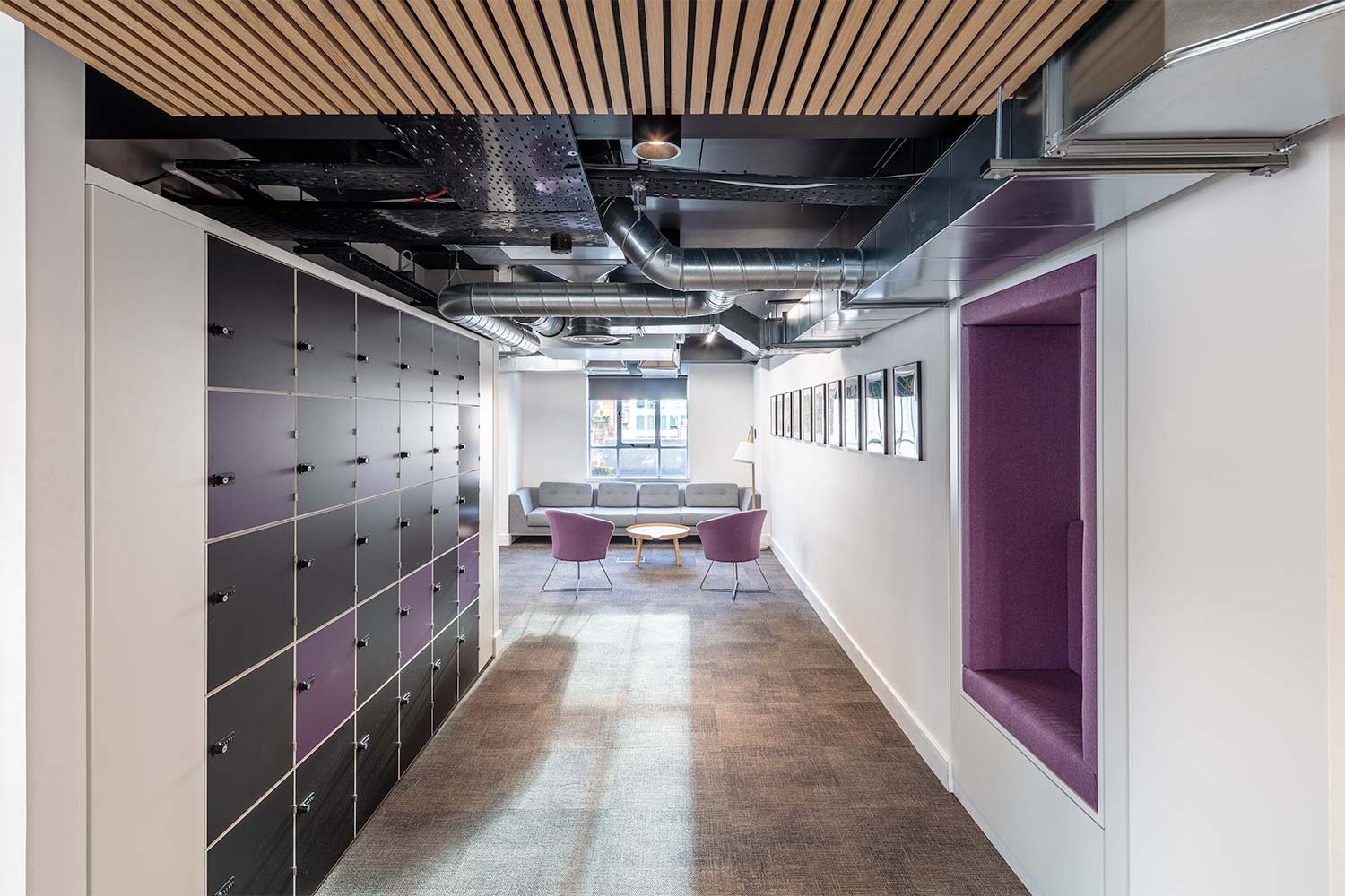
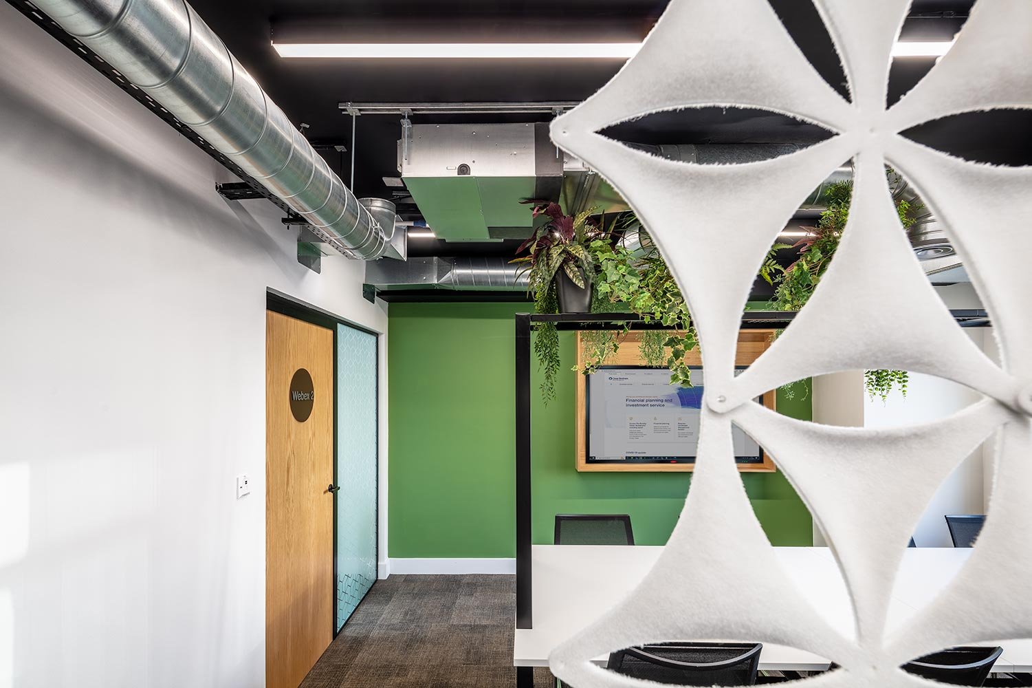
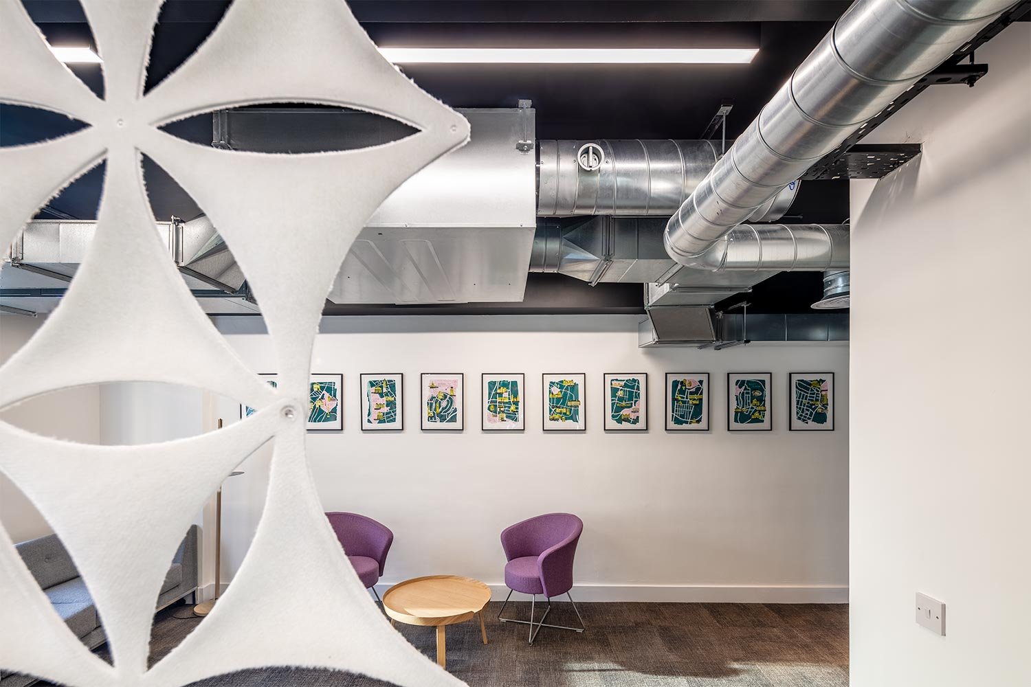
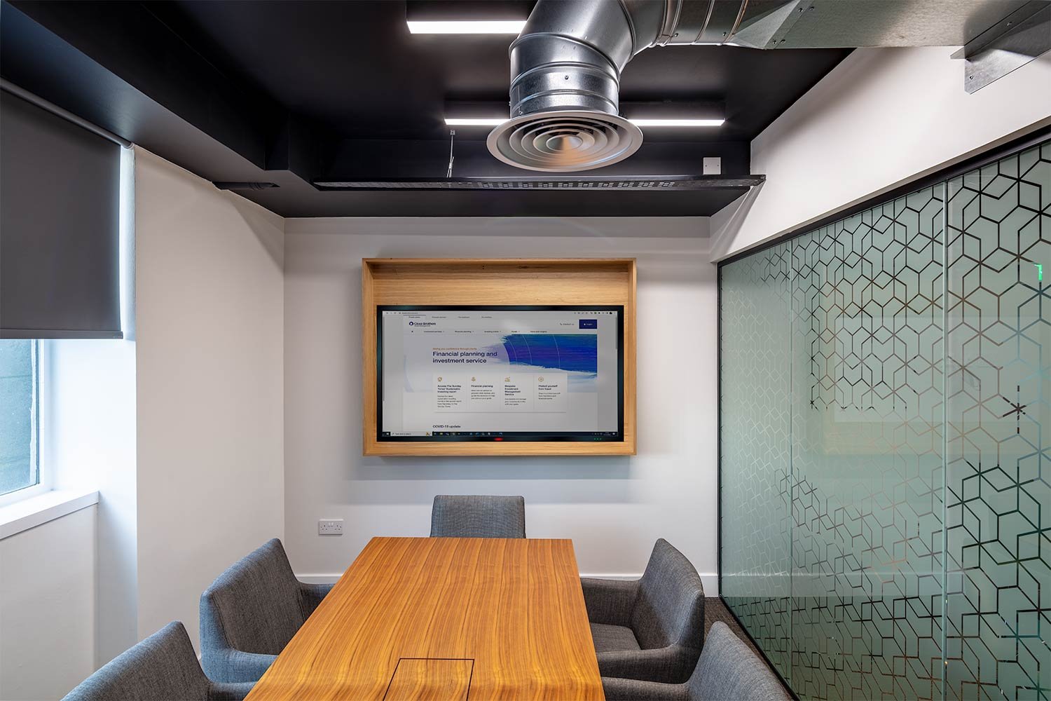
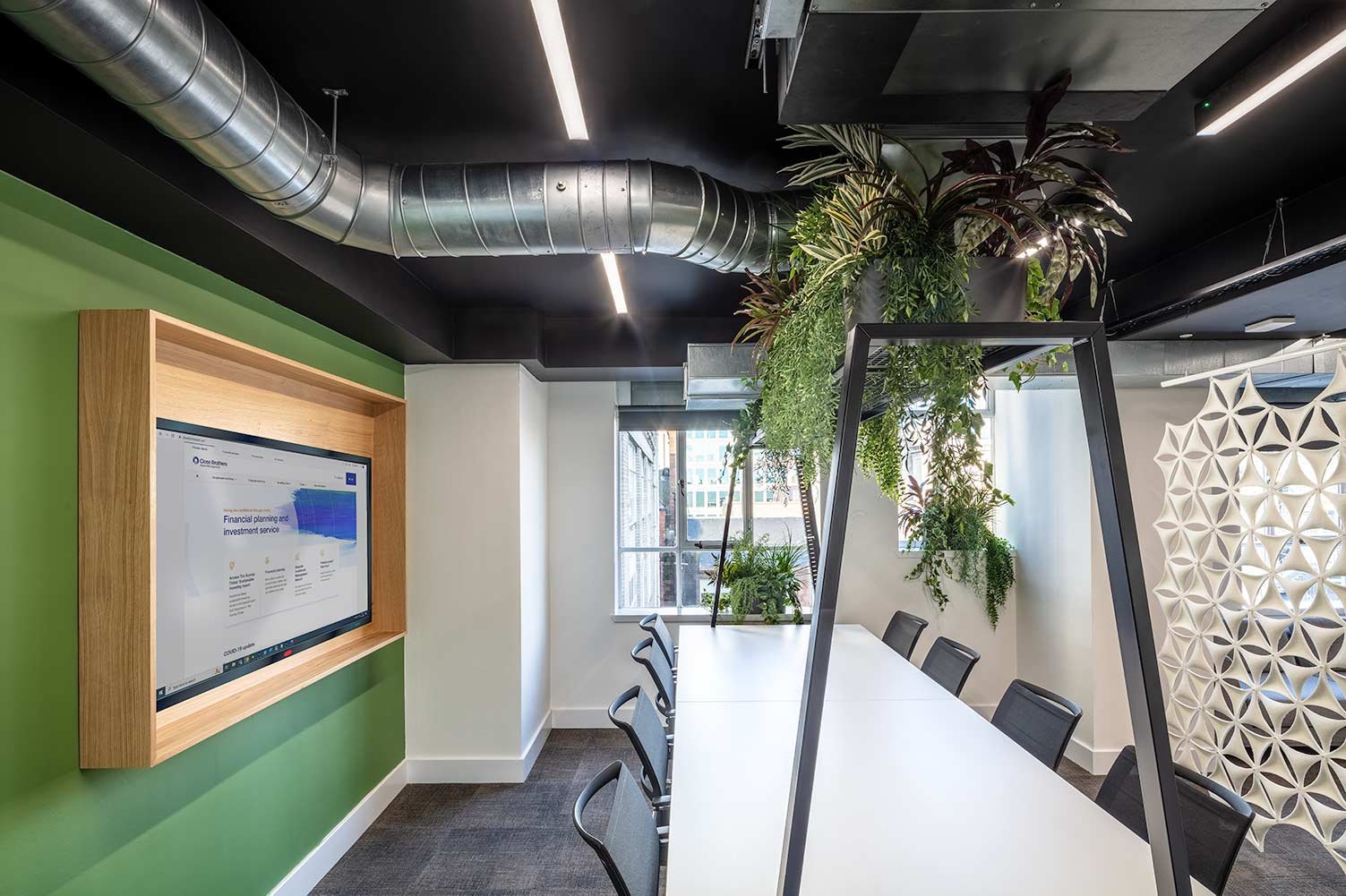
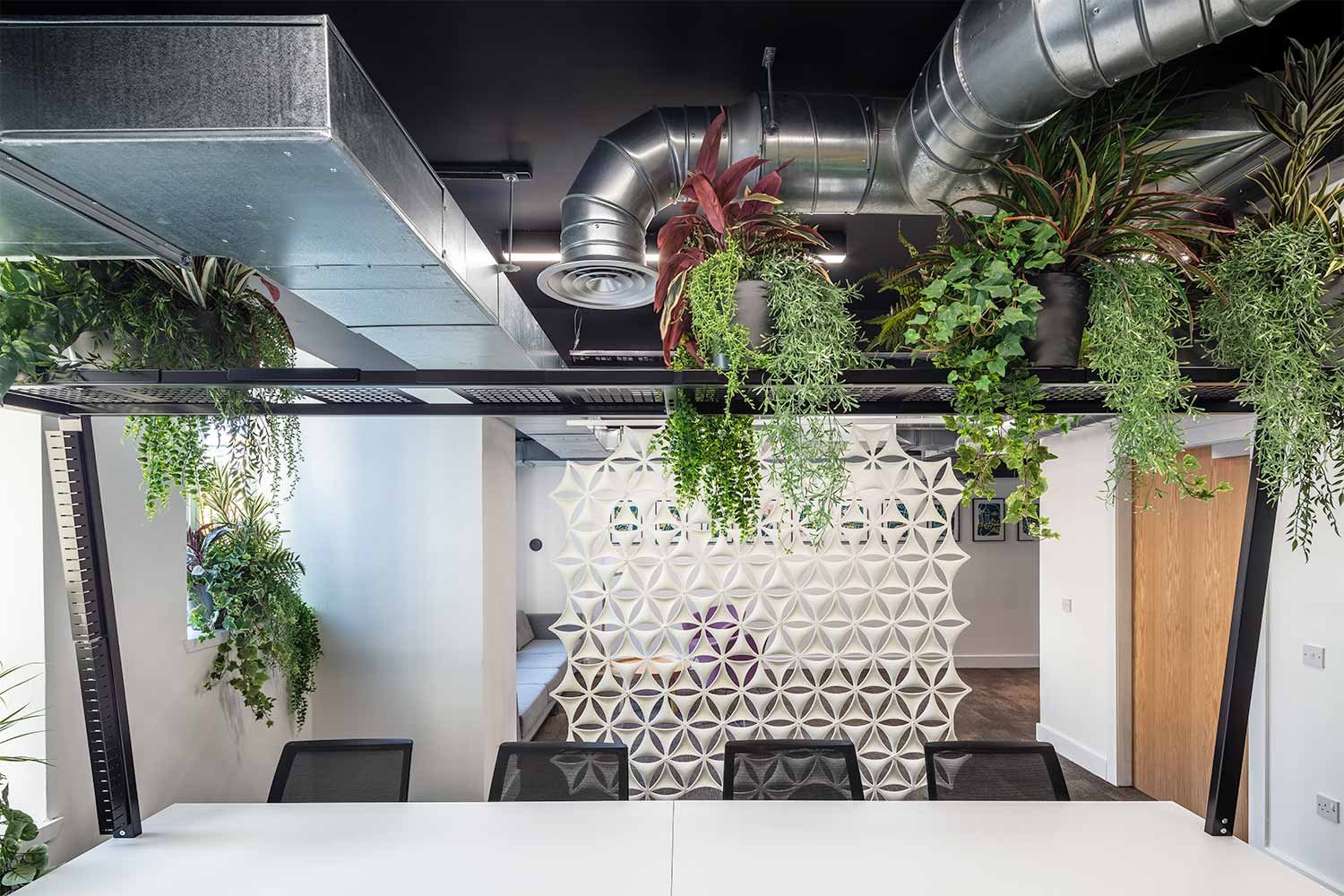
Industrial look of exposed air conditioning ductwork
Circular Office Furniture
As part of their CSR policy, re-using as much furniture as possible from their previous office was requested. Amos Beech provided removal and storage services to allow this to happen as their move and occupancy of the new space was a few months apart.
Working with the Building Consultancy Team at CBRE and the concept design that had been commissioned, Amos Beech developed the design element to the point where it could be executed.
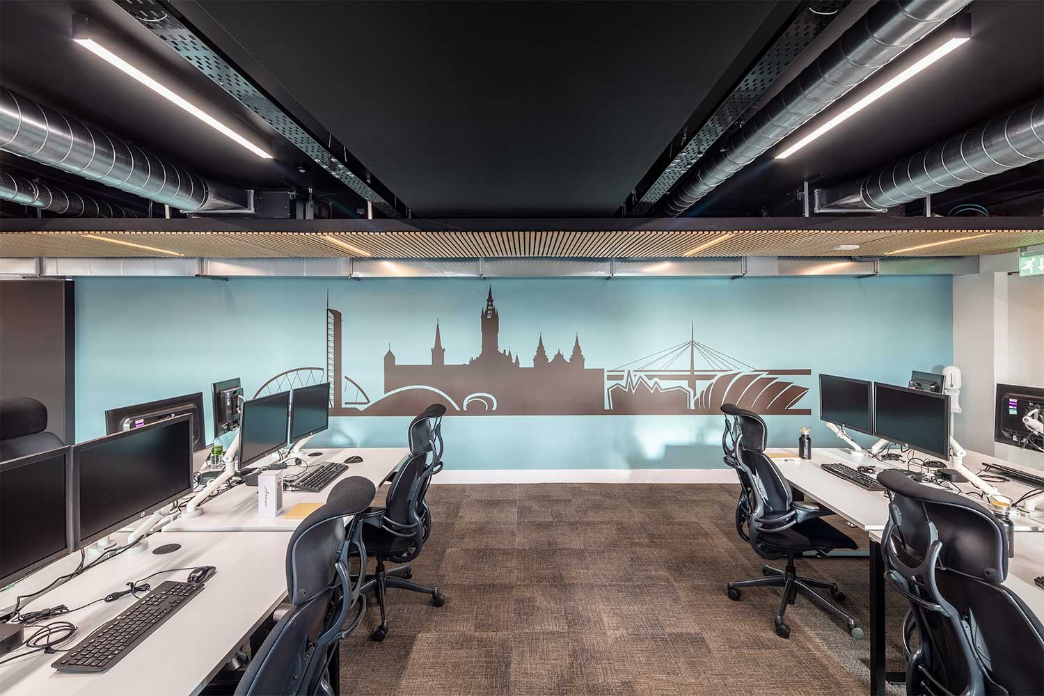
The fusion of a high quality feel, alongside the quasi-industrial look of exposed air conditioning ductwork makes for an incredibly light and airy space. Prior to the build, you needed some imagination to picture it ending up like it has!

From Cat A level to a complete fit-out
A significant part of the project was alterations and additions to the HVAC (Heating/Ventilation/Air Conditioning) system. To ensure that all areas of the new layout were adequately ventilated, the installed system was carefully removed and re-instated along with additional equipment to service the desired layout.
A high security access control system was installed along with a CCTV system to ensure staff safety within the building.
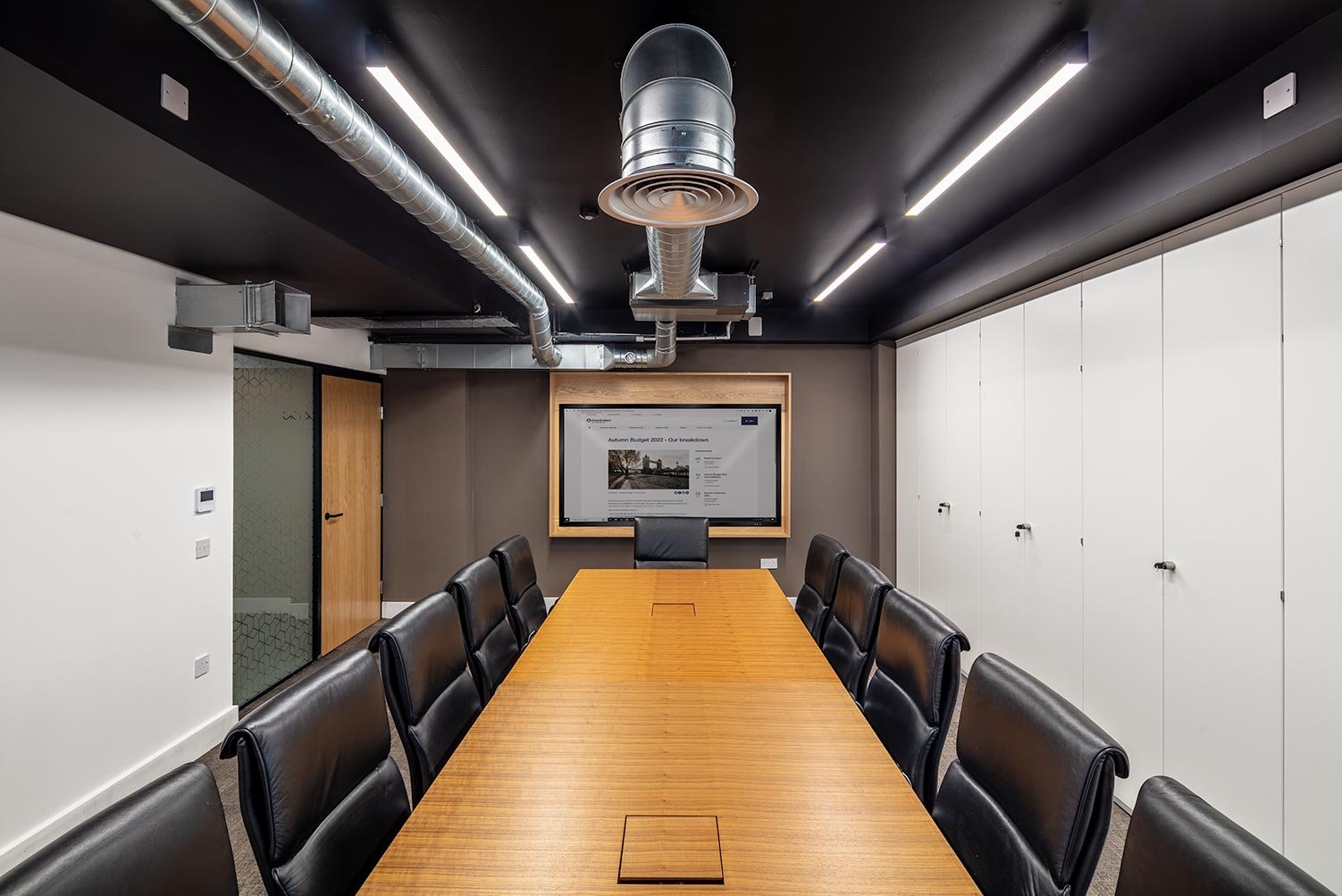
Although the meeting room furniture has been re-used, its high quality belies the fact in as much as it looks extremely smart and compliments the space perfectly. This in itself, confirms why spending more on quality furniture actually saves you money in the long term and reduces carbon footprint. We wish everyone made this sort of intelligent investment.
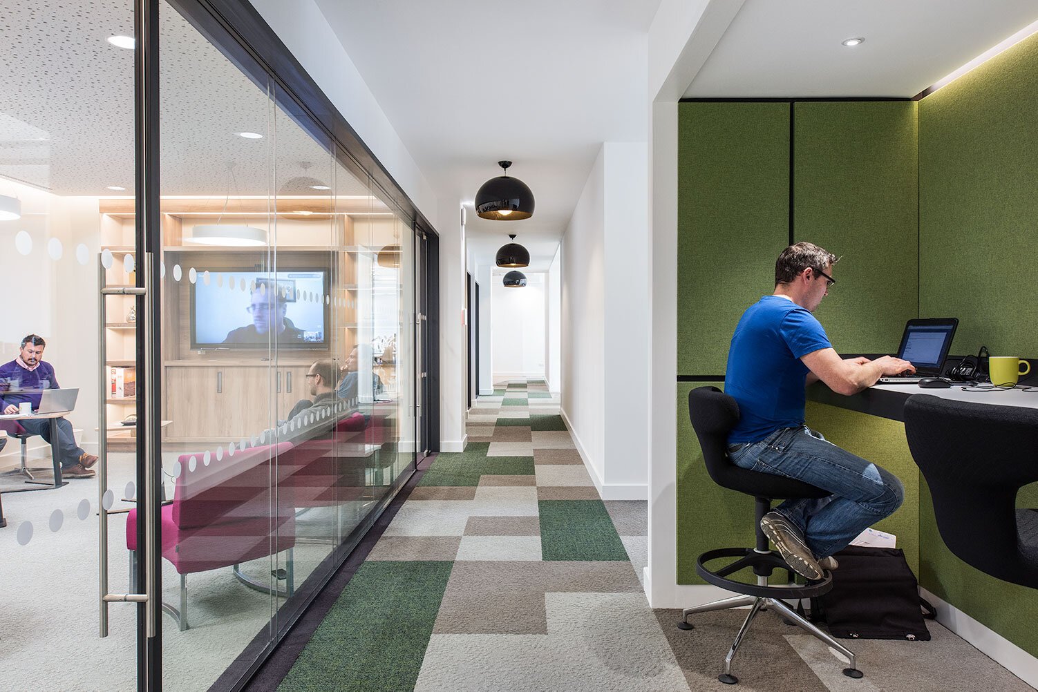
The use of colour and biophilia throughout the space provide a feeling of calm and purpose which together with the intelligent acoustic treatments of walls and ceiling makes an extremely practical and efficient workspace.
Given that the office is significantly smaller than their previous one, the feedback from staff is very positive and they are delighted to have an office that they can come back to:
Published: 22 February 2023
Design, Build, Text & Photography: The Amos Beech Team
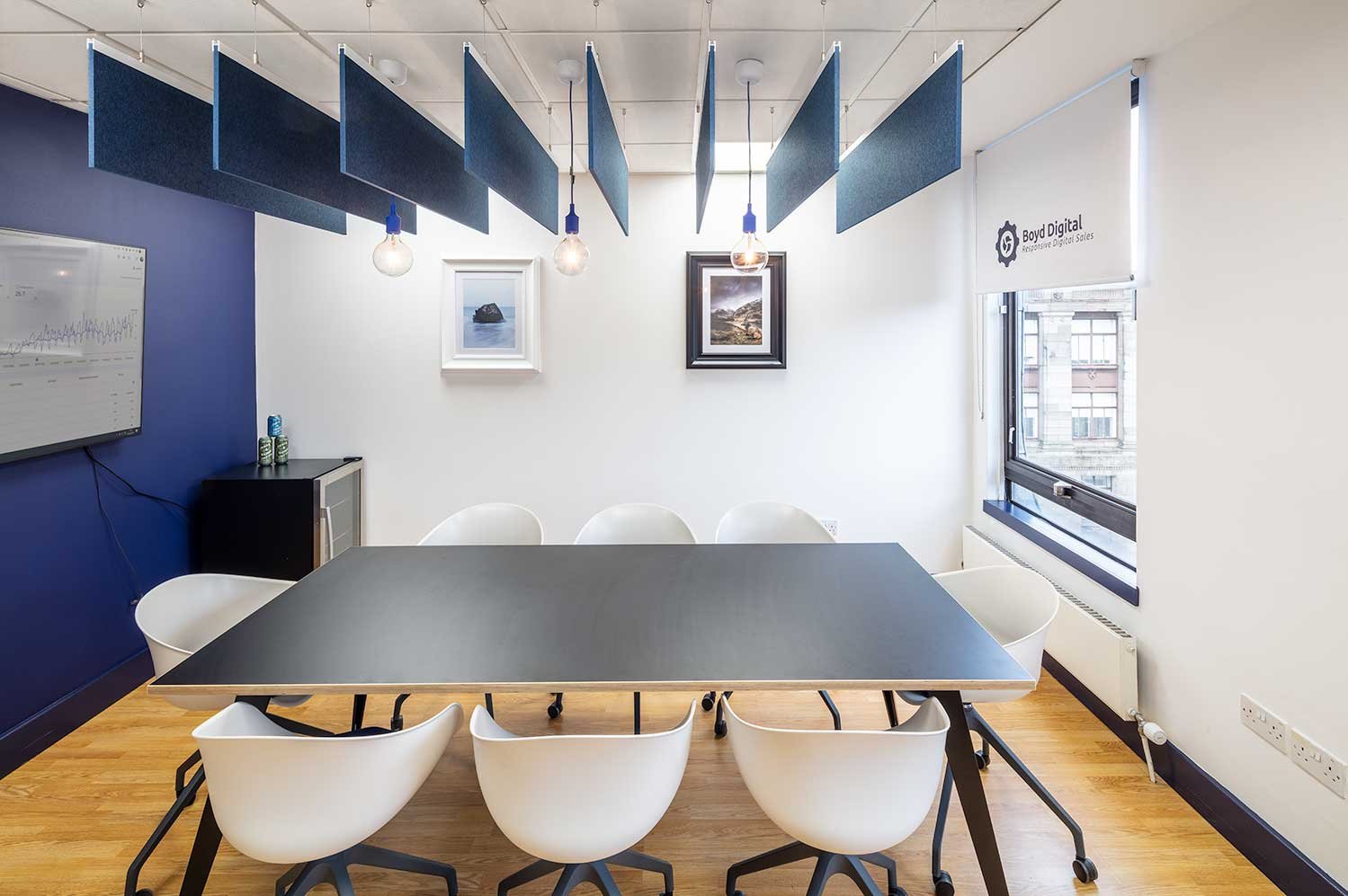
Redesigning The Agency: Reinvigorating Boyd Digital’s Glasgow Office
Boyd Digital is an SEO Digital Marketing Agency based in Glasgow. They are a dedicated team of marketing professionals who specialise in content creation, PPC, social media marketing and search engine optimisation. Boyd believes in an open approach to working with clients to drive traffic to their online channels; they aim to make SEO transparent and deliver results.
As lockdown came to a close, Boyd came to us with a challenge: redesigning their Glasgow office space and making it effective, efficient and exciting – reflective of what they stand for and what they want to show their clients.
WHAT INSPIRED THE OFFICE REDESIGN?
Boyd decided to change the office design as they wanted to create an environment that their staff would be excited to come back to post-covid. After working from home for such a long time, the thought of returning to a tired office space didn’t offer the sense of community and culture that Boyd wanted to give to their employees, so they decided it was time for an updated office design.
They believed a new office space would be important in helping staff bond and allowing them to regain a sense of work/home balance with an office space separate from what most of us experienced over the last couple of years (i.e. working at your kitchen table). It would also allow for a professional environment to take client visits and meetings, to showcase what the brand looks like and what they stand for as a digital agency.
Boyd wanted to illuminate its branding
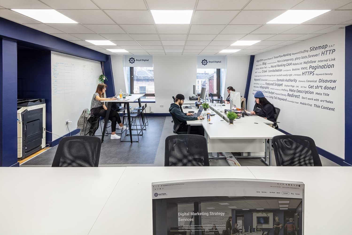
Boyd wanted to create a space which illuminated its branding – in part, this was done by colour-scheming the walls to match their branding and logo, so the whole space is a ‘Boyd’ space. There are a series of keywords on the main wall illustrating what the company does and what they can offer their clients. This wall is also there to inspire the employees, reminding them of key elements of the business and helping them to focus and create.
Are There Any Special Features?
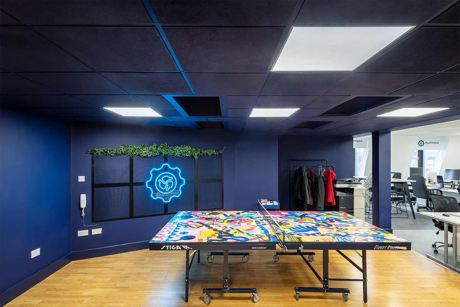
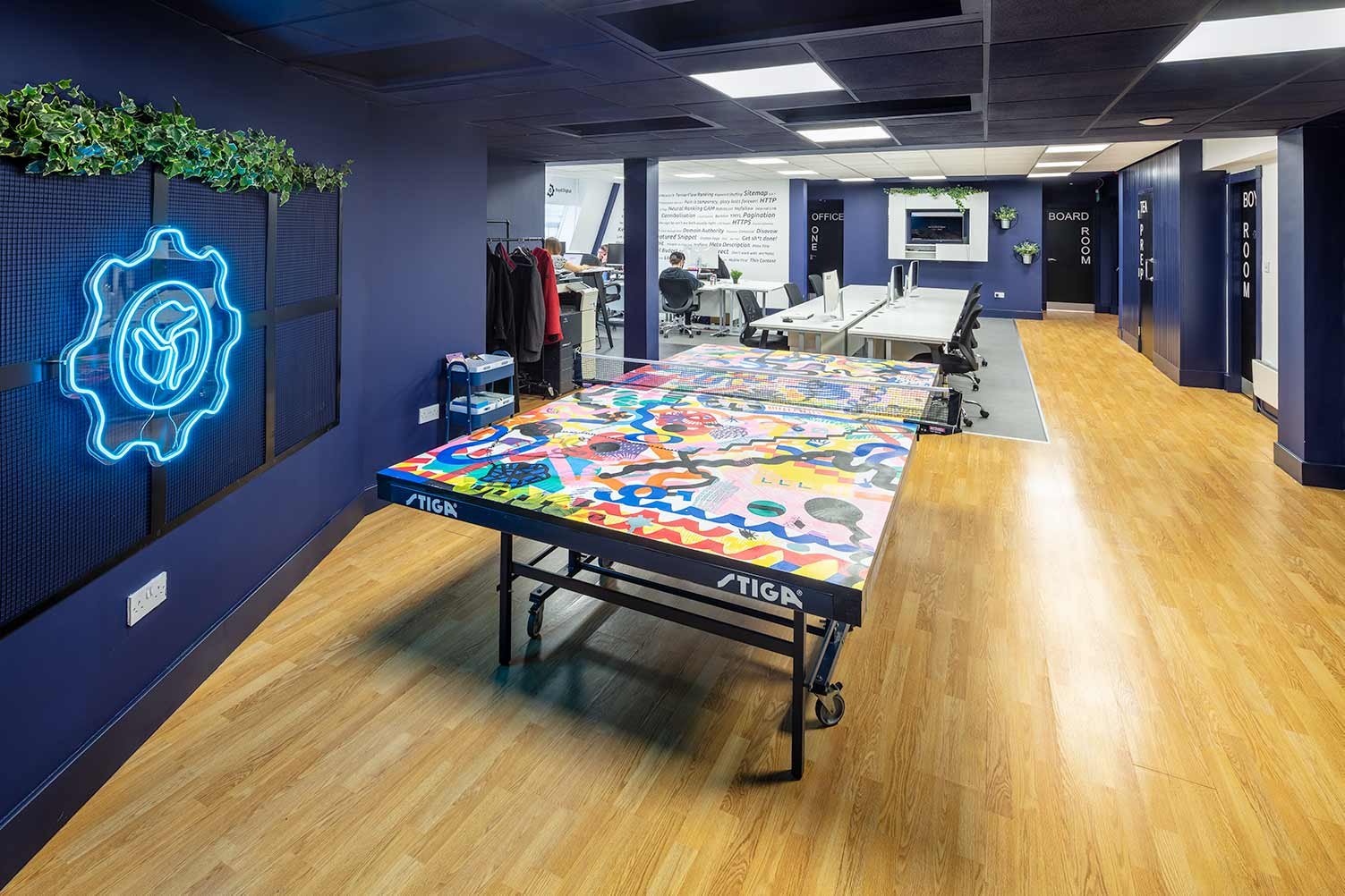
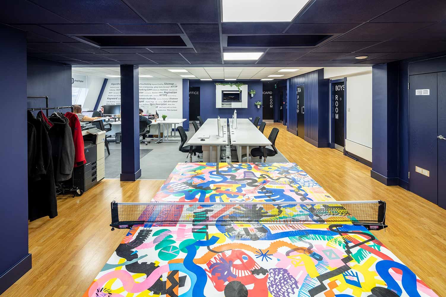
Perhaps the most exciting feature of the new office space is a large table tennis table. Originally showcased by Glasgow based creative design studio Pim-Pam, the table was purchased from the ‘SP!N’ silent auction. SP!N was a charitable art exhibition for the Drumchapel Table Tennis Club (DTTC) and was a project showcasing 42 table tennis paddles designed by artists, designers and illustrators from across Scotland. At the heart of the show was the table, designed by Glasgow based artist Roddy MacNeill, a large feature piece that encouraged visitors to engage in a game.
Table tennis table designed by Roddy MacNeill
The theme of SP!N was balance, resilience and strength — three things important for table tennis, and three things that resonated strongly with Boyd during their return to in-person work culture. The table now acts as a bright and colourful feature piece in the office, there not only for looks but also to help relieve stress and creative blocks by offering employees a physical outlet; to help staff bond over a fun and productive activity, and to give a new home to an artwork by one of Glasgow’s most dynamic artists within their agency.
Did You Maintain Any Of The Original Design?
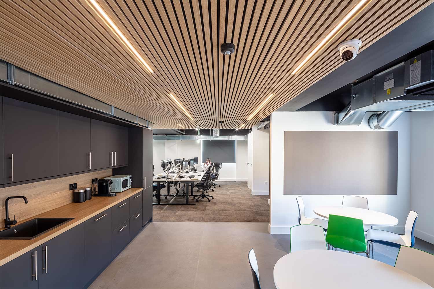
The one thing Boyd wanted to keep the same during the redesign was the open layout. They wanted to maintain a space where their staff could work collaboratively and have an added layer of comfort with large desks and natural lighting from the windows. The space feels open and free, with plenty of room to move and plenty of space to breathe. They also highlighted the importance of keeping a functional kitchen space, so that staff feel comfortable and can make as much coffee as needed (including dozens of cups of our office favourite from Conatum Coffee). Community and comfort were at the heart of this redesign – Boyd made it very clear that they wanted the new Glasgow office to be a positive space for their staff members, a place which they want to return to.
What Was The Process Like?
The process of changing the office was exciting. Knowing that on the other end of lockdown was a completely refreshed Glasgow office was exhilarating for the members of the Boyd team. Working with designers and builders to create the office they envisioned was a fascinating experience, filled with creativity and ideas. The works were conducted within the scheduled period and budget, and the collaboration of ideas between management and designers allowed for heightened attention to detail.
What Were The Results?
When the offices reopened, the staff were excited to come back and experience the new space. And as a growing digital agency, Boyd can now showcase its branding through its physical office space – presenting a stronger image of who they are and what they do to clients. A redesign is also a reinvigoration, and we hope that the team at Boyd can feel this positive energy as they continue to work in their Glasgow offices.
Published: 1 June 2022
Text: Boyd Digital Glasgow
Interior Photography: Studiovhf


